50.3k
50.3k
Welcome to the June–July edition of What’s New in ClickStack. We’ve bundled two releases into one update, so there’s a little more than usual to cover.
Much of the work in the last 2 months has focused on traces and came directly from user feedback. The waterfall now uses a separate color for each service. A new minimap keeps the shape of the full trace visible while you inspect one part of it, and OpenTelemetry span links appear in the span detail panel, letting you move between traces easily.
For metrics, we added quantile support for exponential histograms, introduced a leaner default schema, and enabled connections to external Prometheus-compatible endpoints. This takes ClickStack beyond a single-source observability experience and raises new possibilities for evaluating the TimeSeries Engine and migrating existing Prometheus workloads, which we explore below.
Dashboard filters can now narrow each other, similar to a faceted search. Event patterns are available as a dashboard tile type, and kiosk mode can lock dashboards into a read-only view for wall displays.
We also changed how filter values are fetched. Autocomplete and filter dropdowns now use ClickHouse text indexes where available instead of scanning the source table.
New contributors
Thank you to our open source contributors and to the users whose feedback shaped many of these features.
Aryan Inguz, Marco Frömbgen, heyparth, kumburovicbranko682-boop, Rachit Mittal, Matt Kaye, zoov-xavier, tsushanth, Saksham Goyal, Prince Rawat, Shuvam Kumar, Minh Vu, Niladri Adhikary, xob0t
Contributing doesn't have to mean writing code. Documentation fixes, ideas, feature requests, bug reports, and general feedback are all welcome through the repository. Small contributions count too, and each one improves ClickStack for the wider community.
Trace waterfall improvements
The trace view is where ClickStack users spend most of their time, and teams migrating from Jaeger tend to examine that workflow closely. We've invested significantly here in June and July, redesigning the view and supporting span links.
A redesigned trace waterfall
Last month, we moved span details into a split pane so the waterfall remains visible while you inspect a span. This month, we focused on the waterfall itself.
Each service now has a stable color, shown as a vertical bar beside the operation and service label. Previously, the color appeared as a fill behind the text inside the span bar. Green remains reserved for correlated log rows and red for error spans, so neither can be confused with a service color.
Span duration now appears outside the bar in muted text. Hovering reveals the span body on whichever side of the cursor has more space.
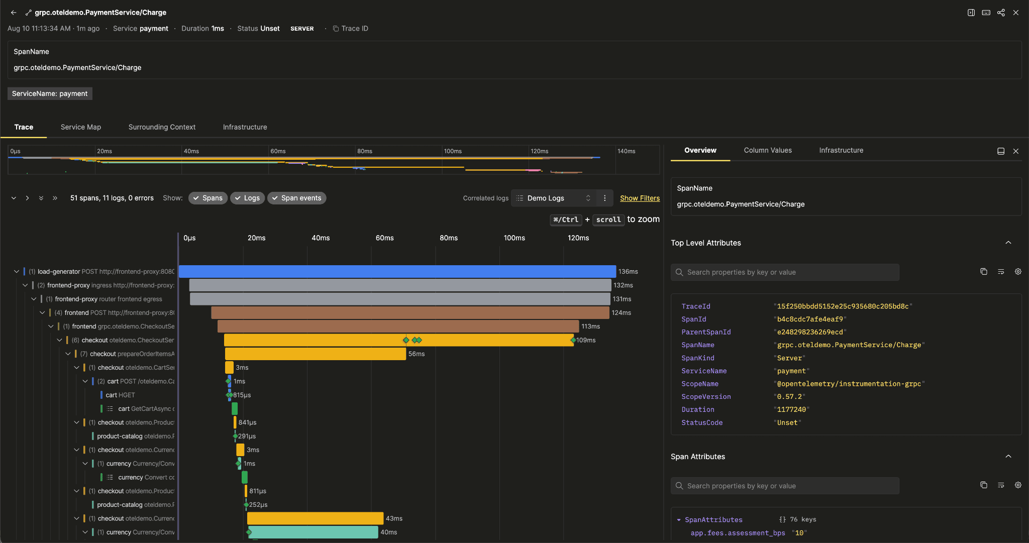
We also fixed how very short spans behave when zooming. Their minimum width was defined as a percentage of the waterfall area, which increases with zoom. This could make a very short span appear as wide as one lasting several seconds. The minimum is now a fixed pixel width, keeping spans in proportion at every zoom level while ensuring that sub-pixel spans remain clickable.
Navigating deep traces is easier, too. Expand and collapse controls can now act on one level or the entire trace, and only appear when there are nodes to collapse.
A minimap for long traces
While improvements to the trace view have helped with navigating large traces, they still don't always fit on a single screen. After zooming into one section, it could still be difficult to tell where that section sat within the full trace. Returning to the full view previously meant scrolling back out or resetting it entirely.
To address this, a minimap now sits above the waterfall. It shows the full trace range as a time axis with one bar per span. A framed rectangle marks the current viewport, while a dimmed overlay separates it from the rest of the trace. You can brush across the minimap to zoom, drag the viewport to pan, or drag either edge to resize it.
Span links in the trace viewer
Span links are OpenTelemetry's way of connecting a span to one in a different trace. They cover cases such as a producer handing work to a consumer, a batch job referring back to its source records, or a retried request starting a new trace. These spans are causally related even though they don't share a trace ID.
ClickStack has always ingested span links into the standard Links column, but didn't display them. In fan-out and batch workflows, related spans therefore appeared as orphans with no visible connection to the work that caused them.
The span detail panel now includes a Span Links section whenever the selected span has links. Each link appears as a compact row, with trace state and link attributes shown as chips. The complete trace and span IDs are available on hover. An Open trace action navigates to the linked trace in place.
Get started today
Interested in seeing how ClickStack works on your data? Get started with Managed ClickStack in ClickHouse Cloud in minutes and receive $300 in free credits.
Sign upConnect to an external Prometheus datastore (experimental)
Last month, we shipped experimental PromQL support using the ClickHouse TimeSeries Engine. It allows Prometheus-style metrics stored in ClickHouse to be queried with a language many engineers already know. Many teams, however, already have Prometheus or Prometheus-compatible systems running.
You can now configure one of those systems as a metrics source through the ClickStack UI. PromQL queries are proxied to the configured endpoint, and the same chart editor works with either backend. Existing Prometheus metrics can therefore be charted alongside logs and traces without first moving the underlying data.
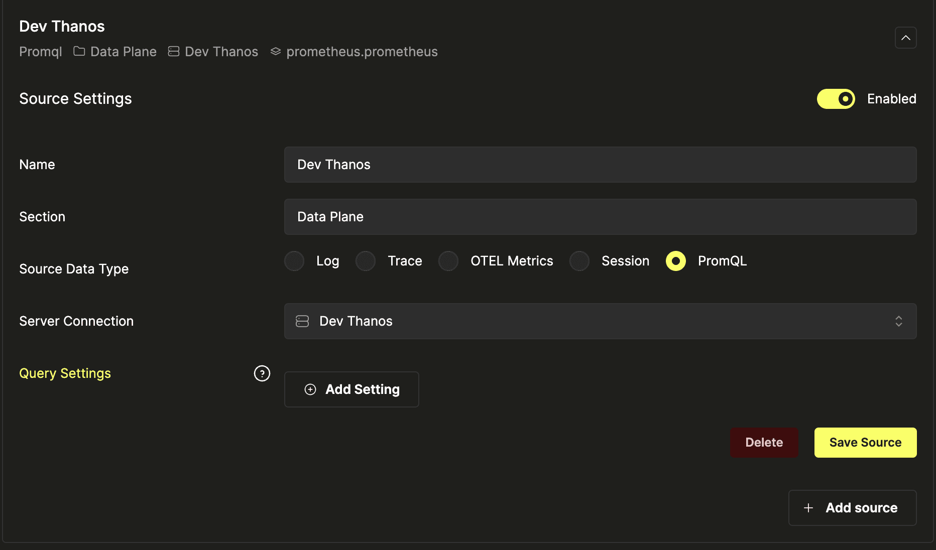
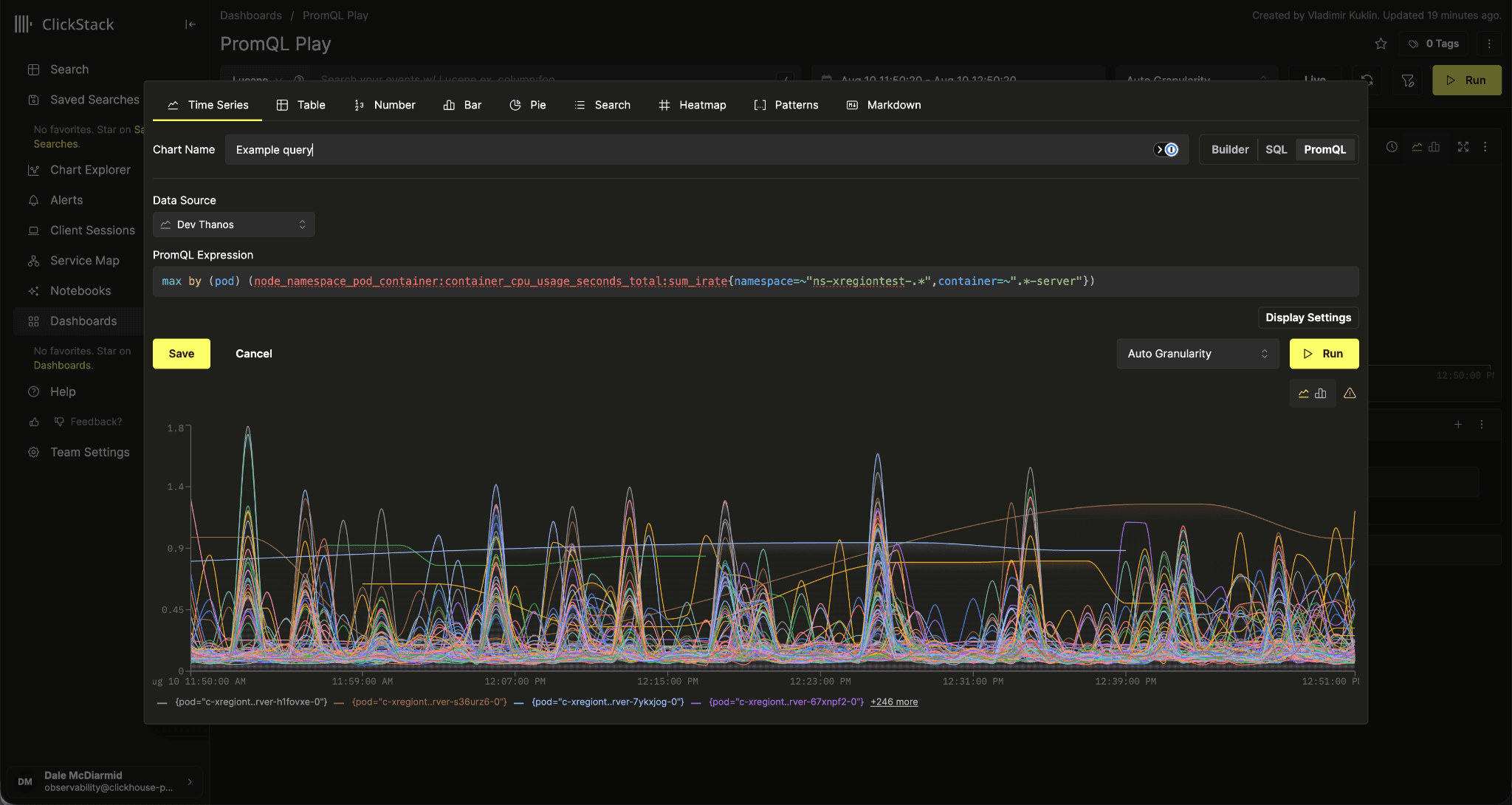
This opens ClickStack beyond a single-source observability experience. As our native metrics support matures, teams can use their existing Prometheus deployment to evaluate ClickStack and move dashboards across without committing to a full migration.
It also supports a hybrid approach. A team moving higher-cardinality workloads from Prometheus to the ClickHouse TimeSeries Engine can migrate gradually, keep using its existing dashboards, and compare results between the two systems. That makes it easier to verify that both backends produce equivalent results before completing the move.
A full migration isn't the goal for everyone. Teams that are satisfied with their Prometheus-compatible deployment can leave it in place and use ClickStack to correlate those metrics with logs and traces.
Prometheus connectivity is still highly experimental and off by default. To surface it, set the environmental variable
NEXT_PUBLIC_ENABLE_PROMQL=true- this exposes the PromQL source kind in the source form. Expect the surface area to change between releases, so enable it in non-production environments first.
Faster filter values and autocomplete
Autocomplete and filter dropdowns need to answer an expensive question: which values does this column contain?
On a high-volume source, scanning the table can turn an instant dropdown into a long wait. ClickStack has used metadata materialized views to reduce that cost for some time, but the logic for choosing what to query had grown into several overlapping paths.
We reworked the logic that determines the strategy for selecting approaches to generate filters, such that it tries each available option in order of cost.
Its first choice is a ClickHouse text index, read through the mergeTreeTextIndex() table function. This lists the terms already stored in the index without reading the underlying data parts. It works with text indexes on maps as well as native columns such as TraceId.
When no suitable text index exists, the router falls back to the metadata rollup materialized views. It queries the source table directly only when neither option is available.
Autocomplete now uses the same path, giving suggestions and filter values a shared implementation.
The
mergeTreeTextIndex()path requires ClickHouse 26.3 or later. For earlier versions, the router skips it and uses the metadata rollups instead, so filters work either way.
Cascading dashboard filters
Dashboard filtering capabilities have improved significantly over the past few months, starting with the ability to limit the values shown in filters before supporting source-scoped filters in May. However, until now, each dropdown still listed every value in its column regardless of the filters already applied. On a Kubernetes dashboard, selecting a cluster left the namespace dropdown full of namespaces from other clusters, most of which would return no results.
Dashboard filter bars and the Kubernetes view now include a "Link filters" toggle. When enabled, each dropdown only offers values that occur alongside the current selections. Choosing a cluster, for example, narrows the namespace list to those found in that cluster. Free-text search on the Kubernetes filter bar contributes to the same narrowing.
Linking is off by default because of its query cost. Narrowed values depend on the current selections and can't come from the inexpensive per-key rollups used by ordinary dropdowns. These lookups become considerably more expensive as a source grows.
To limit that cost, narrowed values are fetched only when a dropdown is opened. This places a bound on the number of additional lookups a dashboard can trigger.
Consecutive-window alerts
A single noisy evaluation window is a common reason for an alert to page someone at three in the morning for a problem that was transient and has already passed. A brief latency spike, a burst of retries, or a deployment that temporarily raises the error rate can cross a threshold, fire an alert, and recover before anyone finishes reading the notification.
Alerts now support waiting for a condition to hold across several consecutive windows before firing. If an alert requires three consecutive one-minute windows, it sends a notification only after the threshold has been breached three times in a row. This filters out short-lived spikes without raising the threshold and making the alert less sensitive to sustained problems.
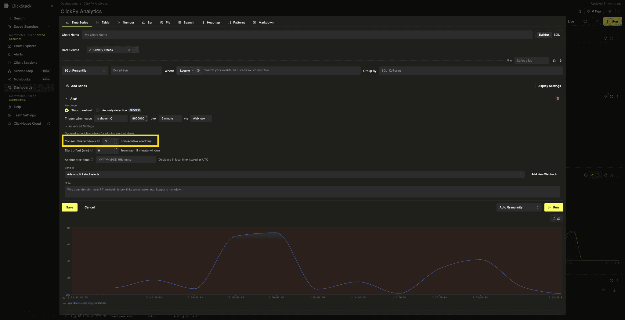
While an alert is accumulating the required windows, it reports a new PENDING state. This separates an alert that may be about to fire from one with no active condition.
The numConsecutiveWindows setting is available in both the alert editor and the external API, so alerts managed as code can use it as well.
Exponential histogram metrics
Exponential histograms are the more compact of OpenTelemetry's two histogram types. Instead of defining fixed bucket boundaries in advance, they represent each bucket using a scale factor and an index. This allows one metric to cover a wide range of values at high resolution without requiring the instrumentation author to predict where the useful latency boundaries will be.
Support for exponential histograms has been one of our most common requests for metric support.
The query builder now supports quantile and sum aggregations over exponential histogram metrics. These metrics also appear in the metric name selector alongside the other metric types.
Calculating a quantile is more involved than it is for fixed-bucket histograms. Scale can vary between series and between data points in the same series. Before aggregating anything, ClickStack normalizes the counts to the smallest scale present. This combines finer buckets into coarser ones while keeping their offsets aligned.
Offsets can also move between data points. To convert cumulative counts into deltas, ClickStack aligns each bucket index with the previous data point in the same series before subtracting the counts.
Once aligned, the buckets are summed across series within each time bucket. ClickStack uses the cumulative counts to find the bucket containing the requested quantile, then estimates its value using log-linear interpolation within that bucket. This matches the behavior in Prometheus.
Categorical bar charts
ClickStack has supported bar charts for a long time, but only as time series with one bar per bucket along a time axis. Answering a question such as "Which ten endpoints produced the most errors today?" meant using a pie chart, which becomes difficult to read when there are many values to compare.
Categorical bar charts now have their own display type in Chart Explorer, dashboards, the MCP server, and the external dashboards API. Each bar represents a group instead of a time bucket, making ranked comparisons much easier to read.
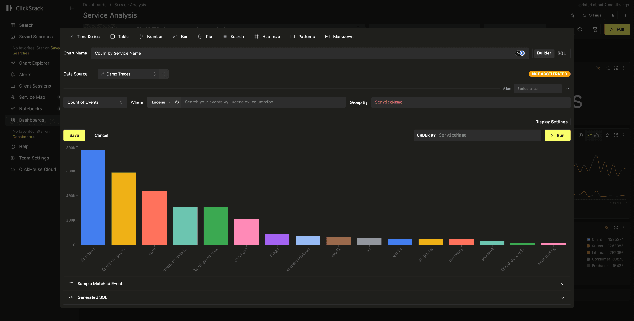
The new bar chart and the existing pie chart also support the series limit already available for time series charts. The implementation is different for categorical charts, though - the limit becomes an ORDER BY and LIMIT in the query, while time series charts require a CTE to calculate the top series across every time bucket.
Ordering is configurable as well. Categorical charts were previously fixed to value-descending order. You can now provide any SQL expression to order by, with value descending remaining the default.
Event patterns as a dashboard tile
Event patterns group similar messages into a small set of representative patterns. This is often the quickest way to understand what a service is emitting.
Previously, patterns were limited to the Search page. You could use them during an investigation, but couldn't save the result to a dashboard alongside the charts it helped explain.
Event patterns are now available as a dashboard tile type. The tile editor has a dedicated section where the column expression to be analyzed can be specified (defaults to Body for logs, SpanName for trace sources) as well as an optional filter supplied in either Lucene or SQL - useful for limiting pattern mining to subsets of data.
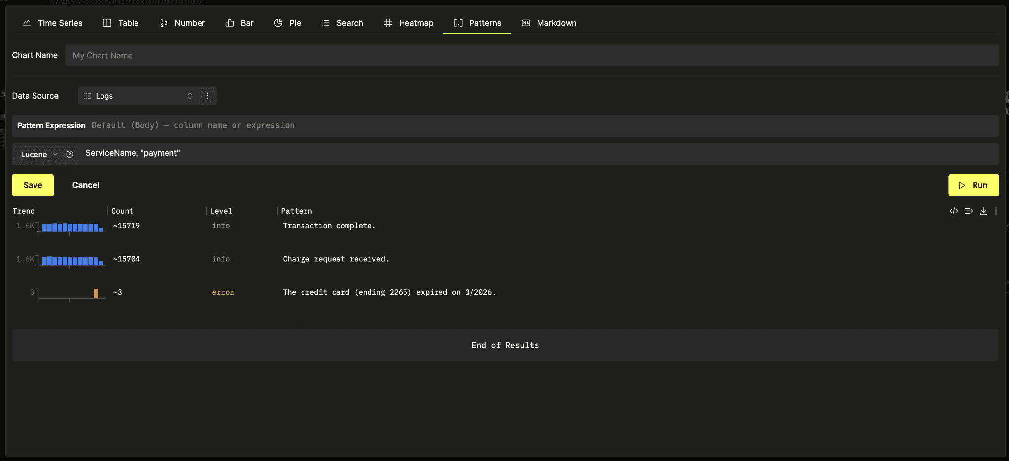
Support covers the UI, MCP server, and external API, so agents can also create a pattern tile using displayType: "event_patterns".
Read-only kiosk mode
Plenty of teams keep a dashboard on a screen in the office. Until now, that meant leaving an editable dashboard open and hoping nobody walked past with a mouse. The authoring interface also took up space on a display that nobody was meant to interact with.
Dashboards now have a kiosk mode, available from the overflow menu. It reduces the interface to the dashboard name, a live read-only indicator, and the tiles themselves. All authoring controls are disabled, and automatic refresh is always enabled, including live behavior for trace and search tiles.
Kiosk mode is stored in the URL as
kiosk=true. A wall display can open that URL directly and return to kiosk mode after a reboot without anyone having to set it up again.
Saved searches and webhooks over the External API
We have been steadily filling in External API v2 so that ClickStack resources can be managed as code rather than clicked together. Alerts and dashboards already had full CRUD. Saved searches had none at all, since /api/v2/search only executes a query, and webhooks were read-only.
Both are now complete. A new /api/v2/saved-searches router supports list, get, create, update, and delete, and /api/v2/webhooks gains POST, PUT, and DELETE alongside its existing list endpoint.
Everything is team-scoped, and saved search requests reference a source by sourceId rather than an embedded source object. Pinned filters on a saved search are validated on write to confirm they will actually render as a sidebar facet, rather than being stored and quietly ignored.
Alongside this work, the v2 list endpoints for alerts, saved searches, and webhooks became paginated, accepting limit and offset and returning a meta block with the total. If you have a client who relied on those lists being unbounded, it now needs to read the total and page.
A leaner and faster metrics schema
Metric tables have a distinctive shape. They contain a relatively small number of series, each with many data points recorded over time, and each series is identified by its attributes.
The original default schema sorted on the attributes map itself:
ORDER BY (ServiceName, MetricName, Attributes, toUnixTimestamp64Nano(TimeUnix))
Putting a map directly in the sorting key is expensive. The primary key index has to keep those map values in memory, and a map containing resource and metric attributes can be large.
The new default schema uses:
ORDER BY (ServiceName, MetricName, toStartOfHour(TimeUnix), cityHash64(Attributes), TimeUnix)
Hashing the attributes gives each series a compact, fixed-width identity in the sorting key, rather than storing the full map there. This reduces the index's memory footprint.
The hourly bucket appears before the attribute hash, allowing time-filtered queries to skip entire granules before examining attributes. A min-max index on TimeUnix provides another inexpensive way to prune data.
Together, these changes reduce the amount of data read by metric queries and the amount of memory used by the index.
This changes the default schema the collector creates, so it applies to newly created metrics tables. Existing deployments keep their current sorting key, since a primary key cannot be altered in place. See our current guide for how to migrate to new primary keys.
Datadog receiver for the OpenTelemetry Collector
The ClickStack distribution of the OpenTelemetry Collector now includes an opt-in Datadog receiver. An existing Datadog Agent can send traces, metrics, and logs to ClickStack without requiring any immediate changes to instrumentation.
Set ENABLE_DATADOG_RECEIVER and the OpAMP controller adds the contrib datadogreceiver at 0.0.0.0:8126 to the traces, metrics, and logs pipelines. When collector authentication is enabled, the receiver checks the DD-API-KEY header against your team API keys.
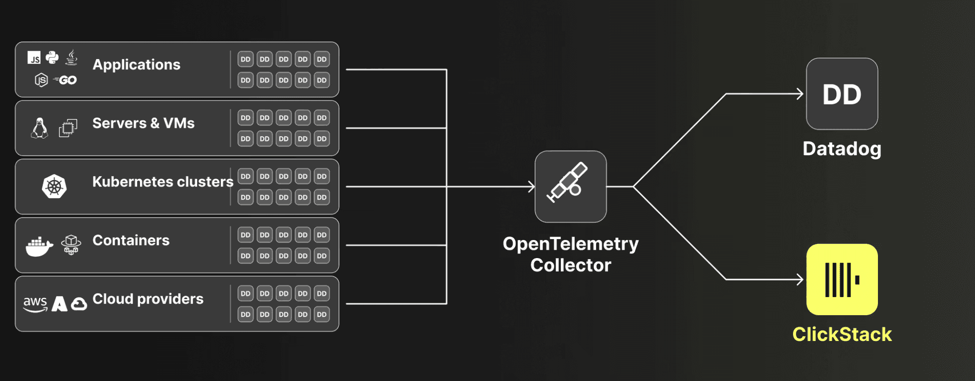
This makes it much easier to evaluate ClickStack using existing workloads. It also provides a gradual migration path. Teams can start sending data to ClickStack immediately, then move their instrumentation to OpenTelemetry SDKs and Collectors over time instead of changing everything at once.
Running both systems in parallel is another option. A team might move logs or traces to ClickStack while leaving metrics in Datadog, without replacing the instrumentation behind every signal. This allows individual workloads to move when the operational or cost benefits justify it.
We cover the migration path, including what the receiver does and doesn't translate, in a dedicated blog.
MCP server improvements
Since announcing the ClickStack MCP server at Open House, we have kept expanding what an agent can do with it. Our own evaluation frameworkshows that agents perform noticeably better when given observability primitives than when asked to reconstruct investigative workflows out of raw SQL. Two improvements this month stand out.
Metrics as a first-class source
The MCP server now has a complete workflow for discovering and querying OpenTelemetry metrics.
Two new tools handle metric discovery. clickstack_list_metrics returns a paginated catalogue of metric names, with filters for metric kind, name pattern and time window. clickstack_describe_metric returns the selected metric's unit, description, attribute keys and sampled values.
clickstack_describe_source is also metric-aware. It selects a representative table according to metric kind and runs the same column discovery and value-sampling pipeline used for other source types.
The tools clickstack_timeseries and clickstack_table now accept metricType and metricName, enabling metrics to be queried.
Source and webhook management
Several users asked to bring agents into the initial ClickStack setup process, rather than only using them for investigations after data was already flowing. That previously assumed sources and webhooks had been configured before the agent became involved.
The MCP server can now create, update and delete sources and webhooks. An agent can start at the initialization stage, create a source, point a shipper at ClickStack and begin ingesting data. From there, it can build searches, dashboards and alerts over the same data.
The tools supporting this workflow are clickstack_save_source, clickstack_delete_source, clickstack_save_webhook and clickstack_delete_webhook.
Little but useful things
Pinned chart tooltips
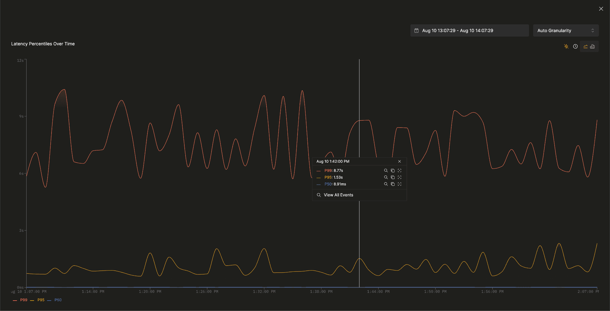
Hovering over a time chart shows per-series values and previous-period change; clicking pins the tooltip and adds View All Events, plus Drill in, Copy name, and Focus actions for each series.
Builder charts convert to raw SQL
Switching a chart from the query builder to the SQL editor used to hand you an empty editor and reset the source. The current builder configuration is now converted to SQL when you switch, and the selected source is preserved, so the visual editor becomes a starting point for a hand-written query rather than something you abandon.
Table styling
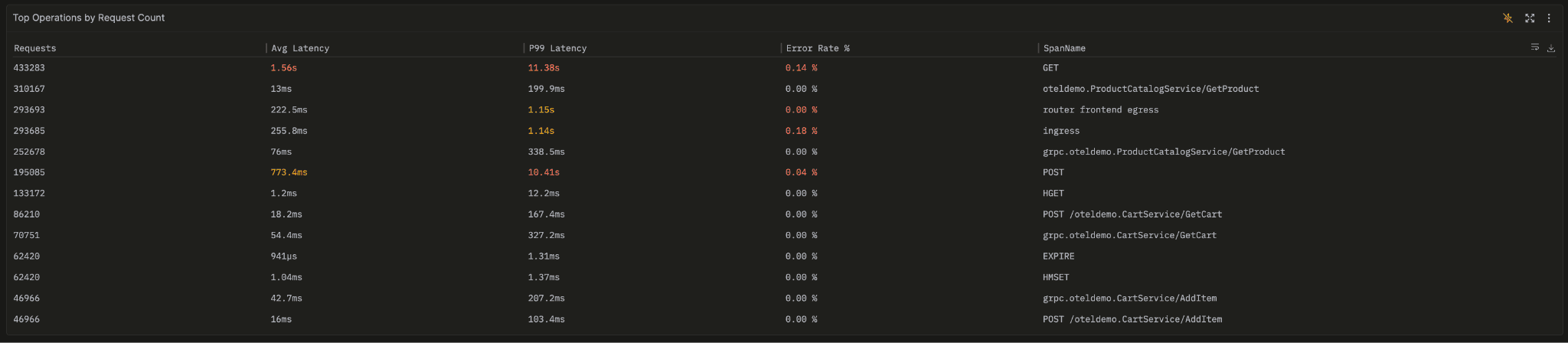
Table visualizations gained per-column colors, either a static color on a column or ordered conditional rules e.g. a duration column where values above 500ms turn cells red. An always-on separator also now keeps a table's sticky header distinct from the rows scrolling underneath it.
Alert annotations on tile charts
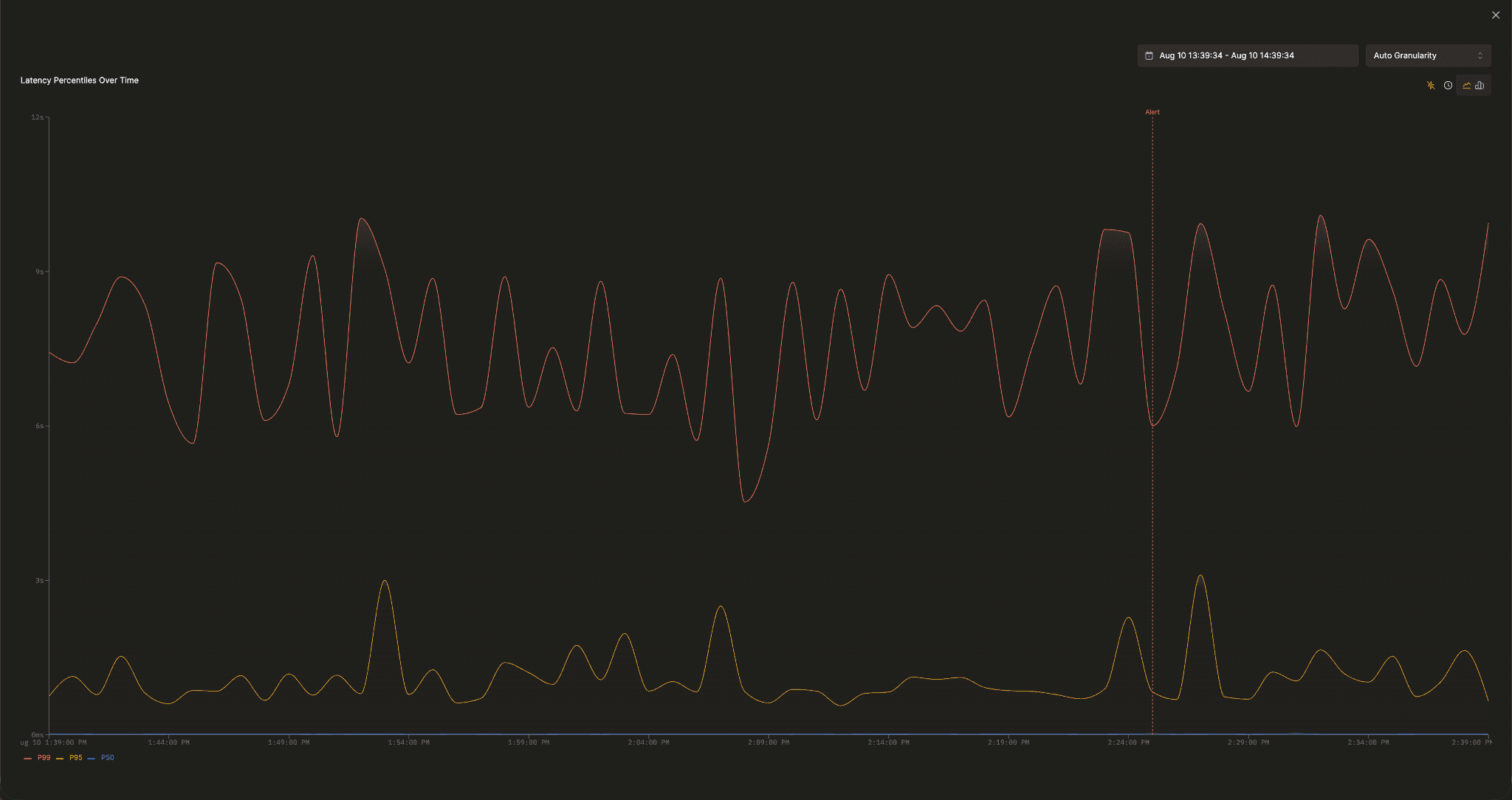
When investigating an alert, users need to see when it fired and recovered against the visualization it monitors. Enable Show alert annotations from the dashboard menu to add a red marker when an alert fires and a green one when it recovers on each associated tile.
Browser RUM dashboard enhancements
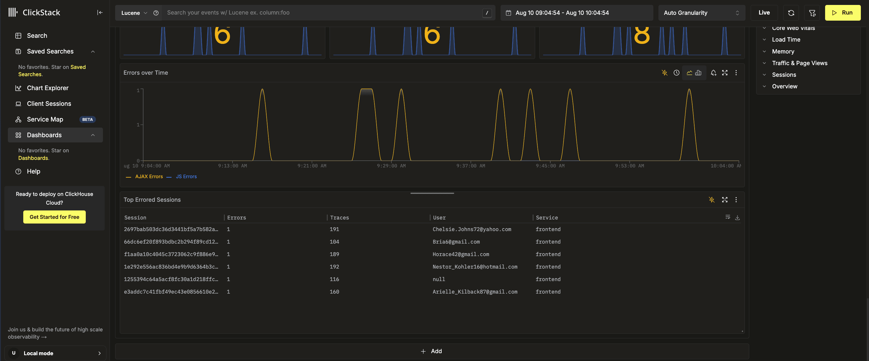
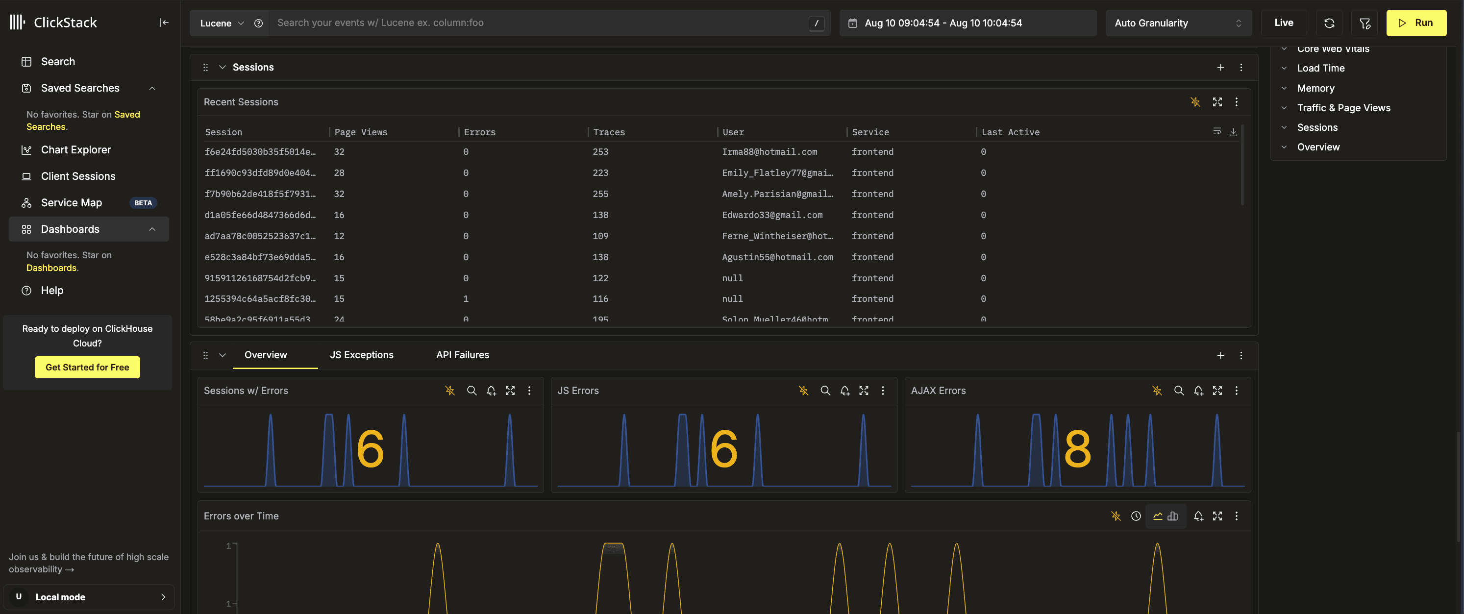
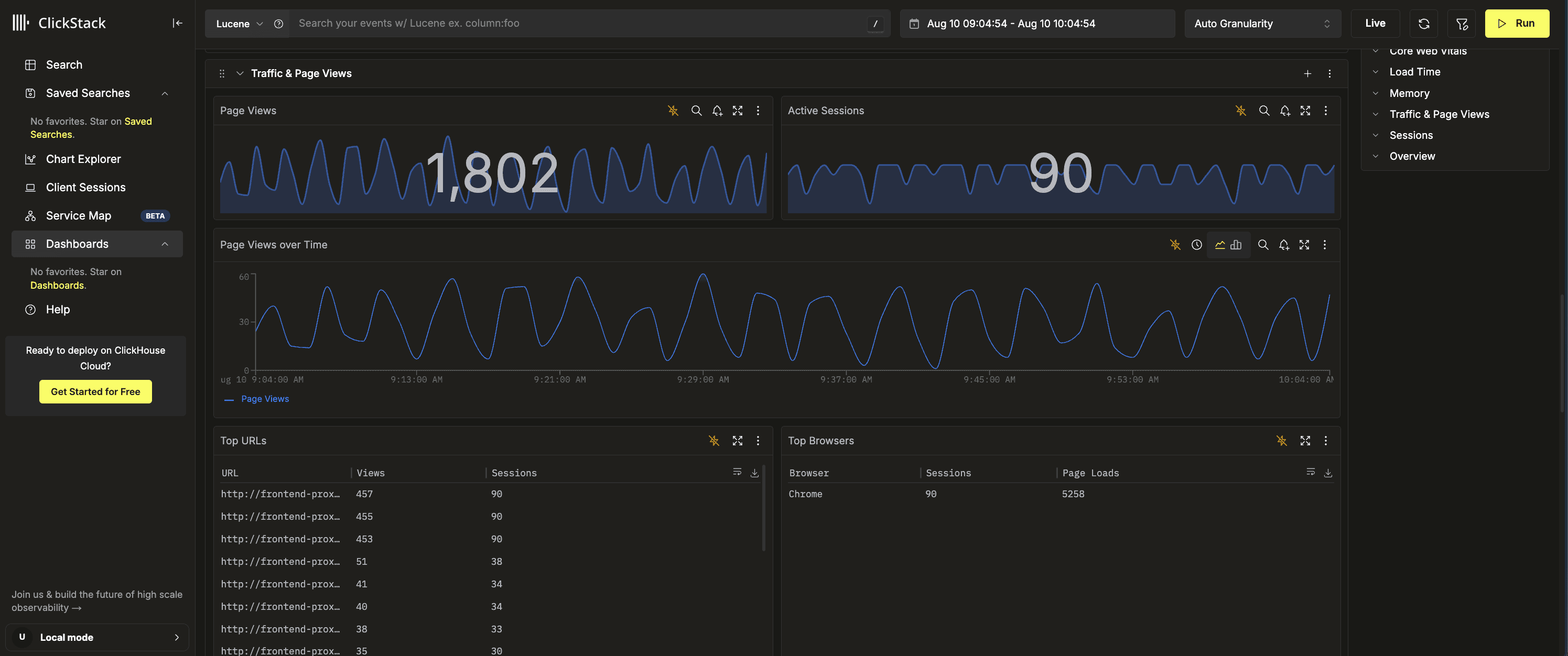
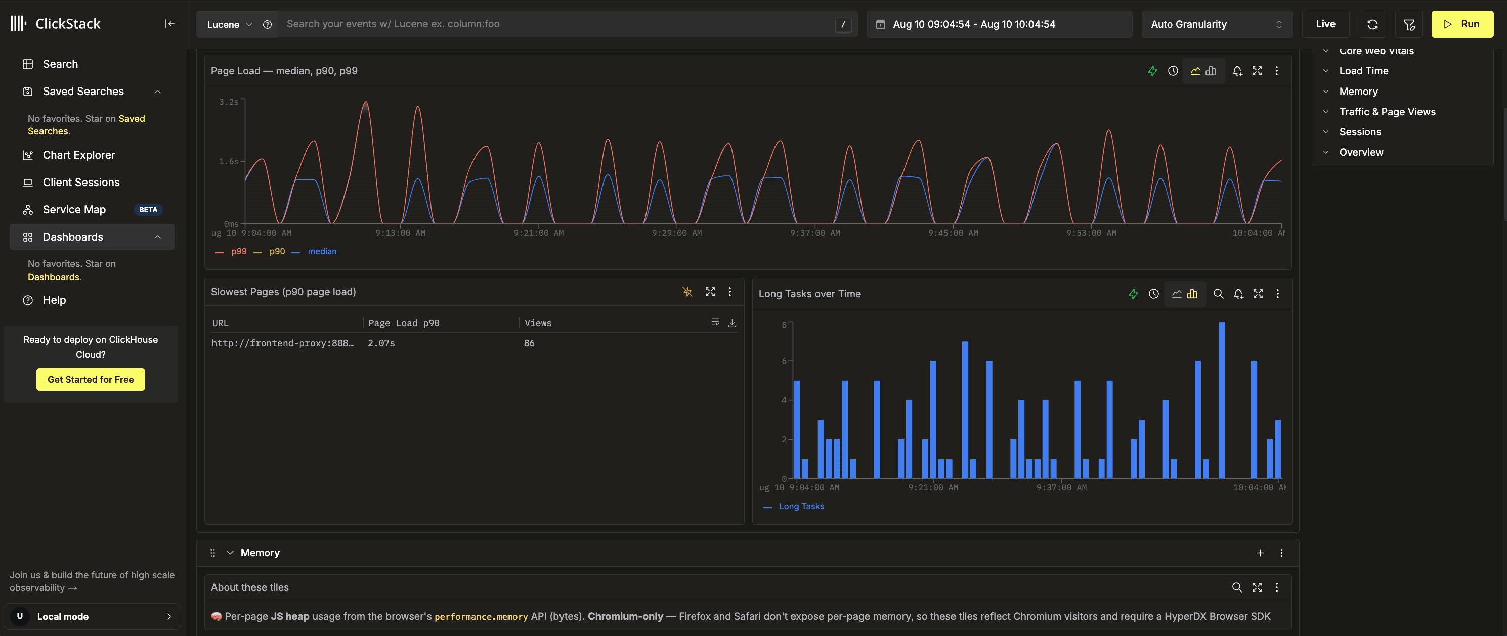
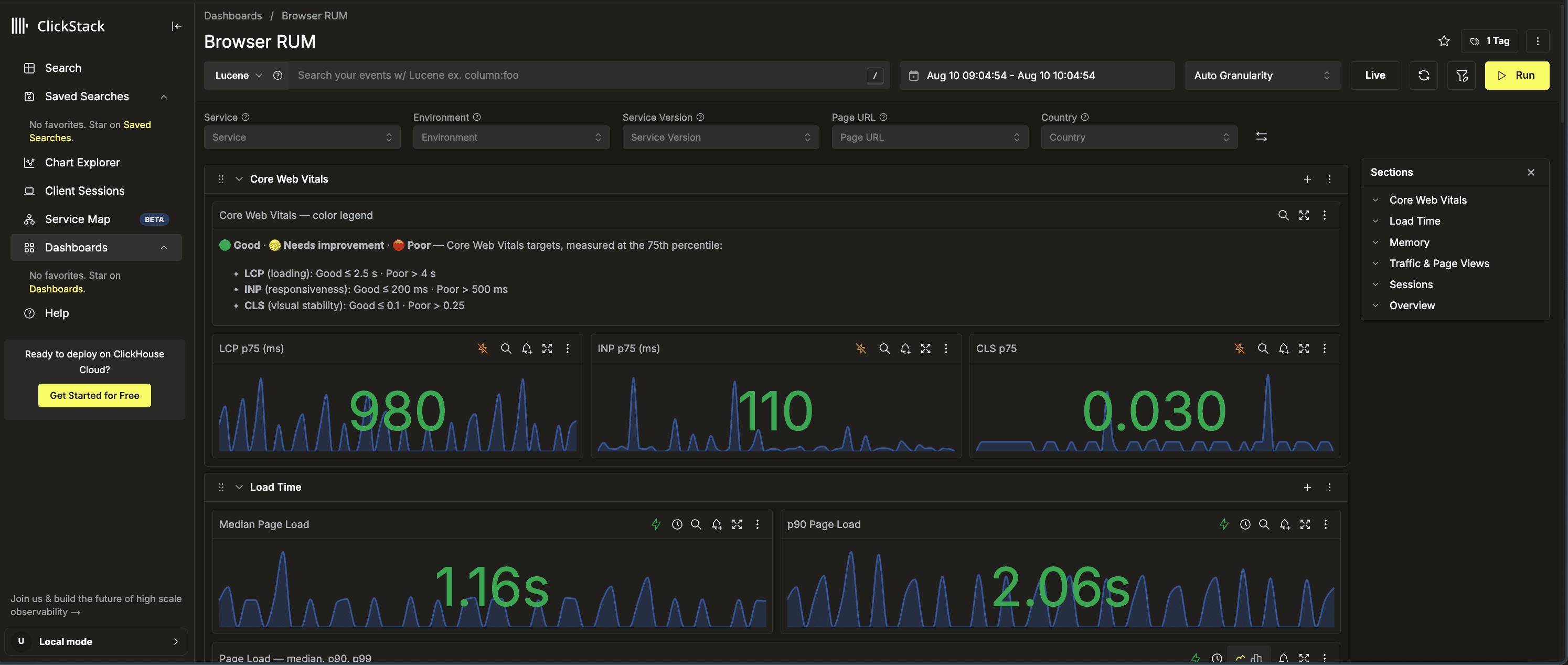
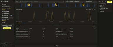
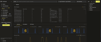
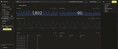
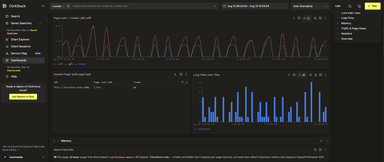
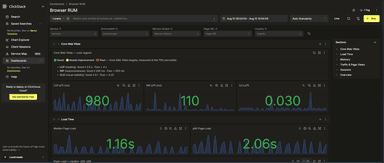
Browser RUM dashboard shipped last month now color-codes tiles by value: Core Web Vitals use Google’s good, needs-improvement, and poor thresholds, page loads use latency bands, and error tiles turn amber when any errors are present, with a legend explaining each threshold. Single-value tiles also include a faint background sparkline for context. A new Sessions section lists recent sessions by rum.sessionId, including page views, errors, distinct traces, user, service, and last-active time, with each row linking to traces filtered for that session. A Memory section adds per-page JavaScript heap tiles from performance.memory.* attributes on documentLoad spans.
External links from table tiles
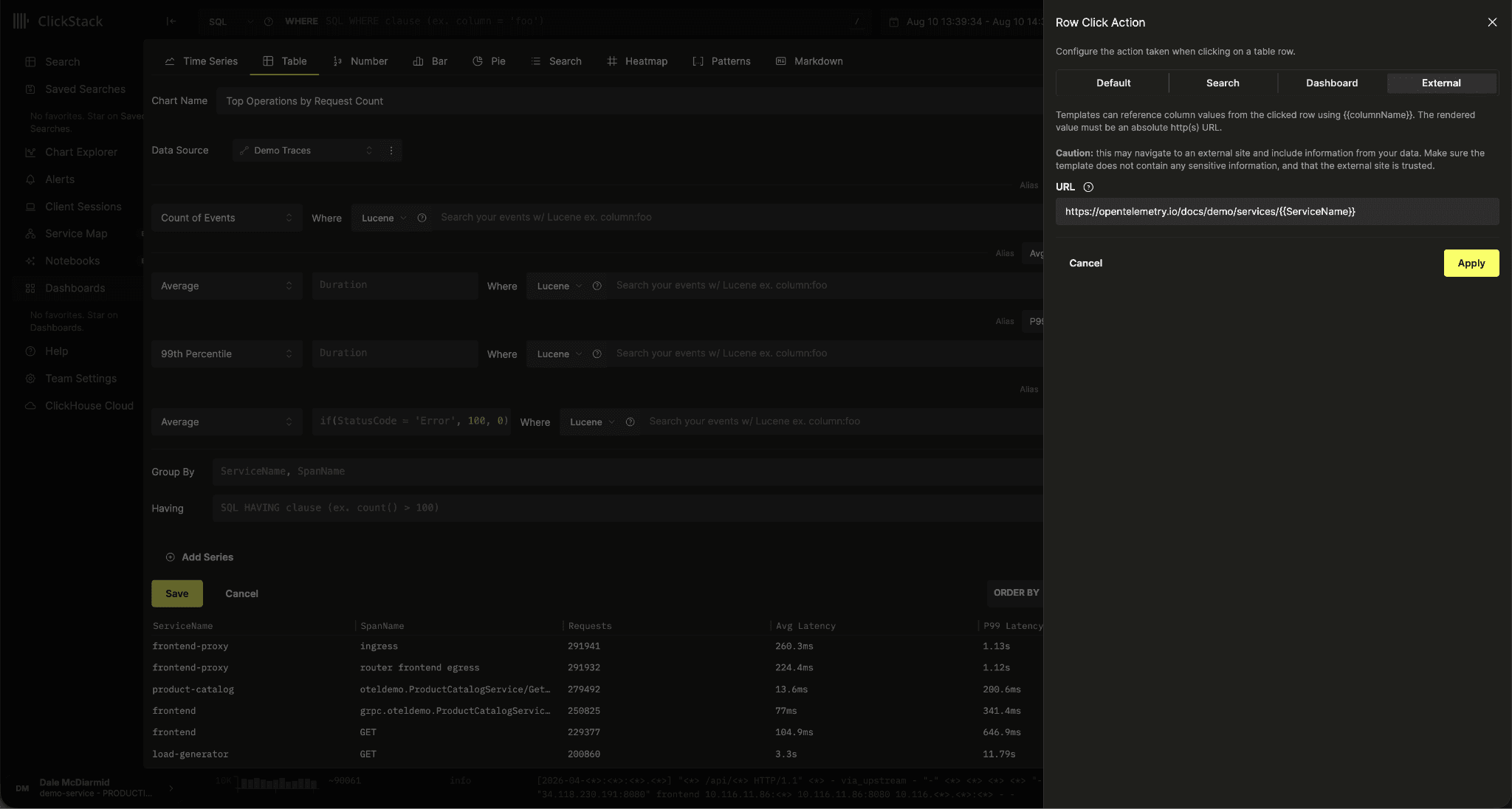
Table tile on-click behavior can now open an external link, extending the dashboard actions we shipped in May. For example, a table of failed deployments can link each row to the relevant CI build, or a service breakdown can link to a runbook.
Snap grid while moving tiles
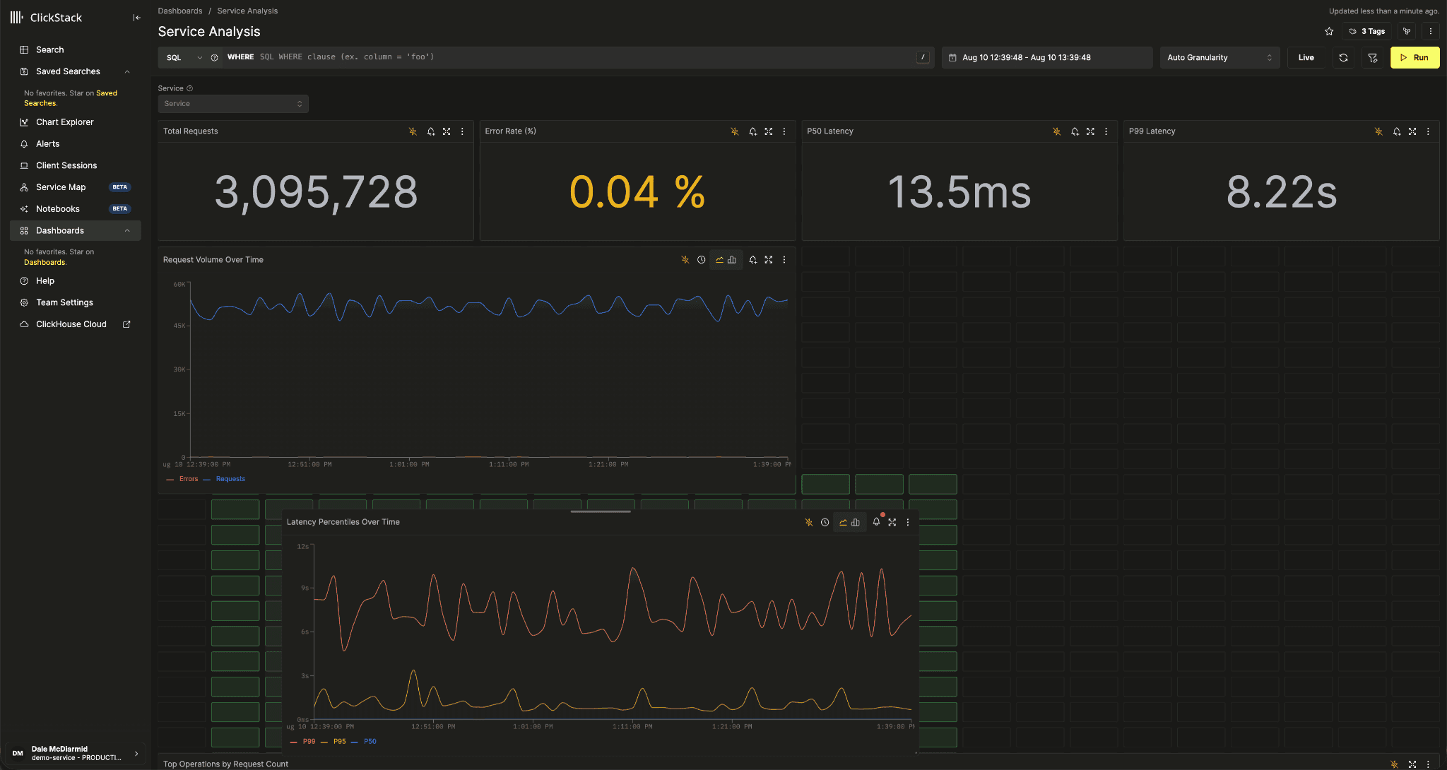
Dragging or resizing a dashboard tile now draws the grid behind the tiles and highlights the cells the tile will actually land in.
Service map color by metric
Following up on improvements with the service map last month, it now includes a metric mode that colors the graph by latency, error rate, or throughput, with a legend explaining the color scale and how node size represents throughput.
Conclusion
June and July brought improvements across ClickStack, from richer trace navigation and broader metrics support to smarter dashboards, alerts, and APIs. Many of these changes came directly from user feedback and contributions and make ClickStack faster, easier to operate, and more flexible for teams adopting it alongside existing observability tools. Try the latest release and as ever please let us know what you'd like to see next!