This blog post is part of a series:
- Visualizing Data with ClickHouse - Part 2 - Superset
- Visualizing Data with ClickHouse - Part 3 - Metabase
Introduction
At ClickHouse, we are passionate about supporting our ecosystem. This includes providing users with the widest possible range of choices when it comes to visualizing data. Each part of this blog series will explore an option for visualizing your data in ClickHouse: Grafana, Superset, and Metabase.
While each of these can be used with almost any type of data inserted into ClickHouse, they each have their respective strengths. We touch on when these might be appropriate, and each demonstrates features we find impressive.
Often a decision on visualization tooling comes down to a specific feature set applicable to your data type or simply a personal preference of your users. While we hope this post assists in any selection process you need to make, we encourage our users to try them! All of these tools are free to use, and trivial to get started with.
This post references datasets from our "Getting Data into ClickHouse" blog series[1][2][3] These datasets are available in our play.clickhouse.com environment in the blogs database. Users should be able to reproduce all examples using the explorer user (no password required).
Grafana
Since originating as a fork of Kibana in 2014, Grafana has grown to be one of the most popular visualization techniques for time series data. The code has long diverged from its Kibana roots, extending its support for datastores, adding new visualizations, and expanding beyond a simple dashboarding tool. While applicable to BI use cases, it predominately focuses on serving the Observability use case, with excellent support for dedicated views for logs and traces.
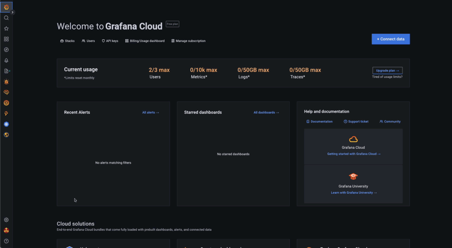
At ClickHouse, we continue to work closely with the Grafana team to invest in the official OSS ClickHouse plugin, allowing users to visualize data in real-time effortlessly. We recently released version 2.x of the Grafana plugin for ClickHouse, which included long-awaited features like JSON and HTTP support. In our examples, we utilize Grafana Cloud, which provides a generous free tier more than sufficient for querying data in our ClickHouse Cloud service. The instructions for installing the official ClickHouse plugin can be found here. These should be identical for self-managed instances.
To connect Grafana to ClickHouse a user is simply required to create a ClickHouse Datasource - effectively an instantiation of the plugin. Users can create multiple data sources: each potentially connecting to a different ClickHouse service or possibly providing access to the same instance with different credentials. We illustrate this process below:
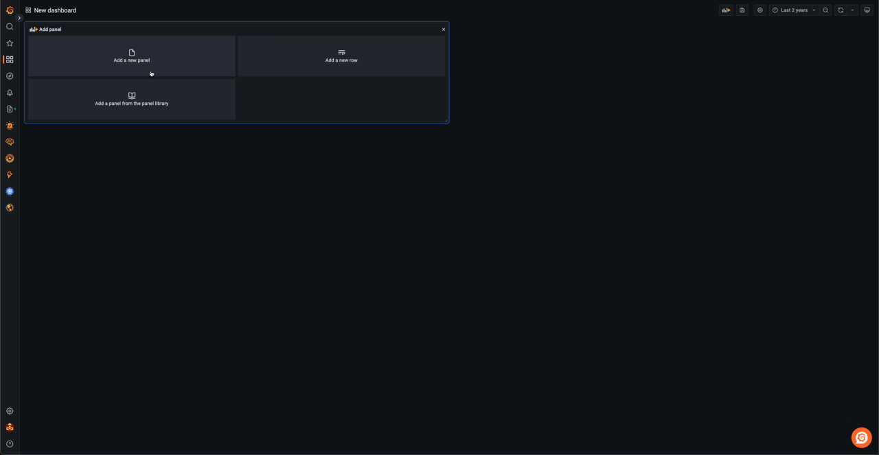
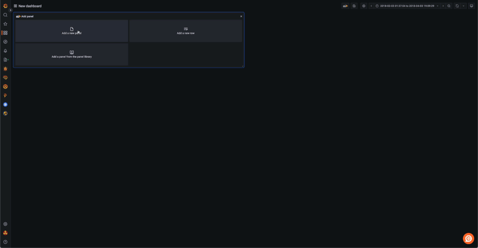
Visualizing data in Grafana requires us to create a dashboard. From here, the user can add a visualization panel and specify that this should use our ClickHouse data source.
When creating a visual, the user is required to be familiar with SQL concepts. However, a visual query builder assists with constructing ClickHouse SQL for most chart types. With Granfana focusing on time-series data, most charts require the user to define a DateTime/Date column along with a numerical value.
In the example below, we use the hacker news dataset from an earlier post, to create a simple bar chart showing ClickHouse activity over time. Notice how we initially use the query builder to get started, before editing the SQL directly to capture posts per month.

SELECT count() as `posts per month`, toStartOfMonth(time) as month FROM default.hackernews WHERE type IN ('comment', 'story') AND (text ILIKE '%ClickHouse%' OR title ILIKE '%ClickHouse%') GROUP BY month ORDER BY month LIMIT 1000✎
Multi-line charts, i.e., those with more than one series, require a string column in addition to the standard Date/DateTime and numeric columns. This string column thus defines the series key. Below we utilize the forex dataset from our previous post, to show the price of various currency pairs where the USD is the base. Note we use a SQL query here with the filter $__timeFilter, which automatically injects our selected time range into the query as a filter - thus allowing us to drill down. We use the argMax function to get the close price each day. Finally, we use SETTINGS max_result_rows = 10000 to allow us to get a larger dataset from play.clickhouse.com.
SELECT toStartOfDay(datetime) as time, quote, argMax(bid,datetime) as close FROM blogs.forex WHERE (base ='EUR') AND quote IN ('GBP', 'USD', 'NZD', 'CAD') AND $__timeFilter(datetime) GROUP BY time, quote ORDER BY time ASC, quote ASC SETTINGS max_result_rows=10000✎
A little more work is required for less standard visualizations, such as heatmap and candlestick. Candlestick visualizations require a value for each time period indicating the open, close (using argMin), low, and high values. This naturally fits our forex dataset, allowing us to visualize how prices change over time.
SELECT toStartOfDay(datetime) as day, argMin(ask, datetime) as open, argMax(ask,datetime) as close, max(ask) as high, min(ask) as low FROM blogs.forex WHERE (base ='EUR') AND quote ='USD' AND $__timeFilter(datetime) GROUP BY day ORDER BY day ASC SETTINGS max_result_rows=10000✎
Heatmaps in Grafana require us to bucket our geo data and provide a numerical value to control the color scale. Our weather dataset, from a previous post, provides us with a simple means to demonstrate this. We use the ClickHouse geoHashEncode function to aggregate on our Point field, finding the max temperature recorded for each grid. These can then be plotted using the GeoMap visualization as a heatmap to show the hottest areas of the United States and Mexico. Note the geographic restriction via the polygon dictionary - a filter optimization explored here.
SELECT geoHash, geohashDecode(geoHash) as lon_lat, max(tempMax)/10 as max_temp FROM blogs.noaa WHERE date > '1970-01-01' and dictGet(blogs.country_polygons, 'name', location) IN ('United States of America', 'Mexico') GROUP BY geohashEncode(location.1, location.2, 3) as geoHash SETTINGS max_result_rows = 100000✎
The above examples focus on datasets from our previous posts. Grafana, however, is typically used for the Observability use case. While a post dedicated to using Grafana with Observability data is justified (coming soon!), here we demonstrate the use of the JSON log data available in play.clickhouse.com to build a simple view in Grafana’s log explorer. We offset this data to the last 24 hrs in order to simplify the visualization. Note we also create a level field from the status code to ensure our logs are categorized and color-coded.
SELECT now() - (toDateTime('1998-05-08 13:44:46') - timestamp) AS log_time, multiIf(message.status > 500, 'critical', message.status > 400, 'error', message.status > 300, 'warning', 'info') AS level, message.request.method AS method, message.status AS status, message.size AS size, message.request AS log FROM blogs.http_logs ORDER BY timestamp DESC LIMIT 10000✎
Conclusion
In this post, we have shown some simple visualization techniques using the Grafana plugin. Next time we will explore Superset and its greater focus on BI use cases.
If you’re enthusiastic about the latest technologies and are passionate about Open Source, we’re currently hiring for our integrations team and would love to hear from you.


