In this post, we continue our series on the visualization of data in Clickhouse by exploring Superset as a popular tool for business users.
This blog post is part of a series:
- Visualizing Data with ClickHouse - Part 1 - Grafana
- Visualizing Data with ClickHouse - Part 3 - Metabase
What is Superset?
Apache Superset is an Apache Open Source visualization tool launched in 2017 as a result of an initiative at AirBnB. With a focus on SQL-based data stores, users are expected to be comfortable writing queries but with assistance from an IDE-like editor. Retaining the concept of dashboards, data analysts and more technical BI users are presented with a rich BI experience and a wide range of visualization types, including tree maps and box plots.
One of Superset's key strengths is its extensibility, allowing developers to create custom visualizations and plugins to meet specific organizational needs. Additionally, Superset supports a variety of data sources, including traditional relational databases, NoSQL databases, and cloud-native data warehouses, making it a versatile choice for organizations with diverse data ecosystems. The platform also emphasizes security and governance, providing features like role-based access control and data source management to ensure data integrity and compliance with organizational policies.
Getting started with Superset and ClickHouse
docker-compose represents the simplest getting started experience for new users of Superset.
First clone the Superset repository:
git clone --depth=1 https://github.com/apache/superset.git
cd supersetPrior to running any docker-compose commands, ensure the official ClickHouse driver will be installed by adding “clickhouse-connect” to the requirements file as shown below. We also add a map box key to enable geo visualizations.
echo "clickhouse-connect" >> ./docker/requirements-local.txt
echo "MAPBOX_API_KEY=" >> docker/.env-non-devNext, let's launch Superset
export TAG=3.1.1
docker compose -f docker-compose-image-tag.yml upFinally, we're going to create our Superset admin and initialize Superset's database:
SUPERSET_ID=$(docker ps -aqf "name=superset_app")docker exec -it ${SUPERSET_ID} superset fab create-admin \
--username admin --firstname Superset --lastname Admin \
--email admin@superset.com --password admin
docker exec -it ${SUPERSET_ID} superset db upgrade
docker exec -it ${SUPERSET_ID} superset initYou can access Superset via http://localhost:8088 and log in using the credentials admin/admin.
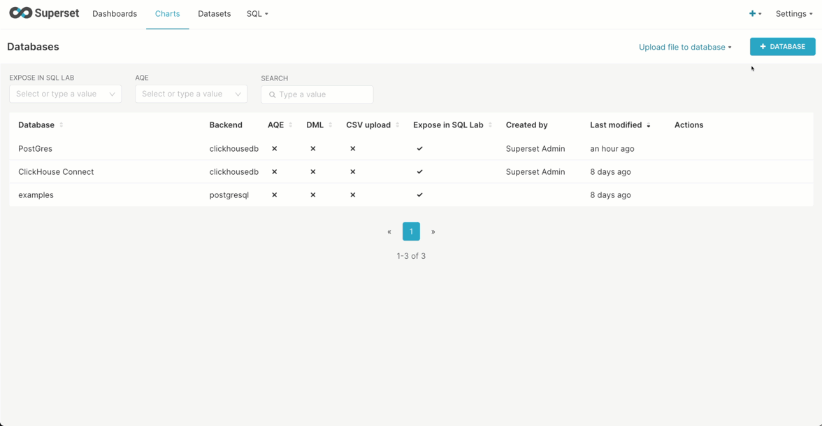
Adding database connection
Once we've logged in, we're going to create a database connection. Below we connect to sql.clickhouse.com to exploit our datasets using the user explorer (no password). Note the use of the HTTP port.
Use the following credentials:
- Host -
sql-clickhouse.clickhouse.com - Port -
443 - User -
demo
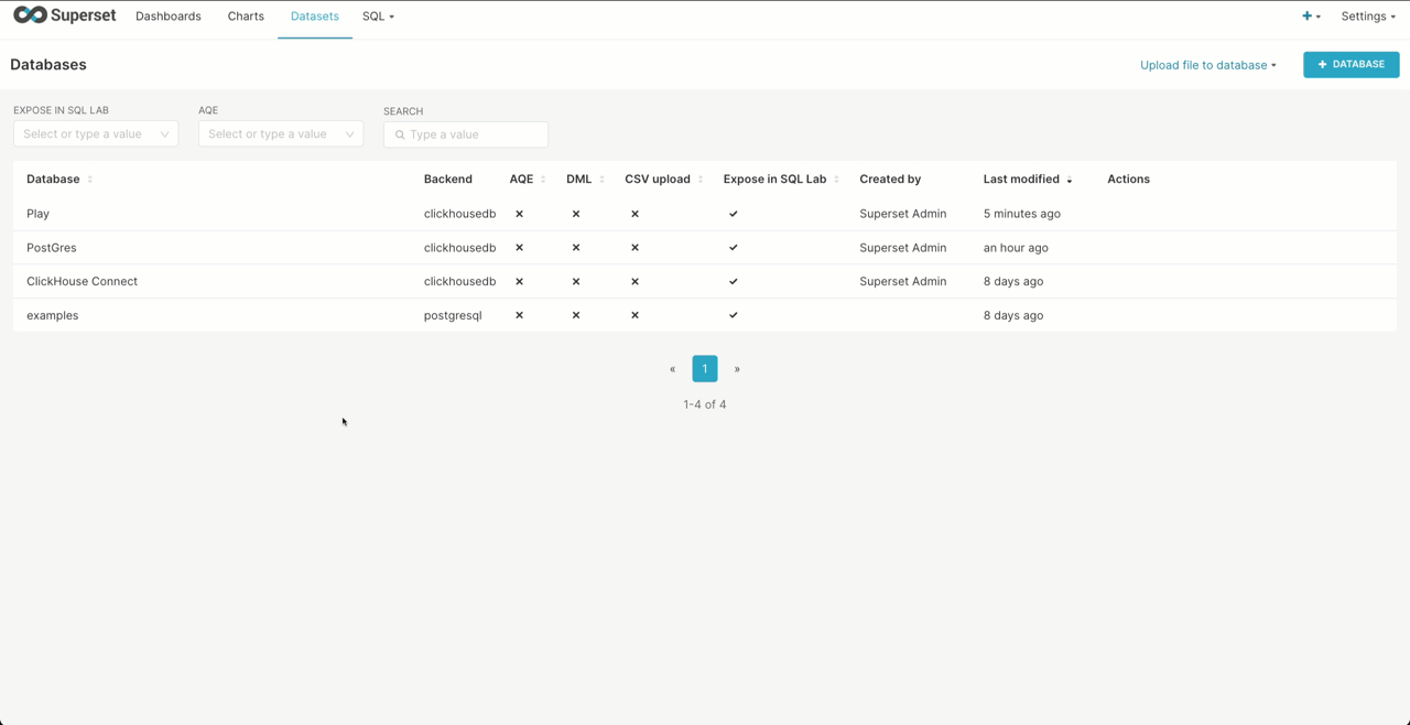
Creating a Superset dataset from a ClickHouse
Superset requires you to create virtual “datasets”. These can either provide a connection to a specific table or capture the results of a query. Below we create a connection to the hackernews table in sql.clickhouse.com, making this available for chart creation.
Note a Schema for ClickHouse is a database.
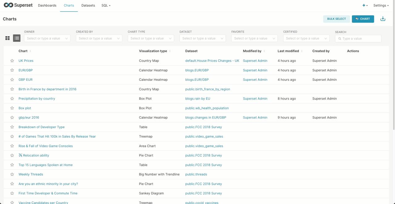
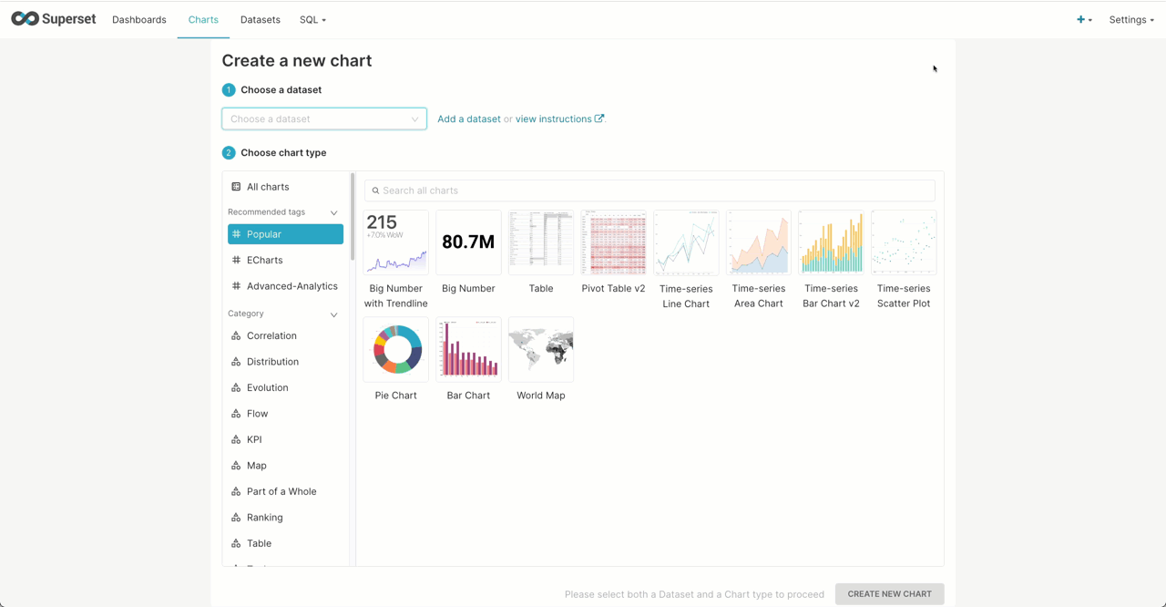
Creating a Superset chart
Once we've configured a dataset, we can create charts based on it.
Recreating the simple line chart visualization from our previous post, showing ClickHouse Hacker News posts over time is shown below:
Using our forex dataset from a previous post, Superset is able to visualize the most commonly traded currency pairs using a treemap. Here we limit to data from the 2020s and assume the reader has created the dataset in Superset using the previous example. Note we use 1/avg(ask-bid) as an estimation of market activity in a currency pair. This computes the inverse of the spread (see our earlier post for the definition), for which a lower value indicates greater liquidity and trading volumes.
Creating a Superset dataset from a SQL query
We can perform a similar analysis of the GBP/EUR but visualize it as a calendar to see those days during which the largest change in price occurred during 2016 - unsurprisingly, the day of the Brexit referendum. This requires us to use the SQL IDE, where the results of a query can be saved as a dataset. This powerful feature allows us to capture more complex logic. This specific query is from our earlier forex post and requires a window function to compute the daily change.
SELECT base, quote, day, close, close - any(close) OVER (PARTITION BY base, quote ORDER BY base ASC, quote ASC, day ASC ROWS BETWEEN 1 PRECEDING AND CURRENT ROW) AS change FROM ( SELECT base, quote, day, argMax(ask, datetime) AS close FROM blogs.forex WHERE (quote = 'GBP') AND (base = 'EUR') AND (datetime > '2016-01-01 00:00:00.000') AND (datetime < '2017-01-01 00:00:00.000') GROUP BY base, quote, toStartOfDay(datetime) AS day ORDER BY base ASC, quote ASC, day ASC ) ORDER BY base ASC, quote ASC, day ASC✎
Although we haven’t explored the UK house price dataset in our blog series, this is often used for example purposes throughout our docs. By using a list of regional codes for the UK (ISO 3166-2) we can identify regions that have seen the largest percentage change in median house prices in the last 20 years. The query here uses some nice aggregate functions, joining our codes and prices, and yet still runs in less than 0.2 secs in our public play environment. The UK has undergone changes in regional codes over the last 25 years, so some houses have no valid value in the current codes - however, this compromises less than one-tenth of a percent and is not meaningful to our analysis.
SELECT code, (anyIf(med_2020, med_2020 > 0) - anyIf(med_2000, med_2000 > 0)) / anyIf(med_2000, med_2000 > 0) AS percent_change FROM ( SELECT code, medianIf(price, year = 2000) AS med_2000, medianIf(price, year = 2020) AS med_2020 FROM ( SELECT date, price, locality, town, district, county, code FROM uk_price_paid LEFT JOIN blogs.uk_codes AS codes ON (uk_price_paid.county = codes.name) OR (uk_price_paid.district = codes.name) OR (uk_price_paid.town = codes.name) OR (uk_price_paid.locality = codes.name) OR (replaceAll(uk_price_paid.district, 'CITY OF ', '') = codes.name) ) WHERE (code != '') AND ((toYear(date) = 2000) OR (toYear(date) = 2020)) GROUP BY code, toYear(date) AS year ORDER BY code ASC ) GROUP BY code ORDER BY percent_change DESC✎
Using the country map we can in turn visualize this.
Superset offers a box plot visualization, effective for showing the distributions of a metric across multiple groups. This allows us to show how precipitation varies per country using the weather dataset explored in a previous post. For this, we need a simple mapping of fips 10-4 codes to country names. Recall that the first 2 digits of the station id for the weather dataset represent a fips country code. Our mapping is this then loaded into a ClickHouse Complex Key Hashed dictionary, using our table as a source, for use in the following query via the dictGet function.
CREATE TABLE blogs.country_codes (
   `name` LowCardinality(String),
   `code` LowCardinality(String)

) ENGINE = MergeTree ORDER BY code

INSERT INTO blogs.country_codes SELECT Name as name, `FIPS 10-4` as code FROM url('https://raw.githubusercontent.com/mysociety/gaze/master/data/fips-10-4-to-iso-country-codes.csv', 'CSVWithNames')

CREATE DICTIONARY blogs.country_iso_codes
(
   `code` String,
   `name` String
)
PRIMARY KEY code
SOURCE(CLICKHOUSE(TABLE 'country_codes' DATABASE 'blogs'))
LIFETIME(MIN 0 MAX 0)
LAYOUT(COMPLEX_KEY_HASHED())
Below we show the dataset being created from a query that computes the average precipitation per year by country. We limit the countries to those in the EU by their FIPS code. This can, in turn, be used to create our box plot.
SELECT year, avg(`precipitation`) AS `avg_precipitation`, dictGet(`blogs`.`country_iso_codes`, 'name', code) as country FROM `blogs`.`noaa_v2` WHERE date > '1970-01-01' AND code IN ('AL', 'AN', 'AU', 'BE', 'BO', 'CY', 'DA', 'EI', 'EZ', 'EN', 'FI', 'FR', 'GG', 'GI', 'GK', 'GM', 'GR', 'HR', 'HU', 'IC', 'IM', 'IT', 'JE', 'LG', 'LH', 'LO', 'LS', 'LU', 'MD', 'MK', 'MN', 'MT', 'NL', 'NO', 'PL', 'PO', 'RO', 'SI', 'SM', 'SP', 'SW', 'SZ', 'TU', 'UK', 'UP', 'VT') GROUP BY toStartOfYear(`date`) AS `year`, substring(station_id, 1, 2) as code HAVING avg_precipitation > 0 ORDER BY country, year ASC LIMIT 100000✎
As well as offering your usual numerical analysis charts, Superset allows some simple text analysis with a word cloud. Focusing on the Hacker News dataset from our earlier post, we can use the tokenization and array functions to identify the top N 2-term phrases (shingles).
WITH stop_words AS ( SELECT token FROM blogs.stop_words ) SELECT phrase, count() AS c FROM ( SELECT arrayJoin(shingles) AS shingle, concat(shingle.1, ' ', shingle.2) AS phrase FROM ( SELECT tokens, arrayFilter(t -> (NOT ((t.2) IS NULL)), arrayZip(tokens, arrayPushBack(arrayPopFront(tokens), NULL))) AS shingles FROM ( SELECT arrayFilter(t -> ((t NOT IN (stop_words)) AND (length(t) > 2)), alphaTokens(title)) AS tokens FROM default.hackernews WHERE (type IN ('story', 'comment')) ) WHERE length(tokens) > 0 ) ) GROUP BY phrase ORDER BY c DESC LIMIT 20✎
Note how we exclude phrases containing stop words. This obviously is a crude means of identifying top phrases and statistical based techniques would like yield more interesting results!
Finally, like Grafana, Superset offers the ability to combine chart types. Below we explore a more classical visualization mixing line and bar charts to show the value of the GBP/USD and USD/EUR currency pairs against their spread. Note how we use multiple axes and add a moving average of the spread over the previous 10 data points.
Creating a Superset dashboard
Once you're happy with your chart, you can save it and optionally add it to an existing dashboard or create a new dashboard, as shown in the screenshot below.

You can then go directly to the dashboard, or find it via the Dashboards link on the top navigation bar.
Below is an example of a Hacker News dashboard that we created with a couple of charts:

To publish a dashboard so that other people can view it, click on the 'Draft' button, which will then change to 'Published'
Conclusion
In this post, we have explored using some of the unique visualization capabilities of Superset and its ability to be highly useful to both technical and business users. In the next post, we will demonstrate how Metabase targets a simpler experience for rapid data investigation.
If you’re enthusiastic about the latest technologies and are passionate about Open Source, we’re currently hiring for our integrations team and would love to hear from you.