Traditional BI assumes a dashboard is the destination. Most often, the destination is a conversation. This post continues the series on creating a chat‑native BI layer inside Slack using ClickHouse + MCP:
* Answers analytical questions in a Slack thread by querying ClickHouse via MCP.
* Generates visualizations from returned data and adds them to the Slack thread.
* Uses MCP tools to push query execution, semantic context, and guardrails closer to the data.
* Is simple enough to fork, run, and adapt to your own stack in an afternoon.
Dashboards carry hidden tax: handovers between the person with the question and the BI team, the overhead of learning a new BI tool if you want to self‑serve, granting and managing secure access, or falling back to writing SQL when you really just need a quick check. A chat‑native BI layer collapses that tax:
- Ask in natural language. “How did signups trend last 90 days by channel?”
- Let AI do the heavy lifting. The agent generates SQL through MCP tools, so you don’t need to learn the syntax yourself.
- Run it where the data lives. Queries execute directly in ClickHouse - no ETL hops, just fast results.
- See the answer, trust the path. You get both a visualization and the exact SQL, so if the analysis is valuable, you can turn it into a KPI or dashboard later.
We’re not replacing BI; we’re right‑sizing it. Dashboards remain for curated KPIs. Chat picks up the fluid, investigative 80%.
What’s new since the last post #
In the first version of our Slack BI agent, the agent responded with a table or a short textual summary. In this iteration, we added visualization capability:
- The LLM generates a vega-lite visualisation spec (JSON)
- The Python bot renders the chart from the spec using vega-altair and attaches an image to the Slack message
This small addition changes the feel entirely - threads become lightweight, shareable mini‑reports.
A straightforward solution #
We added visualization in about 50 lines of code. The approach is simple:
- The system prompt instructs the LLM to generate a vega-lite compatible spec if a visualisation was requested by the user
- If a spec is present in the LLMs output, create the visualisation with vega-altair
- Render the chart as a PNG and upload the image to the Slack thread
The system prompt now looks like:
Available capabilities:
1) ClickHouse tools to explore databases, tables, and execute SQL queries
2) Chart generation by providing Vega-Lite specifications

When users ask for data analysis with visualizations:
1. First query the database using available tools
2. If a visualization would be helpful, create a Vega-Lite chart specification
3. Format your Vega-Lite spec as JSON within ```json blocks
4. Choose appropriate chart types: bar charts for categories, line charts for time series, scatter for correlations, pie for proportions

Example Vega-Lite specification format:
```json
{
  "$schema": "https://vega.github.io/schema/vega-lite/v5.json",
  "title": "Chart Title",
  "data": {"values": [{"category": "A", "value": 100}, {"category": "B", "value": 200}]},
  "mark": "bar",
  "encoding": {
    "x": {"field": "category", "type": "nominal"},
    "y": {"field": "value", "type": "quantitative"}
  }
}
And to turn a returned spec into a visualisation:
async def render_and_upload_chart(client, channel, thread_ts, vega_lite_spec, title="Chart"):
    """Render Vega-Lite spec to PNG and upload to Slack"""
    try:
        # Parse the Vega-Lite specification
        if isinstance(vega_lite_spec, str):
            spec = json.loads(vega_lite_spec)
        else:
            spec = vega_lite_spec

        # Render to PNG using vl-convert
        png_data = vlc.vegalite_to_png(spec)

        # Create temporary file
        with tempfile.NamedTemporaryFile(suffix='.png', delete=False) as tmp_file:
            tmp_file.write(png_data)
            tmp_file.flush()

            # Upload file to Slack
            response = await client.files_upload_v2(
                channel=channel,
                file=tmp_file.name,
                title=title,
                thread_ts=thread_ts
            )

        # Clean up temp file
        os.unlink(tmp_file.name)
        return response

    except Exception as e:
        logging.error(f"Error rendering and uploading chart: {e}")
        return None
No visualization servers. No complex rendering pipeline. Just using the LLM's understanding of both the data and Vega-Lite to create appropriate charts on demand.
What this looks like in practice #
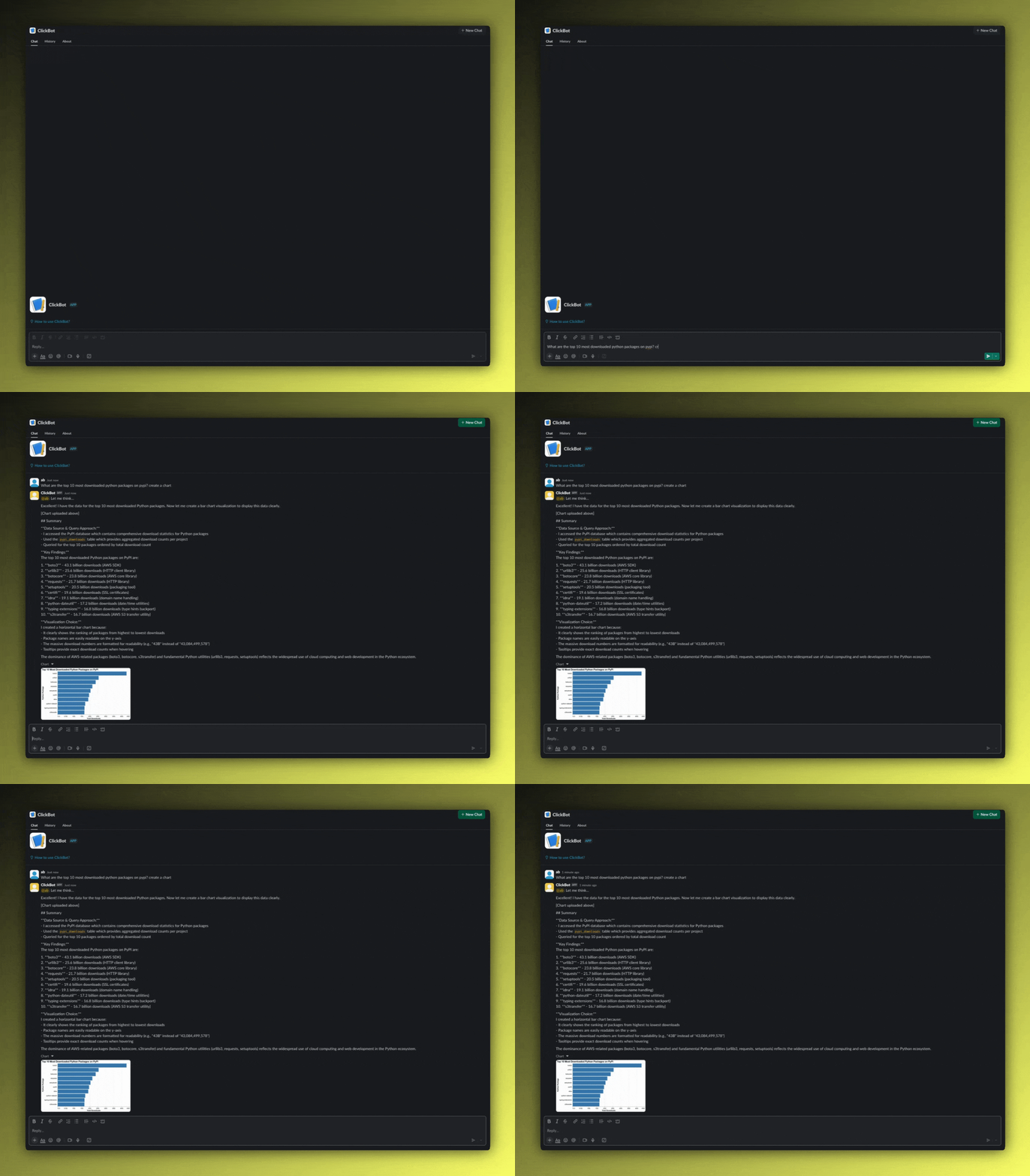
Here's a typical interaction:
User:
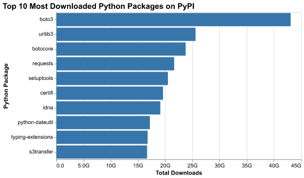
"What are the top 10 most downloaded python packages on pypi? create a chart"
Bot:
"Key Findings:
The top 10 most downloaded Python packages on PyPI are. boto3 - 43.1 billion downloads (AWS SDK)
-
urllib3 - 25.6 billion downloads (HTTP client library)
-
botocore - 23.8 billion downloads (AWS core library)
-
requests - 21.7 billion downloads (HTTP library)
-
setuptools - 20.5 billion downloads (packaging tool)
-
certifi - 19.6 billion downloads (SSL certificates)
-
idna - 19.1 billion downloads (domain name handling)
-
python-dateutil - 17.2 billion downloads (date/time utilities)
-
typing-extensions - 16.8 billion downloads (type hints backport)
-
s3transfer - 16.7 billion downloads (AWS S3 transfer utility)"

The chart appears inline in the Slack thread. No new tabs, no context switching. The visualization and interpretation are right where the question was asked.

Prompting strategy for charts #
When a user asks a question, we prompt the model with:
- The pre-set system prompt
- The natural‑language question from the user
The system prompt contains instructions for how the LLM should behave, and what it should produce. Including:
- Instructions to include the final SQL and a preview of the result rows.
- A style guide (e.g., prefer lines for time series, bars for discrete categories)
The vega spec for the conversation shown above looks something like this:
{
  "$schema": "https://vega.github.io/schema/vega-lite/v5.json",
  "title": {
    "text": "Top 10 Most Downloaded Python Packages on PyPI",
    "fontSize": 16,
    "fontWeight": "bold"
  },
  "data": {
    "values": [
      {
        "package": "boto3",
        "downloads": 43084499578,
        "downloads_formatted": "43.1B"
      },
      {
        "package": "urllib3",
        "downloads": 25600943735,
        "downloads_formatted": "25.6B"
      },
...
    ]
  },
  "mark": {
    "type": "bar",
    "color": "#1f77b4",
    "tooltip": true
  },
  "encoding": {
    "y": {
      "field": "package",
      "type": "nominal",
      "sort": "-x",
      "axis": {
        "title": "Package Name",
        "labelFontSize": 11
      }
    },
    "x": {
      "field": "downloads",
      "type": "quantitative",
      "axis": {
        "title": "Total Downloads",
        "format": ".2s"
      }
    },
  },
  ...
  "width": 500,
  "height": 300
}
LLMs turn out to be quite good at generating Vega-Lite specifications. They can:
- Match chart types to data patterns (time series → line chart, categories → bar chart)
- Set reasonable scales and formatting
- Add helpful touches like rotated labels or formatted axes
Slack UX details that matter #
When designing the Slack experience, small details make the difference between a gimmick and a tool your team actually uses. The agent is structured so that every answer feels like a complete mini-report:
- One message, three artifacts: summary → chart image → SQL block.
- Thread-native: follow-ups inherit context (same table, filters, window) unless the user says otherwise.
- Flexible surfaces: you can chat with the bot in public threads by tagging it, or work privately in direct messages if the analysis is sensitive.
Why ClickHouse is a great brain for chat BI #
Behind the scenes, performance and flexibility matter. ClickHouse provides a natural foundation for this type of chat-native analytics:
- Speed at scale: columnar engine with vectorized execution makes the agent feel instant.
- SQL-first: easy to trace, review, and cache.
- Time-series native: materialized views + aggregations make “what changed?” a 1-liner.
Why MCP is the glue #
Finally, the MCP layer is what keeps the agent robust, portable, and trustworthy. It defines what the model can do and how it does it:
- Explicit capability boundaries. Tools expose exactly what the model may do.
- Portability. The same agent code can sit behind Slack, a web UI, or any other surface without changing the data brain.
- Extensibility. You can add more MCP servers to let the agent talk to additional data sources or tools.
Compared to classic BI #
| Concern | Classic BI | Chat‑Native BI (this approach) |
|---|---|---|
| Curated KPIs | Excellent | Fine (defer to dashboards) |
| Exploratory Q&A | Slower (new tiles) | Instant (ask in thread) |
| Reuse | Dashboards | Thread history + re‑prompt |
| Explainability | Varies | SQL + spec posted |
| Simplicity | Learning curve to build charts, or SQL knowledge | Just natural language chat |
Takeaway: It’s not either/or. Use dashboards for executive reporting; use chat for the investigative loop.
The tradeoffs #
Let's be realistic about what this doesn't do:
Complex visualizations: You won't get interactive 3D scatter plots or sophisticated statistical visualizations. For most ad-hoc questions in Slack, you don't need them.
Noisy visualisations: The LLM is formatting a JSON spec to create the visualisation, so the data to plot is being loaded into its context window. Visualizing many thousands of points isn't practical.
Pixel-Perfect Design: The charts are clean and functional, but they won't match your brand guidelines or win design awards. That's fine for internal analytics.
Caching: Every request generates a new query and visualization. While ClickHouse will help with query and result caching, for frequently-accessed metrics, a traditional dashboard might be more efficient.
The bigger picture #
This isn't about replacing all BI tools. Dashboards, especially for operational monitoring and executive reporting, serve important purposes. But a lot of analytical work is exploratory and conversational. It happens in Slack threads, during stand-ups, while debugging issues.
For these use cases, the ability to generate visualizations on-demand, right where the conversation is happening, removes friction. It's not revolutionary - it's just practical.
Try it yourself #
The code is available on GitHub. With your own ClickHouse instance (or using our public playground), you can have this running in a few minutes:
- Clone the repository
- Configure your Slack bot and API keys
- Run the bot:
uv run main.py
Start with simple questions and iterate from there. You might be surprised how much analytical ground you can cover without leaving Slack.
If you're experimenting with similar ideas or have thoughts on how to improve this approach, we'd love to hear from you in our community Slack or on GitHub.


