They say a picture is worth a thousand words, so does that mean one data visualization is worth a thousand rows?
Data visualizations are to raw data as images are to prose - they can often tell the story of a query result much better than any table of data or stream of JSON ever could. Real-time data visualization adds a real-time element to these visualizations. We want these visualizations to use fresh data and be updated regularly as new data appears.
This guide will explore real-time data visualization, learn why it’s essential, and see some examples in action.
Real-time data visualization needs real-time analytics #
We want to get insights as soon as the data is available. If I upload a video to YouTube, I want to know if anyone’s watching it and for how long they’re watching as soon as possible. I don’t want to wait until tomorrow when the batch job runs and populates the analytics database.
Real-time data visualization goes hand in hand with real-time analytics. We can’t generate real-time visualizations if we don’t have the infrastructure to ingest streaming data quickly, serve queries on it with low latency, and do so at scale.
Without speedy ingestion, our visualizations are based on stale data. Without low-latency queries, dashboards take too long to load and update, and without scale, we can’t have as many visualizations as we’d like on our dashboards.
None of these scenarios are helpful for timely decision-making.
Benefits of real-time data visualization #
The benefits of real-time data visualization are similar to those of real-time analytics. Let’s go through some of them and some examples of how these benefits might play out.
Faster decision-making #
We can now react quickly to changing situations and make decisions based on up-to-date information.
For example, imagine that we’re running an online clothing store with an unexpected demand for a summer dress. Seeing this in real-time allows the operations manager to check stock numbers and place an order with the supplier to ensure that demand is satisfied. Or perhaps they could introduce a flash promotion for accessories that go well with the dress to take advantage of the sudden interest.
Using real-time data to adapt the user experience quickly makes you more likely to engage customers, increase sales, and improve overall satisfaction with your e-commerce platform.
Improved customer experience #
Organizations can use real-time data to instantly personalize user experiences and react to trends. By leveraging real-time dashboards, organizations can spot and act on trends as they happen, creating timely and relevant user experiences.
For example, imagine we’re the concierge at an upscale hotel in a popular tourist area. Our dashboard shows a spike in check-ins on one chart but unusually low wait times for the city’s most famous museum. Based on this insight, we could greet guests as they check-in, inform them about the short wait times, and offer to reserve museum tickets. We could even arrange for the hotel’s shuttle service to make an extra trip to the museum.
By using real-time data to inform your interactions with guests, we can provide a service that feels personal, timely, and valuable. This can lead to higher guest satisfaction, positive reviews, and increased loyalty to your hotel.
Early problem detection #
Real-time data visualization serves as an early warning system, allowing us to identify issues or anomalies as soon as they emerge. This proactive approach enables us to address potential problems before they escalate into significant concerns.
For example, imagine our e-commerce platform's real-time dashboard suddenly shows a spike in cart abandonment rates. Upon investigation, we discover that a recent website update has caused the checkout process to slow down significantly on Android phones. By catching this issue early through our real-time visualizations, we can quickly roll back the problematic update or implement a fix, minimizing lost sales and maintaining a smooth customer shopping experience.
Using real-time data visualization can help detect and resolve issues quickly, preventing potential revenue loss and maintaining customer satisfaction
Examples of real-time data visualization #
Let’s look at some uses of real-time data visualizations.
CommonRoom #
CommonRoom is a software platform or tool designed to help companies, particularly tech companies, manage and optimize their developer relations and community engagement efforts.
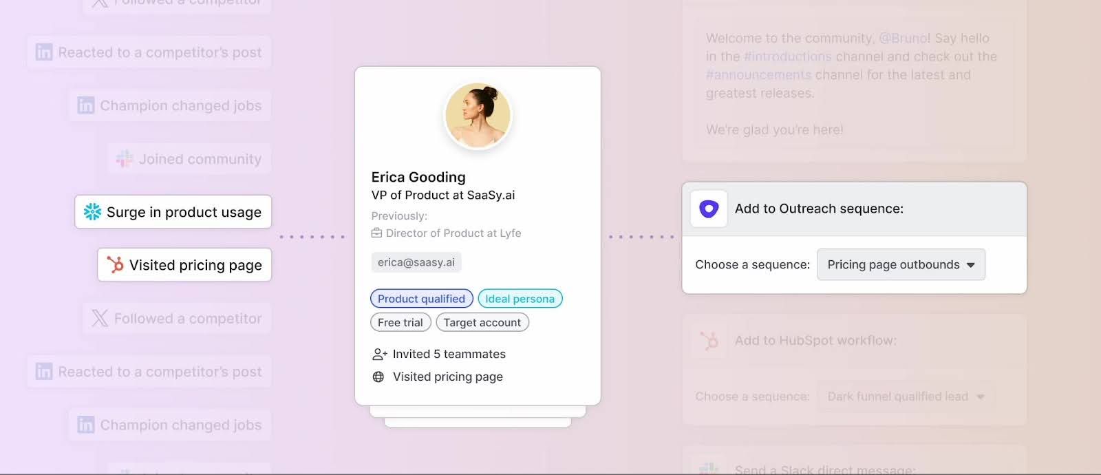
The CommonRoom app contains various real-time dashboards and visualizations that allow organizations to manage their communities. They recently added ClickHouse to their architecture to act as a fast search engine on top of data ingested from multiple sources, such as Marketo, Salesforce, LinkedIn, Slack, and more.
An example of a page in CommonRoom is shown below:
adsb.exposed #
ADS-B (Automatic Dependent Surveillance-Broadcast) is a radio protocol that broadcasts various flight data. ClickHouse co-founder and CTO Alexey Milovidov has built an interactive visualization and analytics tool based on this data.
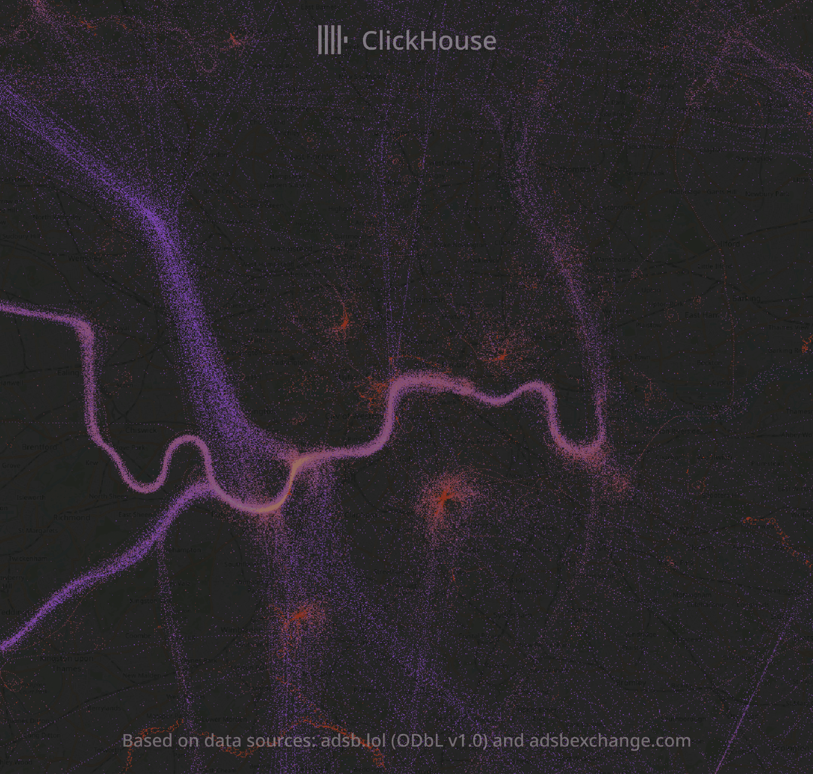
adsb.exposed aggregates and visualizes massive amounts of air traffic data. The data is hosted in a ClickHouse database and queried on the fly. You can tune the visualizations with custom SQL queries and drill down from 50 billion records to individual data records.
Below is an example visualization from the application showing helicopters flying over the River Thames in London:
CryptoHouse #
CryptoHouse is a platform powered by ClickHouse that offers free blockchain analytics. CryptoHouse provides real-time analytics, making instant query responses accessible to everyone.
Users can utilize SQL to query continuously updated data, courtesy of Goldsky. In addition to viewing results in table format, users can also generate charts. Below is an example of a chart that shows the number of Solana transactions, grouped by day and status:

Juspay #
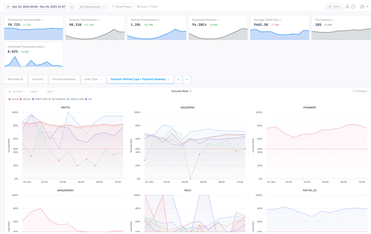
Juspay is an Indian fintech company that uses ClickHouse to power A/B testing and monitoring for its end-to-end payment solutions and real-time merchant dashboards.
For monitoring and A/B testing, they use a combination of Kafka, ClickHouse, and Grafana. They monitor active logs and perform transformations in Kafka, before transferring data to ClickHouse. You can see an example of one of their Grafana dashboards below:

They also provide real-time dashboards to their merchants so that they can track their transactions and monitor their success or failure in real time. An example of one such dashboard is shown below:
Real-time data visualization architecture #
The data used in real-time data visualizations will start their life on a streaming data platform like Apache Kafka or Redpanda. That data might be transformed or augmented by a stream processor before being transported to a real-time database.
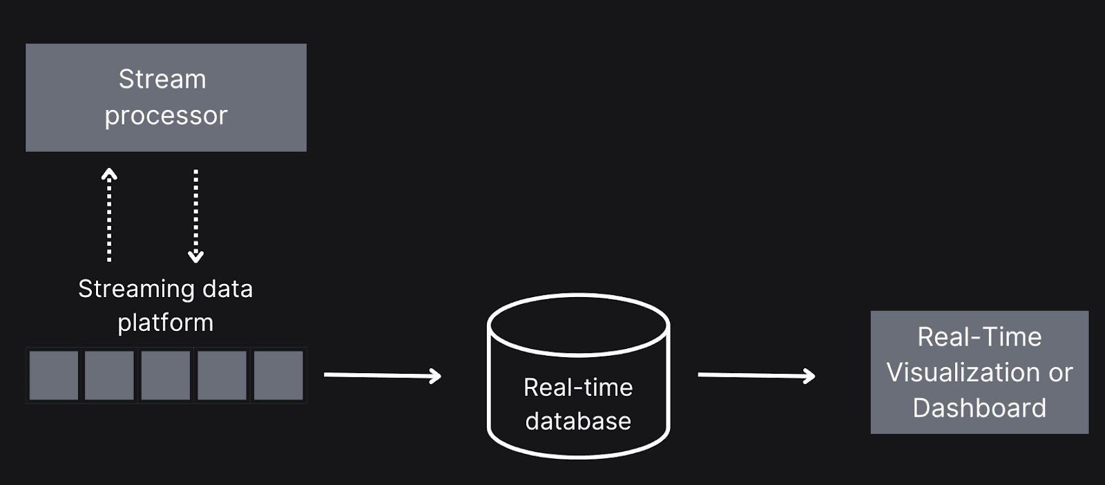
Now that the data’s in the database, how does it get to the visualization? That’s what we’ll learn about in the next section
Connecting databases to visualization tools #
At a high level, there are two approaches to getting data from a database to a dashboard or visualization tool: push-based and pull-based.
Push-based data transfer #
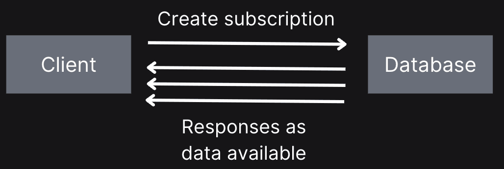
Push-based means that as data arrives in our real-time analytics system, it’s sent to the visualization tool - it doesn’t need to do anything to get the data. Web sockets and server-side events are the most popular technologies for this technique.
With both of these technologies, you create a subscription from the client and receive new events as they become available. These events can then be included in the visualization.
ClickHouse doesn’t currently support this approach.
Pull-based data transfer #
Conversely, pull-based means polling a server for data, usually on a fixed interval. For example, we might ask for new data every second, so we’d call an API or send a query to execute every tick. We’d use an HTTP client or programming language client for this technique.

This was traditionally done using APIs like JDBC if you used Java and ODBC for other programming languages. Indeed, many analytics platforms still require you to use one of these APIs to connect to your database.
As Python has grown in popularity, SQLAlchemy emerged as an alternative API. SQLAlchemy provides a high-level ORM (object-relational mapper) for mapping Python classes to database tables and the ability to execute SQL queries.
Tools and technologies #
Let’s now look at some tools we can use to build real-time data visualizations and dashboards. We’ll assume that ClickHouse is being used to serve the data to these tools!
This is a very fast-moving space, so while we’ll cover the latest tools at the time of writing, new ones may be created by the time you read this!
Analytics platforms #
The first category is what we’ll call analytics platforms. These tools are all-in-one solutions that let you create multiple dashboards with a wide selection of supported visualizations. They will generally have connectors to popular analytical databases.
- Omni Analytics lets companies quickly embed analytics into their products. It offers a modern architecture that combines in-database and in-memory processing with intelligent caching for fast results. They provide customizable visualizations and extensible components so that companies can create branded data experiences. Omni has connectors to many popular databases, including ClickHouse.
- Apache Superset is an open-source data exploration and visualization platform. It is designed to be fast, intuitive, and loaded with options, making it user-friendly for individuals with varying levels of expertise to analyze and visualize their data. It can connect to any SQL-based database, including ClickHouse and ClickHouse Cloud. We use Superset internally at ClickHouse to visualize data in our data warehouse.
- Looker, developed by Google, is a business intelligence (BI) platform and embedded analytics tool that lets users build custom data applications. Looker has a universal semantic modeling layer to make data more accessible. It also makes it easy to embed dashboards in your applications. You can use Looker with ClickHouse, but it has some limitations on how it handles ClickHouse’s data types.
- Metabase is an open-source business intelligence platform whose big selling point is its ease of use. It provides a user-friendly visual query builder and supports connectivity to over 20 data sources, including those from Amazon and Google. Metabase is lauded for its intuitive interface, which allows even non-technical users to explore data and create reports independently. ClickHouse is a supported data source in Metabase.
- Salesforce-owned Tableau is a visual analytics platform that allows users to explore and analyze data from various sources. It offers a suite of products, including Tableau Desktop, Tableau Server, Tableau Public, and Tableau Reader, with capabilities ranging from data preparation to visual storytelling and collaboration. Tableau has a connector for ClickHouse.
Low-code tools #
This category emerged in the late 2010s, making it easy for data scientists to share their work. These tools let you write Python code, which is then turned into an interactive web application.
- Streamlit makes creating and sharing web apps for machine learning and data science projects easy. Users can create interactive dashboards and data visualizations with just a few lines of Python code and publish them to Streamlit Cloud.
- FastHTML is a web framework designed to develop scalable interactive web applications while maintaining a direct correlation to HTML and HTTP concepts.
- Mesop originated from Google and was designed for users building AI web applications. It offers a declarative approach to UI design, a range of pre-built components, and streamlined deployment options, enabling developers to focus on AI logic rather than frontend complexities.
- Gradio enables users to quickly create and share interactive machine-learning demos through user-friendly web interfaces. Gradio apps can be served as web pages or embedded into Python notebooks. Gradio also offers permanent hosting options through Hugging Face Spaces.
Python Visualization libraries #
Low-code tools provide the container for real-time dashboards, but we’ll need to use a visualization library to actually visualize the data. The Python ecosystem has many such libraries, so we’ll focus on a few of our favorites.
- plotly is an interactive, open-source, and browser-based graphing library. It ships with over 30 chart types, including scientific charts, 3D graphs, statistical charts, SVG maps, financial charts, and more.
- Vega-Altair is a declarative visualization library built on the Vega-lite grammar and has a reasonably simple API.
- Bokeh lets users create interactive visualizations for modern web browsers. It helps you create anything from simple plots to complex dashboards with streaming datasets.
We also want to give a special shout-out to Perspective, a library we recently discovered. It’s designed for large streaming datasets, making it a perfect choice for real-time data visualization.
JavaScript Visualization libraries #
There are also a variety of visualization libraries available if you’re creating front-end applications using JavaScript. Below are some of our favorites:
- Apache Echarts is an open-source JavaScript visualization library optimized for both web and mobile. It’s compatible with most modern web browsers, including IE9/10/11, Chrome, Firefox, and Safari.
- Tremor provides a set of open-source, accessible components for dashboards and charts. It’s designed for React v18.2.0+ and requires Tailwind CSS v3.4+.
- plotly is an interactive, open-source, and browser-based graphing library. It ships with over 30 chart types, including scientific charts, 3D graphs, statistical charts, SVG maps, financial charts, and more. It’s also available for Python users.