Monitoring ClickHouse can feel scattered, especially when jumping between system tables and ad hoc queries. In a previous blog post, the ClickHouse Support team provided some “essential monitoring queries” to help users monitor their ClickHouse instance using ClickHouse’s powerful system tables. In this post, we’ll turn those essential queries from our earlier blog into a centralized, reusable dashboard in ClickHouse Cloud, giving you real-time visibility in just a few clicks.
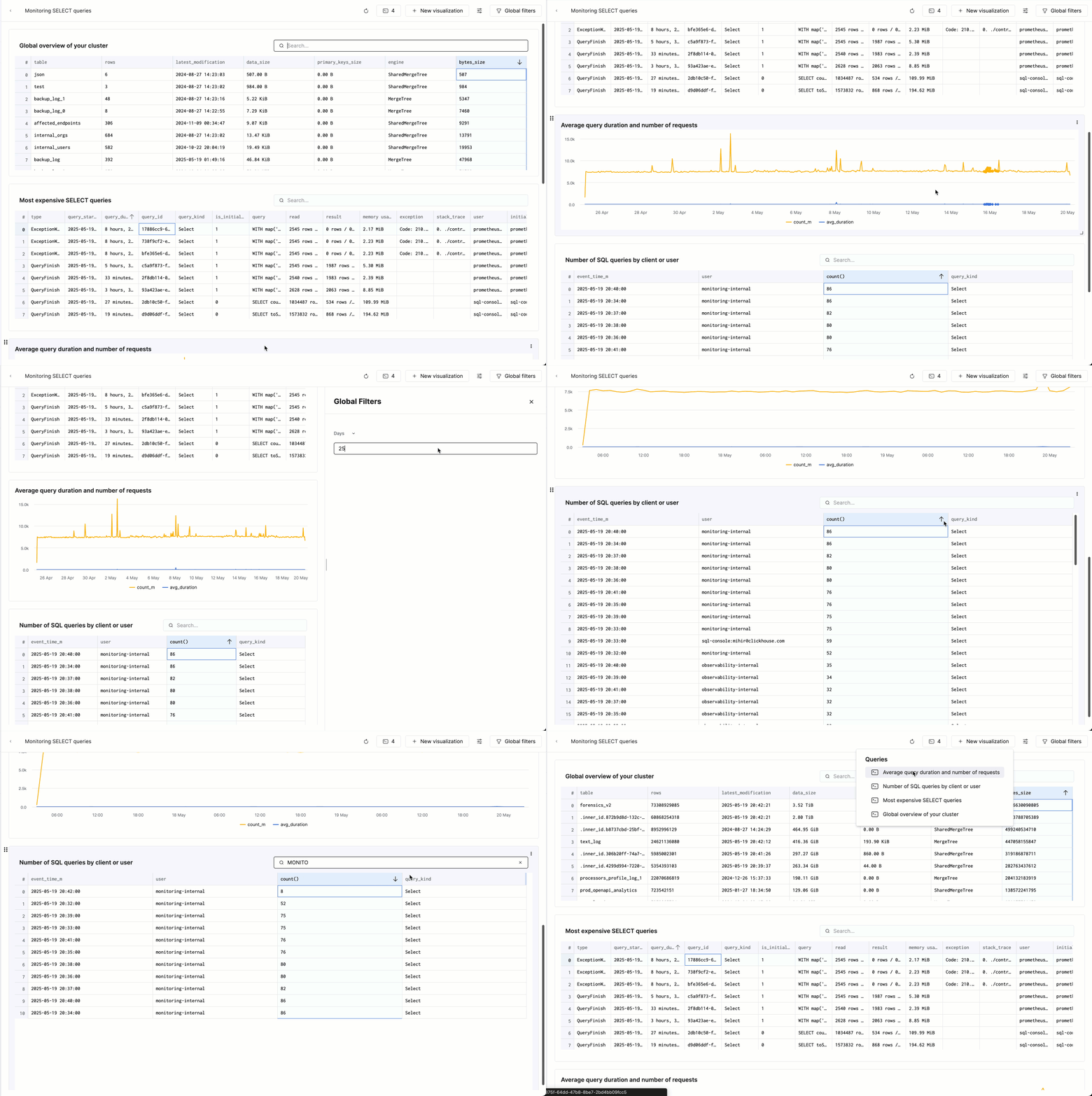
Here’s the end result of what we’ll create:
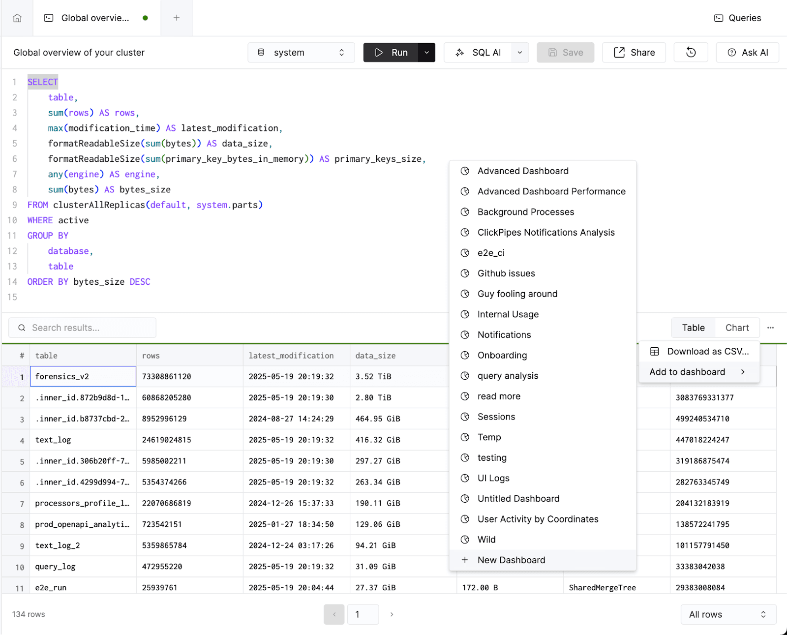
We’ll start by running a query on system.parts to provide a global overview of my cluster. Specifically, it shows the biggest tables in terms of rows, data and primary key size:
1SELECT
2    table,
3    sum(rows) AS rows,
4    max(modification_time) AS latest_modification,
5    formatReadableSize(sum(bytes)) AS data_size,
6    formatReadableSize(sum(primary_key_bytes_in_memory)) AS primary_keys_size,
7    any(engine) AS engine,
8    sum(bytes) AS bytes_size
9FROM clusterAllReplicas(default, system.parts)
10WHERE active
11GROUP BY
12    database,
13    table
14ORDER BY bytes_size DESC
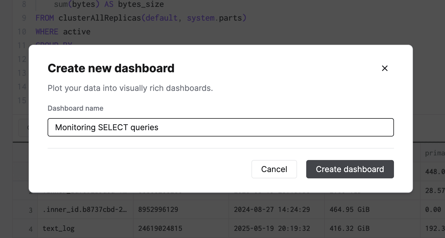
In ClickHouse Cloud, we’ll save this query, and add it to a new dashboard - Monitoring SELECT queries:
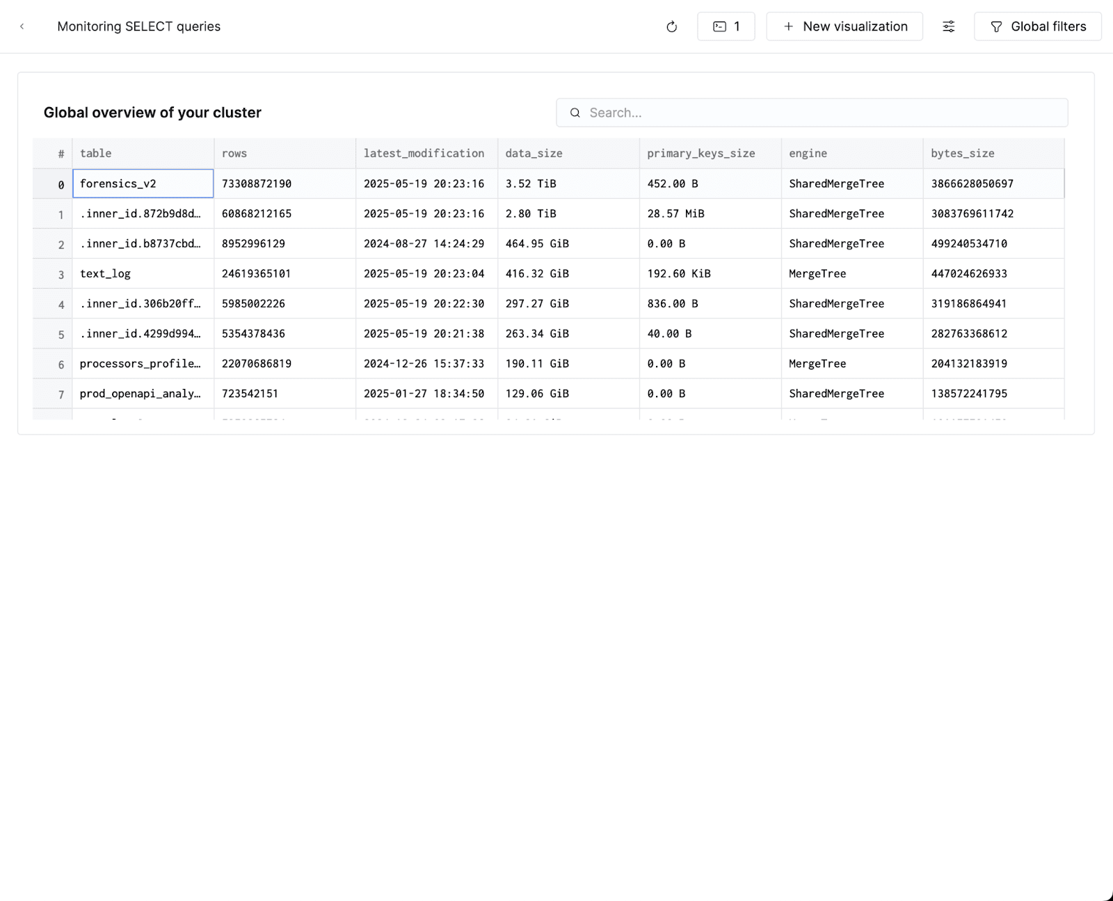
When I navigate to the Dashboards tab, I’ll now see a brand new dashboard with a table component that I just added:
I’ll keep adding a few more queries from the blog post to this dashboard as tables. I’ll create my first line chart showing average query duration and number of requests, which works great as a time-series line graph in the SQL console:
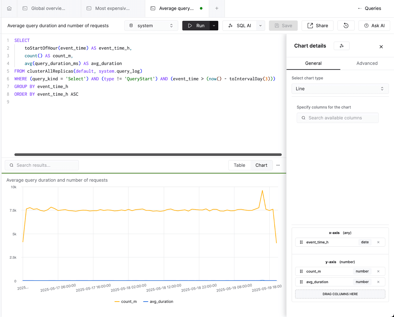
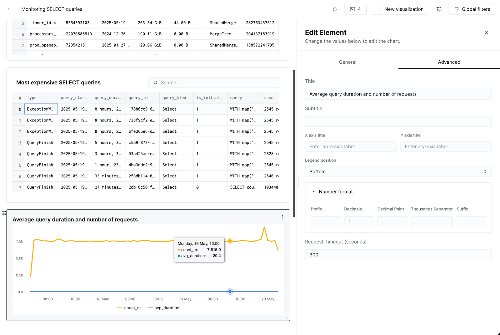
I’ll add this visualization to our dashboard. I’ll also add a legend and change the formatting of my series so hovering over the series only shows one decimal point:
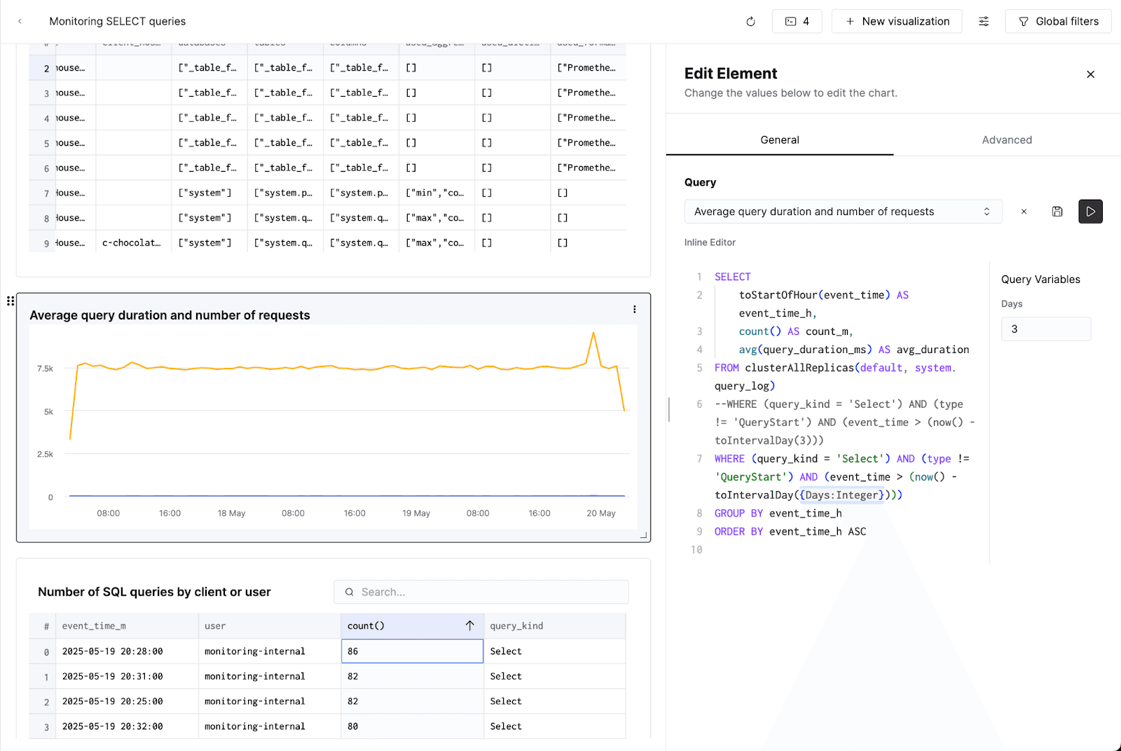
Finally, I’ll add one more table showing which users have been running the most queries recently. I now have a dashboard which I can keep reference to monitor queries on my cluster. As a final step, I’ll use ClickHouse Query Parameters to add a time-based filter to my line chart so the dashboard is interactive. I’ll modify the underlying query, and save it:
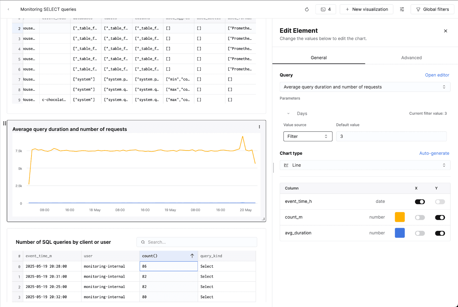
I’ll configure a "Filter" as the value source for this filter, and keep a 3-day default:
Now, viewers of my dashboard can toggle how many days of data they see on the line graph:
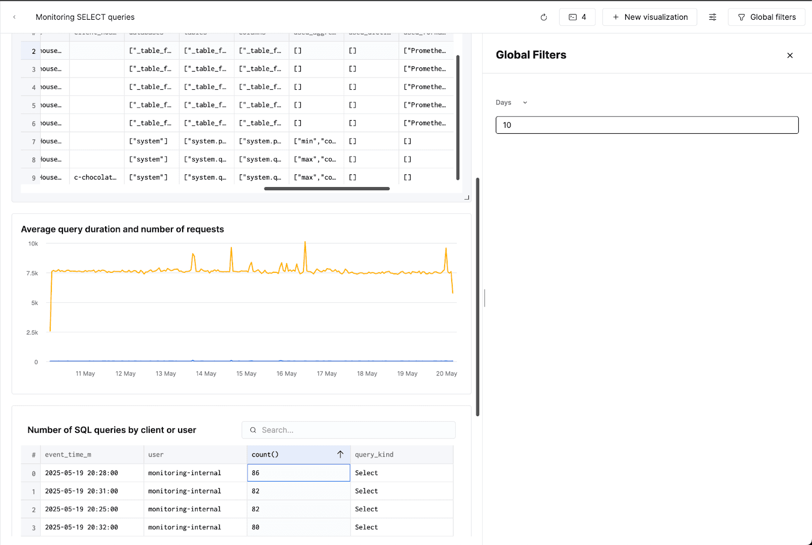
Here’s the final result! Each dashboard has a custom URL, so it’s easy to share this dashboard with colleagues in the same Cloud organization via the browser’s URL:

With this dashboard in place, you’ll spend less time hunting down queries you previously wrote, and more time optimizing performance. Try building your own with sample queries, or customize queries to fit your specific workload.


