 48.8k
48.8k
Get started with ClickHouse Cloud today and receive $300 in credits. To learn more about our volume-based discounts, contact us or visit our pricing page.
Welcome to day 2 of our launch week!
Last month, we released a big update to ClickHouse Cloud Console, you can read all about it here. In this post, we wanted to share our experience and the knowledge we gained in rebuilding our Cloud Console from the ground up.
The vision
In late 2022, shortly before ClickHouse Cloud was released, we joined forces with an early-stage startup building a SQL client called Arctype. Following the acquisition, we initially migrated most of Arctype’s SQL client and database visualization functionality into a new ClickHouse Cloud-native (but still standalone) SQL console, but our vision was always to take it one step further — we believe a truly 'managed' DBaaS shouldn't just abstract away infrastructural complexity, it should also provide a best-in-class experience for developers and analysts who work with data every day. In other words, provisioning a ClickHouse Cloud service should only require a couple of clicks, and interacting with this service (and any data contained within it) should not require users to leave the Cloud Console. To achieve this vision, we knew we would need to fold the legacy ClickHouse Cloud Console and the new-fangled SQL Console into a single application.
Who are we building this for?
Cloud platforms are an interesting beast. You can never really design them with one user in mind. While a lot could be written about the various user personas, for the purposes of this post we'll keep it simple.
First and foremost, there are admin-type users who require a 100ft view of all systems and the ability to manage their user's permissions and security access, as well as monitor their usage and billing information. These users might only spend 1-5 hours per month in any given Cloud interface, but when they need to locate information and complete tasks, speed and ease-of-access are hard requirements.
Second up, we have analyst-type users, who are likely to: view, create, and run queries; import and export large amounts of data; start, stop, and resize ClickHouse services; and share their findings (queries and visualizations) with others. Unlike the Admin user, the Analyst may spend many hours per day in the Cloud interface. They need a comfortable, predictable environment to help immerse themselves in their work.
Third and most important, we have developers. For developers, a Cloud interface (specifically a Cloud database interface in this case) primarily serves as a source of truth for their data. For example - does the data exist in table(s), what volume of data is stored, are queries properly optimized, etc.) and a centralized place to create, modify, and monitor ingestion/consumption services.
Suffice to say, each of these user personas represent entirely different patterns of usage, different focuses, and likely differing sets of criteria when judging the quality of our hypothetical new Cloud interface experience. Designing something with all three in mind was going to be tricky.
Our meta-level design principles
Whenever you're working with complex systems and a dense amount of data, it's important that it doesn't feel like you're working with complex systems and a dense amount of data. For this reason, we knew that aesthetically, we needed to take this in a clean and light direction. The UI chrome had to be minimal, providing only the most important information in a contextual manner. We opted for clarity and consistency in our approach. Predictability really is the key to any successful user interface—if a user knows what's going to happen next when they perform an operation, they’ll quickly grow to trust and appreciate your application.
As mentioned, we have users who spend multiple hours a day in our Cloud interface. Anywhere you invest such a significant portion of your day has to be comfortable. Comfortability and customizability go hand-in-hand, so we made sure that this new iteration of ClickHouse Cloud was designed in a very modular fashion—one that would allow us to easily switch out colors to create multiple themes.
This was all great in concept, but now we actually needed to build the darn thing.
This sounds pretty doable; what’s the catch?
There was one slight hiccup on the path towards our agreed vision; it would require us to merge two large codebases into one, but more challenging still, our legacy Cloud Console is written in Angular whereas the SQL Console utilizes React. In other words, the two applications were written in diametrically-opposing JS frontend frameworks (or more accurately, a framework and a library).
After some spirited debate, we agreed that migrating the legacy Cloud Console Angular application over to React was the best course of action. There is plenty of literature comparing and contrasting the two, and since our choice of one versus the other is not significant to the story here, we’ll spare everyone the debate blow-by-blow. Suffice to say, however, that anyone familiar with both React and Angular is likely to find our decision understandable (at minimum).
In any event, this meant that achieving our vision effectively entailed performing open heart surgery on (at least) the legacy Cloud Console code base in addition to building a sleek, intuitive, and opinionated end-to-end user experience. As challenging as that sounded, we had high conviction, and with that, the Unified Console project was born.
A better design-to-engineering workflow
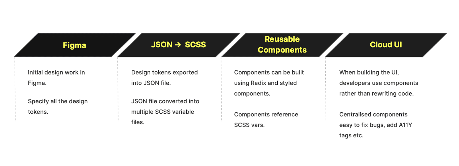
We'll go into the details later in this post, but before we start, here's the rough overview of our final workflow. We wanted to create a connected system where the design work starts in Figma, syncs tightly with our React component library, and flows right through to our Cloud experience.
At this point we had agreed upon both using React as our JS framework, and our design vision, but we still needed to decide on how we were going to rebuild the Cloud Console itself. This time we were thinking longer term, 2-5 years out, and knew we'd be hiring more designers and developers, so we needed a way to ensure new hires could onboard quickly, while still being consistent and true to our visual identity.
The tokenization of everything
While designing the new version of ClickHouse Cloud, we were also building out our design system in Figma, and as previously mentioned, customizability was a first principle, so we wanted every value to be easily customizable depending on the theme. Not just the colors, but font weight, border radius, shadows, everything. The best way to do this is to use design tokens. Design tokens are essentially variables, they allow us to assign a value to a property, let's say global.background.default, and that value can be different depending on the theme. So in a lighter theme, we might see the following:
global.background.default: white
while in a darker theme, that same token may have a different value:
global.background.default: black
This post isn't really about design tokens, so if you're interested, we recommend watching this quick 5 minute video that does a fantastic job of explaining them.
Our aim wasn't to manage a set of design tokens in Figma though — we wanted to establish a connected system where the changes made to the tokens in Figma could flow down through the code and into the product without the developer needing to make any updates.
After some research, we settled on a tool called Tokens Studio, within which we can store all of our tokens via their Figma plugin and then export them in a JSON format. In more recent months, Tokens Studio has even added seamless syncing with Figma variables, which has been a huge quality-of-life improvement for our designers maintaining multiple themes.
Once the tokens are exported as JSON, we still need a way to convert them into CSS so that they can be used in our components. Enter Amazon Style Dictionary. With just a little customization, this incredibly flexible build system took our JSON files and split them per-theme into CSS files full of variables, which could then be imported into our components using a css-in-js library called styled-components.
Click UI
Great progress as it was, this then brought us to our next dilemma — how do we build these components and where do they live? In prior roles, some of us have personally been part of teams that had built component libraries from scratch before. While this might be rewarding, at ClickHouse, we have had neither the time nor the appetite to build and maintain such an entire library. Plus, given the large number of great options readily available today, it would be crazy to build a component library from scratch.
So, rather than reinventing the wheel, we elected to use an existing open source (mostly) headless React component library for the base components, and then use our tokens to add the styling. After taking time to play around with many of the leading options, we settled on Radix-UI, which offered a comprehensive assortment of components, and also great accessibility out of the box.
As our Design System in Figma was called Click UI, it made sense that our component library should be called the same. We set about importing the components from Radix and applying our own styles and customizations to them. At ClickHouse, we have open source running through our veins, so it was never a question that Click UI would be both open source and built-in-public from day one.
Click UI now has over 40 components and is growing all the time. You can follow along and contribute at https://github.com/ClickHouse/click-ui or check out our public Storybook playground at https://click-ui.vercel.app/
Flexibility vs Consistency
A recurrent problem we found while developing Click UI was choosing between the degree of flexibility and consistency we wanted to embed in our library.
For example, for our Select component, we debated whether to expose a generic interface that can work well with a greater number of designs unknown at the time of the development or expose a more restrictive interface, less customizable, but that could make the Select component cleaner and easier to use.
In React terms, this would translate between the following two interfaces:
<Select>
{children}
</Select>and
<Select options=[{value: ‘value1’, label: ‘label1’}] />While the first case can easily accommodate a change in the design (e.g. show an icon for each option) it opens itself to a wider range of possible (mis)usages.
The second alternative, on the other hand, makes using the component easier and by passing only data, doesn’t allow for styles that might break the design, making the overall application more consistent.
This journey is still ongoing, and consequently, we still haven’t found the perfect balance. Obviously, though, if you had to build a design system for a very mature application, you might understandably lean more toward consistency and ease of use.
Attempting to thread this needle, then, we’ve employed a hybrid approach, wherein we implement internal components with flexible interfaces that can be reused to build external components with more restrictive (and cleaner) interfaces. This means that developers can effectively choose their own adventures — we provide both flexible primitives and ready-to-go building blocks.
Development and Testing
Since the beginning, we decided to settle on storybook as the tool for documenting and visually testing our components.
Storybook offers a great user experience in demoing single components and showing how to use them with all their properties. It also offers support for visual testing through an easy-to-set-up integration for github. Each time a new PR is open, a set of checks are run against existing components. In case new changes are found, you can compare the look of the new components with the existing ones and decide whether to accept or decline the new changes.
This approach's limitation is that as the number of variations of each component grows, the number of visual tests needed to check each possible combination of the component grows exponentially.
We also opted to use Vercel because it offers incredibly easy deployments for Storybook-generated applications and auto-generates preview environments for each new PR that is open. This feature is extremely helpful for facilitating the interaction between designers and developers, and the former can easily go to the generated link and check the latest modifications without having to manually deploy the changes on their local machine.
Implementing the Unified Console
At this stage we had a large set of designs, and we had a good amount of the components prebuilt thanks to Click UI, so now it was all about putting it together.
The plan
Before we could pop the Champagne, though, there were many tough decisions to be made about migration. In what order would we convert the pages? Would we release the new experience all at once or take a more iterative approach? How long could we afford to hold off on working on new features to ship this release?
Initially, we planned to split the migration into two phases. Our then-hypothetical phase 1 would tackle service-level functionality — primarily because our new service-centric model charted a very clear course for migration of these pages. We still had some open questions about how organization-level pages fit into this model, so we planned to work on these in phase 2, along with onboarding and authentication. Looking back, we found our original notes outlining this plan:
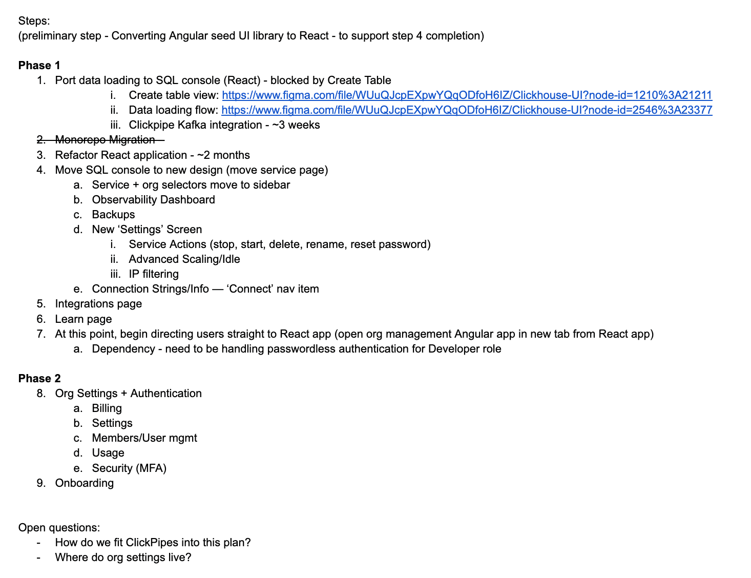
Some more challenges
We ultimately followed this outline with one notable exception: initially, we planned to cut-over to the new experience immediately after completing the service-level page migrations (step #7 above). This would have meant temporarily maintaining a bifurcated experience — similar to the legacy Control Plane / SQL console delineation, just inverted. Instead, we elected to complete both phases of the migration and then utilize a feature flag to incrementally rollout the fully-integrated experience to users over a period of weeks.
This plan also posed a couple of challenges:
- Net-new feature development — while the migration was underway, we delayed new feature work as much as possible. Some critical features, however, could not be postponed, and thus needed to be implemented in both the legacy Angular and new React applications. Double-work aside, this meant that completing some page migrations felt like trying to hit a moving target.
- Two experiences, one application — Because the new console experience is effectively built on-top of the existing legacy SQL console application, we had to simultaneously maintain two versions of the same application, each with slightly different layouts, routing mechanisms, and themes. As we inched closer and closer to completing the migration, an increasing number of regressions began appearing in the legacy SQL console during release testing (and occasionally in Production as well). Maintaining stability across both experiences became increasingly difficult.
Rollout and Beyond
Unsurprisingly, rolling out an entirely new experience to tens-of-thousands of existing users — many of whom are paying customers — is not trivial. In an ideal world, we would have maintained both experiences for several months and offered existing users the option to transition away from the legacy console. However, largely because of the challenges described above, maintaining both applications was not going to be a viable option — especially given that our team comprises only a handful of engineers. In other words, we needed to rip the band-aid off relatively quickly so that the team could resume work on other important feature work.
After roughly a month of testing and iteration during private preview, we felt confident enough in the new Cloud Console to begin rolling it out globally. Our plan was to initially rollout to 20%, incrementing upwards for 2-3 weeks until we reached 100% (assuming no issues arose). Inevitably, a couple of UX-related requirements complicated this plan:
-
All users in an organization should have the same experience. This is easily solved using an organization-level feature flag.
-
Users who are members of multiple organizations should have the same experience across all of their organizations. This one was slightly trickier, but conveniently, cursory analysis of our organization/userbase determined that roughly 20% of all organizations contained users in multiple organizations. Thus, we began our rollout with this segment.
From this point forward, nearly everything went according to plan. We reached 100% rollout on April 30, and as of the time of publication, the volume of bug reports remains relatively low, and feedback has been overwhelmingly positive. In a similar vein, we’d like to take this opportunity to thank everyone who took the time to provide us with constructive feedback as well—we view this as crucial to our continued evolution of the Cloud Console experience.
So, what’s next? There are a number of exciting new features landing in the cloud console over the next few weeks — stay tuned!
Get started with ClickHouse Cloud today and receive $300 in credits. At the end of your 30-day trial, continue with a pay-as-you-go plan, or contact us to learn more about our volume-based discounts. Visit our pricing page for details.