Introduction
Modern businesses no longer make decisions based on gut-feel. In every software or app we use - even consumer apps like FitBit, Strava, or banking apps - we expect some sort of dashboard or charts to help us guide our daily decisions.
However, as a software developer, building these user-facing dashboards can be a frustrating and time-consuming process. And that’s mostly because of two reasons:
- It costs a lot of time, expertise and development resources to develop data visualizations and advanced analytics capabilities from scratch.
- Many SaaS apps rely on a relational database, which isn’t optimal as a data infrastructure for user-facing analytics. As a result, dashboards load very slowly, hurting your user experience.
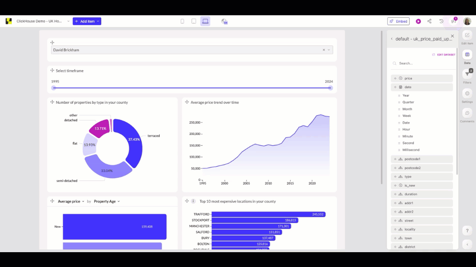
- In this article, you’ll learn how you can overcome both obstacles, using ClickHouse as your analytical database and Luzmo for embedded data visualizations. In a quick tutorial, we’ll show you how to build the following user-facing dashboard in just a few minutes that you can embed into your own application!

Why you need an analytical data model for user-facing analytics
Most SaaS companies already use an operational database to run and store their SaaS platform’s transactions. So it’s tempting to think: "Why do I need another database if all our data is already stored in one?"
Unfortunately, using a relational model for analytics can quickly become problematic. Every transaction is stored in a single row, so even when you only need a small subset of information from one or two columns, your database needs to scan entire rows to retrieve it. Queries are slow because they need to process so much data. On top of that, you risk putting too much load on your operational systems, causing downtime for your entire platform.
Columnar databases like ClickHouse store data by columns, which means they only need to scan the right columns to execute your query. That drastically reduces the amount of data processed, leading to faster query performance and faster loading times of reports and dashboards. When you’re dealing with millions of data points, users often deploy a dimensional data modeling approach to fully exploit these capabilities and handle complex reporting requests.
What we’re building: an embedded analytics dashboard
In this tutorial, we’ll build a customer-facing dashboard for a property management app, showing the historical prices of homes in the UK. Real estate investors and property managers can use the insights to buy new properties below market price, set prices for available properties, and maximize their revenue.
To create a user-friendly, fast-loading dashboard that integrates seamlessly into your existing web app, we’ll be using two technologies:
- ClickHouse is our analytical database to store and query the data from
- Luzmo is our embedded analytics platform to build interactive visualizations and embed them directly into our SaaS app
As our data source, we’re using a UK government open dataset, which is available through the ClickHouse Playground and can be queried here.
Step 1: Connecting your ClickHouse dataset
To start building user-facing dashboards, we first need to pull data from ClickHouse into Luzmo. You can connect any ClickHouse database to Luzmo by simply entering your database credentials.
In Luzmo, go to "Connections" and click "+ New Connection". Select ClickHouse from the many different database options, and add your Host (database name), Key (username), and Token (password).

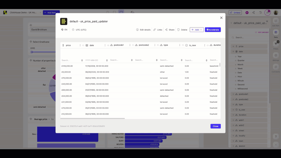
Now that you've successfully connected your ClickHouse database to Luzmo, navigate to "Datasets". When selecting ClickHouse as your source, you can now see all the datasets available in your database. Bulk-select all the datasets you want to use for your dashboard to import them.
We'll select the UK government dataset from the playground.

That's it! With our new dataset, we can now create our first dashboard.
Additional tips for data preparation
Although we highly recommend modeling your data in ClickHouse first, Luzmo has some data editing features available, should you need them.
In our case, we’re using a sample dataset, and we’d like to add some finishing touches to make our dashboard pixel-perfect.
Displaying the correct currency
Home prices are imported as numeric values, which we’d like to change to a currency so that our dashboard automatically shows all prices in British pounds.
Using formulas to manipulate data
One of our data columns indicates whether a property was newly built, or an established residential building in the form of a boolean: 0 or 1. To make sure we can use this column as a filter in our dashboard, we want to change it to a hierarchy.
In Luzmo, you can easily manipulate this by creating a derived column like this:
We can then change the values, 0 and 1, to something more meaningful, like "New" and "Old".
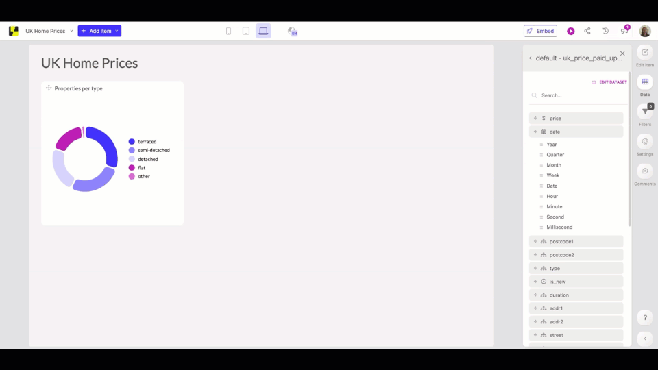
Step 2: Building the dashboard
Now, the fun part can begin: turning our raw data into interactive, understandable data visualizations!
You won’t need any coding for this part, so if you prefer, you can leave this up to your customer success manager or support reps who know the reporting requirements of your customers best.
Adding charts
Click "+ New Dashboard" in Luzmo, and you'll end up in their drag-and-drop dashboard interface. If you already know which metrics you want to visualize, simply drag any chart onto your dashboard canvas and drop the data columns you want to use onto the chart.
If you're dealing with large datasets with many columns, you may first want to explore your dataset a bit more to understand which metrics are most interesting to visualize. In the "suggestions" section, you'll get a number of recommended charts to choose from, based on your dataset.
We're interested in price trends over time, so let's add this one to our dashboard!
Adding interactivity
If your platform is used by thousands of users, each person will be looking for different data points. To make sure they can play around with the data in your dashboard and find the insights they need, we'll add some interactivity to it as well.
Filters are the obvious way to go. On our example dashboard, we've added:
- A slider: to filter home prices for specific time periods
- Interactivity between charts: e.g. if you want to show pricing data for detached houses only, you can filter the donut chart on "detached", and your entire dashboard will display data accordingly
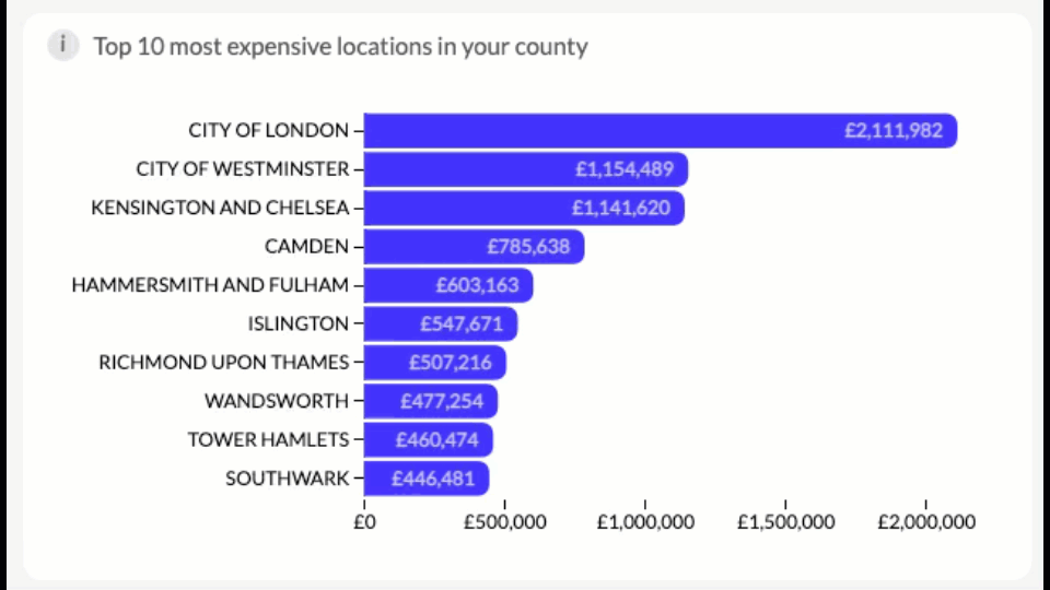
Besides filtering, there are many other ways you can let your users interact with your data. For example, in the chart below, you can use drill-downs to explore the prices of a specific location in more detail. Drill down on "City of London" and you'll be able to view the most expensive districts, towns, or even streets within that area.
If you want to offer a lot of information, it’s tempting to keep adding charts with more data. However, a dashboard with +30 charts and endless scrolling will overwhelm your users. To avoid this, using a “picker” on top of your charts is a great idea.
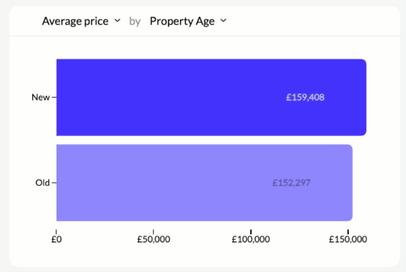
In the example below, you can easily switch between the average, median, or maximum price of a property without having to create three separate charts. And thanks to our optimized data model in ClickHouse, this information can be retrieved and calculated super quickly!
Your demo dashboard is now ready to embed. If you’re following this tutorial with your own dataset, the world is your oyster! Explore all the different visualization types, or let the AI Chart Generator do the work for you.
Step 3: Embedding the dashboard in your SaaS app
The last step, and perhaps the most important one, is to embed the dashboard where your users will expect it: directly inside your web or SaaS application. Why push your customers to a separate BI tool, driving them away from your app, if you could increase product usage by adding valuable insights?
Before you embed a dashboard, you’ll need to decide on a few things:
- Location: where in your app do you want to show your dashboard?
- Access control: Which customers are allowed to see which data?
- Customization: Do you need to display dashboards in different languages? On different devices? In different branded colors?
Once you’ve made a decision on each of these factors, it’s fairly straightforward to implement.
For our use case, we’ll walk through the steps to embed the dashboard in an analytics tab in your web app, with different access rights for each UK county. For example, property managers in London will only get access to data about London, not Manchester.
1. Setting up access rights
To define access to our dashboard, we'll first need to create a Luzmo collection containing all of the dashboards and datasets used in our project. You can add a new collection in the left-hand navigation under "My collection" and drag any datasets and dashboards directly into your overview page.
We will add one dashboard and one dataset, but you can add as many as you like. Now that we've defined which dashboards and datasets will be used in our project, we need to set the correct access rights for everyone who will have access to these dashboards in your app.
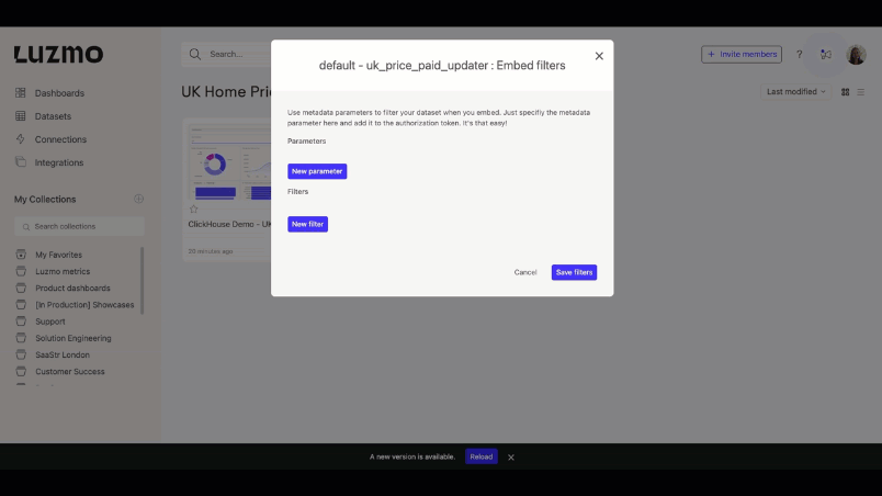
In our case, we are only using one dataset, but we want our users to have access only to a specific subset of data. Specifically, all the data related to their specific county in the UK. To do this, we will first need to create a parameter filter on our dataset that we can pass on when a dashboard is rendered.
From within the collection, select your dataset and click on "Embed filters". Under Filters, select "County" before choosing the counties you'd like to include data for. Create a parameter called "County", so you can use it later on in the code when embedding the dashboard.
p.s.: You don’t need to have all your data in one dataset to set specific access rights. If you are using a different dataset for each client, or a multi-tenant API, here’s how you can set up multi-tenancy, but note the process will look slightly different.
2. Creating an embed token
The embed token is a secure way of rendering a dashboard in your SaaS app. It ensures that the user only sees the data you want them to see, as we defined in the previous step.
To generate an embed token, you will need to create an API key and token to give your application secure access to our Luzmo. You can do this via Profile Settings > API Tokens. Copy your API key and token and save it since you won’t be able to access them later. Authorization tokens are always generated server-side for security reasons, so never use your API key and token client-side!
Now, your server-side code can make an API request to retrieve an authorization token. This is where you’ll fill in the API key and token, the user’s details, and the resources you want to give that user access to.
const Luzmo = require('@luzmo/nodejs-sdk');
var client = new Luzmo({
api_key: '< Your API key >',
api_token: '< Your API token >'
});
let promise = client.create('authorization', {
type: 'embed',
access: {
collections: [
{
id: '<collection ID>',
inheritRights: 'use'
}
]
},
username: '< unique identifier for your user >',
suborganization: '< company name >',
name: '< user name >',
email : '< user email >',
parameter_overrides: {
County: ['< counties visible to this user >']
}
});
promise.then((result) => {
// result.id contains the embed authorization key,
// result.token contains the embed authorization token.
});Let's have a look at what that might look like for different users. Let's say a property manager, Irvine Seller, from London, is trying to access the dashboard. With the following parameter override, he will only be able to access data about London.
username: 'irvineseller',
suborganization: 'Big Ben Properties Co.',
name: 'Irvine Seller',
email : 'irvine.seller@bigbenproperties.com',
parameter_overrides: {
County: ['GREATER LONDON']
}The same thing would be true for a property buyer in Manchester; the authorization token will limit their access to properties in Manchester:
username: 'davidbrickham',
suborganization: 'Soccer Estates Co.',
name: 'David Brickham',
email : 'david.brickham@soccerestates.com',
parameter_overrides: {
County: ['GREATER MANCHESTER']
}When you pass on this request, you’ll get a JSON object in return with an ID and token. You’ll need this for the actual embedding step.
{
"type": "embed",
"id": "<the embed authorization key>",
"token": "<the embed authorization token>",
"user_id": "<a uuid used on Luzmo's end to identify the embed user>"
// ...
}3. Embed the dashboard
Now that we’ve set up a way to fetch and display data in your dashboards securely, we can go ahead and embed them inside our application.
Once you know where you want to display your dashboard inside your app, it’s literally as easy as copy-pasting 5-10 lines of code.
<luzmo-dashboard
dashboardId="<ID of dashboard you want to embed>"
authKey="<embed key (id property) returned by step 1>"
authToken="<embed token (token property) returned by step 1>"
appServer="https://app.luzmo.com/"
>
</luzmo-dashboard>
<script defer src="https://cdn.luzmo.com/js/luzmo-embed/5.1.5/luzmo-embed.min.js" charset="utf-8"></script>To find your unique code snippet, go to the dashboard you want to embed and click "Embed". Now select the front-end framework your app uses and copy the code snippet. The dashboard ID will already be filled out; you'll only need to add the authKey and authToken generated in the previous step.

And that's it! You'll now have an interactive user-facing dashboard added to your app, showing only the data your users are allowed to see.
To see what it would look like, try out the embedded dashboard below and switch between two users:
- Irvine Seller, the London-based property manager
- David Brickham, the Manchester-based real estate owner
We’ve kept it relatively simple in this example, but there are many more properties you can add to make your dashboard experience more customized:
- Which language to display your dashboard in
- Timezone of the user
- Screen mode the dashboard should load in (desktop, mobile, fixed width)
- Styling of the dashboard loader
- Connecting to different databases based on users or environment
Check out the developer documentation to see what else you can customize!
Resources
If you want to get started embedding a user-facing dashboard into your own SaaS or web app, here are a few resources that will come in handy.
Tools:
Documentation:
- Connecting data
- Creating dashboards
- Embedding a dashboard


