Визуализации и панели мониторинга с ClickStack
ClickStack поддерживает визуализацию событий и имеет встроенные средства построения графиков в ClickStack UI (HyperDX). Эти графики можно добавлять на панели мониторинга для совместного использования с другими пользователями.
Визуализации могут создаваться на основе трейсов, метрик, логов или любых пользовательски определённых широких схем событий.
Создание визуализаций
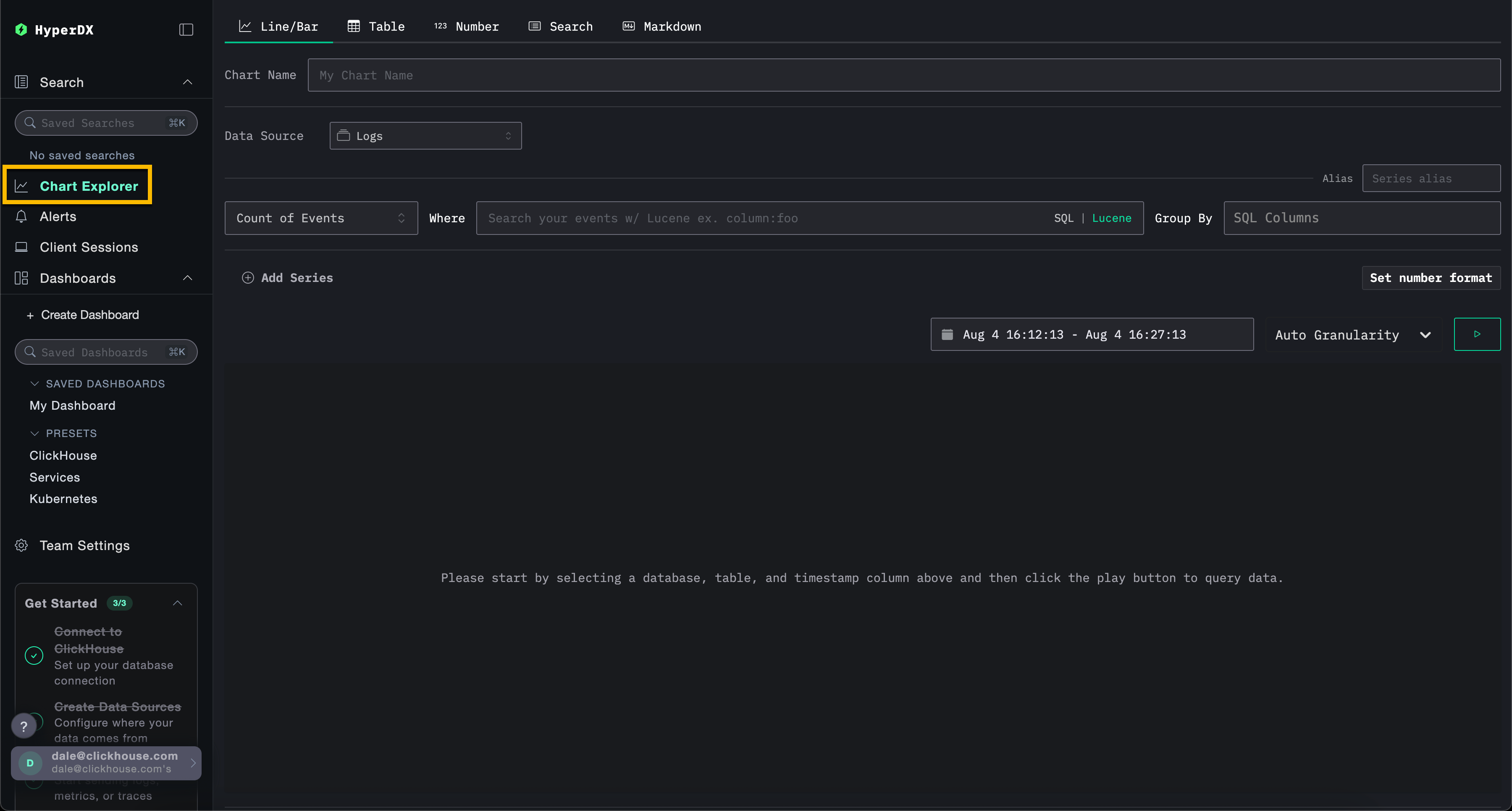
Интерфейс Chart Explorer в HyperDX позволяет вам визуализировать метрики, трейсы и логи во времени, что упрощает создание быстрых визуализаций для анализа данных. Этот интерфейс также используется при создании дашбордов. В следующем разделе пошагово разбирается процесс создания визуализации с помощью Chart Explorer.
Каждая визуализация начинается с выбора источника данных, затем метрики с необязательными фильтрами и полями group by. Концептуально визуализации в HyperDX соответствуют SQL-запросу с GROUP BY под капотом — вы задаёте метрики для агрегации по выбранным измерениям.
ClickStack также поддерживает создание графиков по запросам на естественном языке с помощью функции text-to-chart. Опишите, что вы хотите увидеть, и ClickStack автоматически сгенерирует визуализацию.
Например, можно построить график количества ошибок (count()) с группировкой по имени сервиса.
В примерах ниже используется удалённый набор данных, доступный по адресу sql.clickhouse.com, описанный в руководстве "Remote Demo Dataset". Вы также можете воспроизвести эти примеры, посетив play-clickstack.clickhouse.com.
Создание визуализации
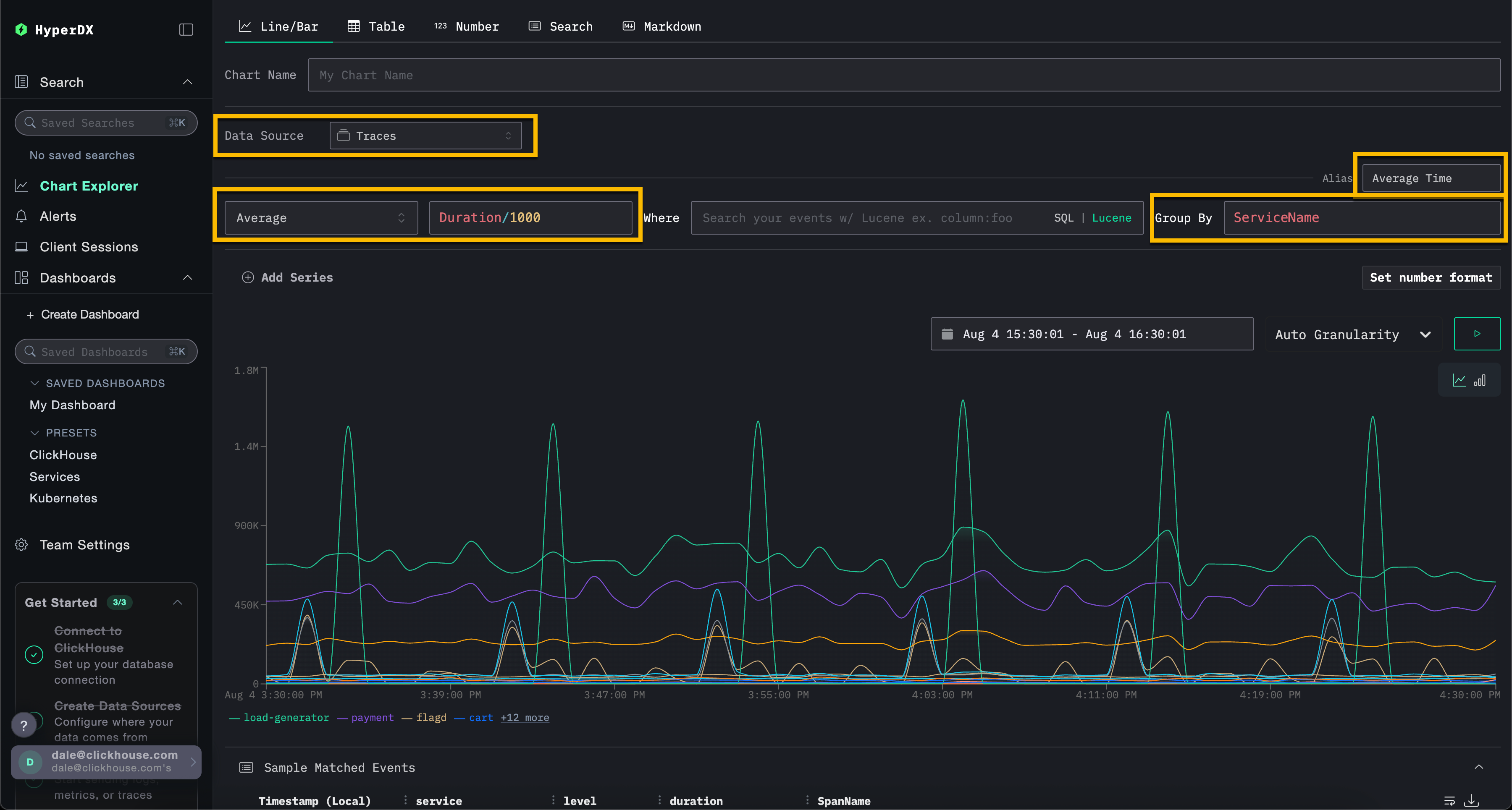
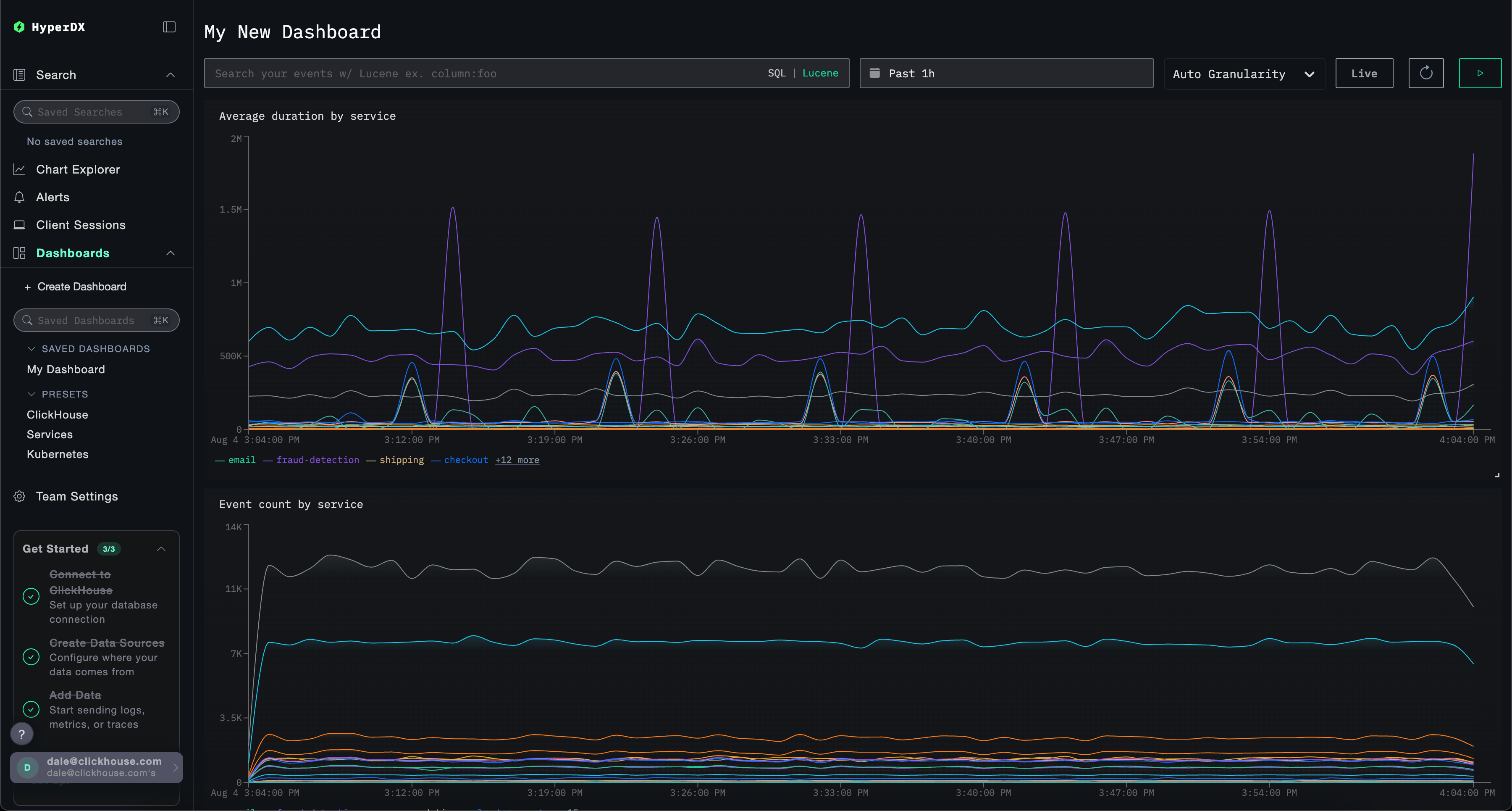
В примере ниже мы строим график средней длительности запроса во времени по имени сервиса. Для этого пользователю необходимо указать метрику, столбец (который может быть SQL-выражением) и поле агрегации.
Выберите тип визуализации Line/Bar в верхнем меню, затем набор данных Traces (или Demo Traces, если используется play-clickstack.clickhouse.com). Заполните следующие значения:
- Metric:
Average - Column:
Duration/1000 - Where:
<empty> - Group By:
ServiceName - Alias:
Average Time
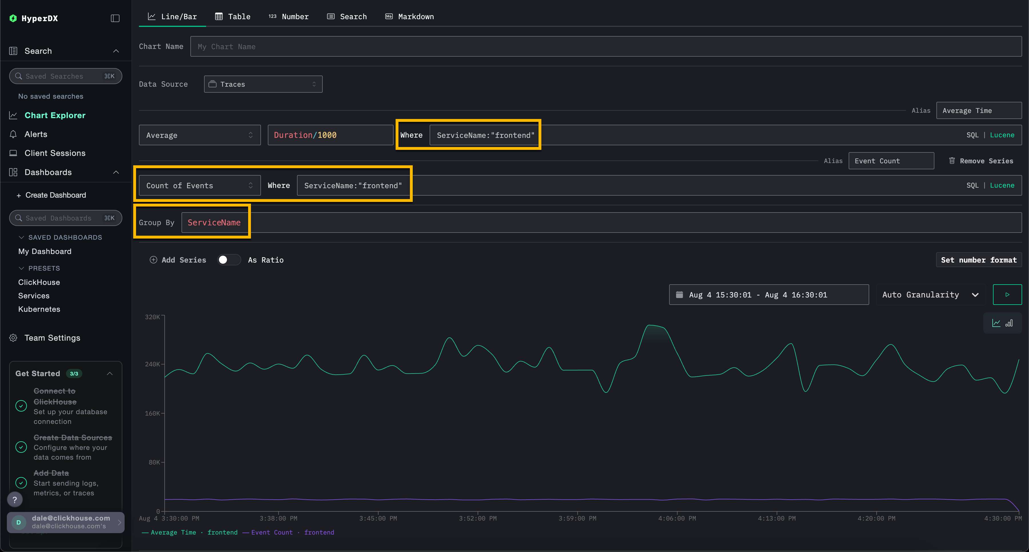
Обратите внимание, что вы можете фильтровать события с помощью SQL-выражения WHERE или синтаксиса Lucene, а также задавать интервал времени, за который должны отображаться события. Также поддерживаются несколько серий данных.
Например, отфильтруйте сервис frontend, добавив фильтр ServiceName:"frontend". Добавьте вторую серию для подсчёта количества событий во времени с псевдонимом Count, нажав Add Series.
Визуализации можно создавать из любого источника данных — метрик, трейсов или логов. ClickStack рассматривает всё это как широкие события (wide events). Любой числовой столбец может быть отображён во времени, а столбцы типов string, date или numeric могут использоваться для группировок.
Этот унифицированный подход позволяет вам строить дашборды по всем типам телеметрии с использованием согласованной и гибкой модели.
Создание панелей мониторинга
Панели мониторинга позволяют группировать связанные визуализации, давая пользователям возможность сравнивать метрики и исследовать закономерности бок о бок, чтобы выявлять потенциальные первопричины проблем в системах. Эти панели мониторинга можно использовать для разовых расследований или сохранять для постоянного мониторинга.
Глобальные фильтры могут применяться на уровне панели мониторинга и автоматически распространяются на все визуализации внутри него. Это обеспечивает единообразное детализированное исследование диаграмм и упрощает корреляцию событий между сервисами и типами телеметрии.
Ниже мы создаем панель мониторинга с двумя визуализациями, используя источники данных логов и трейсинга. Эти шаги можно воспроизвести на play-clickstack.clickhouse.com или локально, подключившись к набору данных, размещенному на sql.clickhouse.com, как описано в руководстве "Remote Demo Dataset".
Переход к разделу Dashboards
Выберите Dashboards в левом меню. Затем нажмите New Dashboard, чтобы создать временную или сохраненную панель мониторинга.
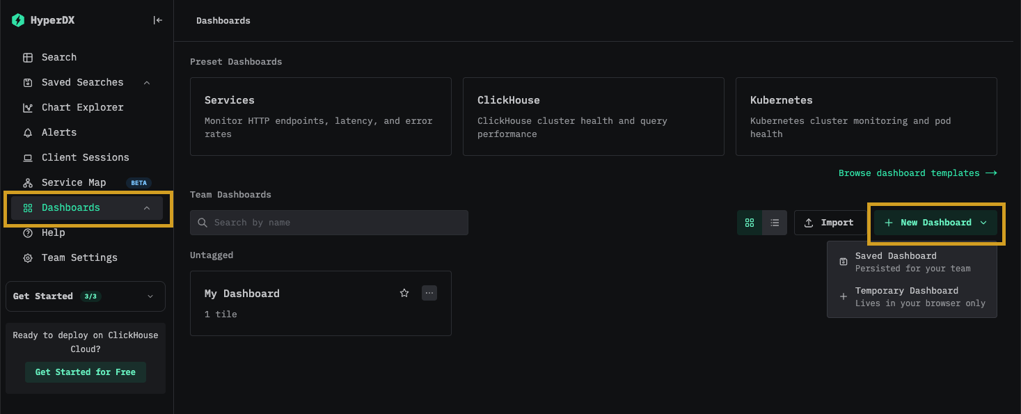
Создание визуализации – среднее время запроса по сервисам
Выберите Add New Tile, чтобы открыть панель создания визуализации.
Выберите тип визуализации Line/Bar в верхнем меню, а затем набор данных Traces (или Demo Traces, если используете play-clickstack.clickhouse.com). Заполните следующие значения, чтобы создать график, показывающий среднюю длительность запросов во времени по имени сервиса:
- Chart Name:
Average duration by service - Metric:
Average - Столбец:
Duration/1000 - Where:
<empty> - Group By:
ServiceName - Alias:
Average Time
Нажмите кнопку play перед тем, как нажать Save.
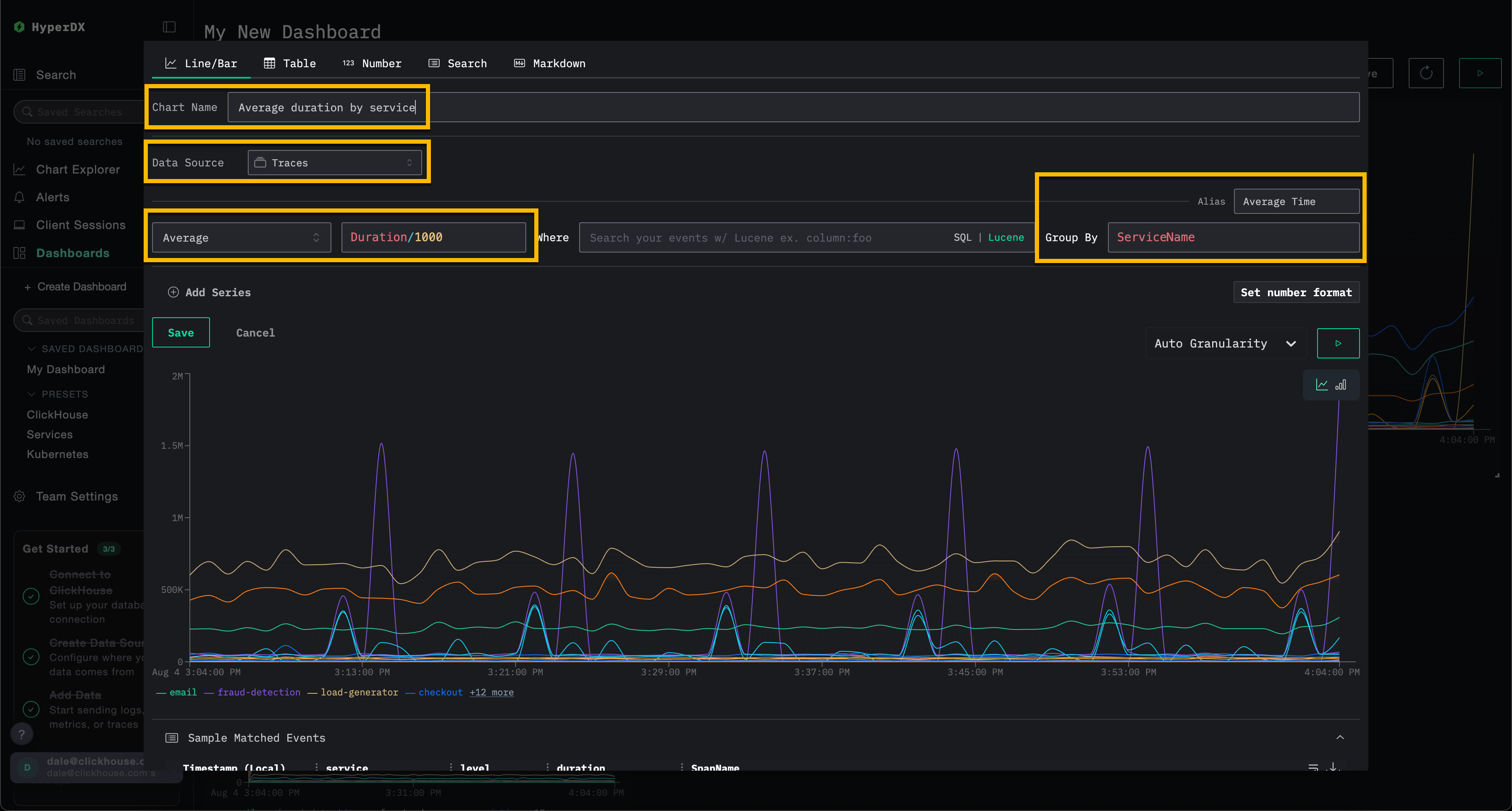
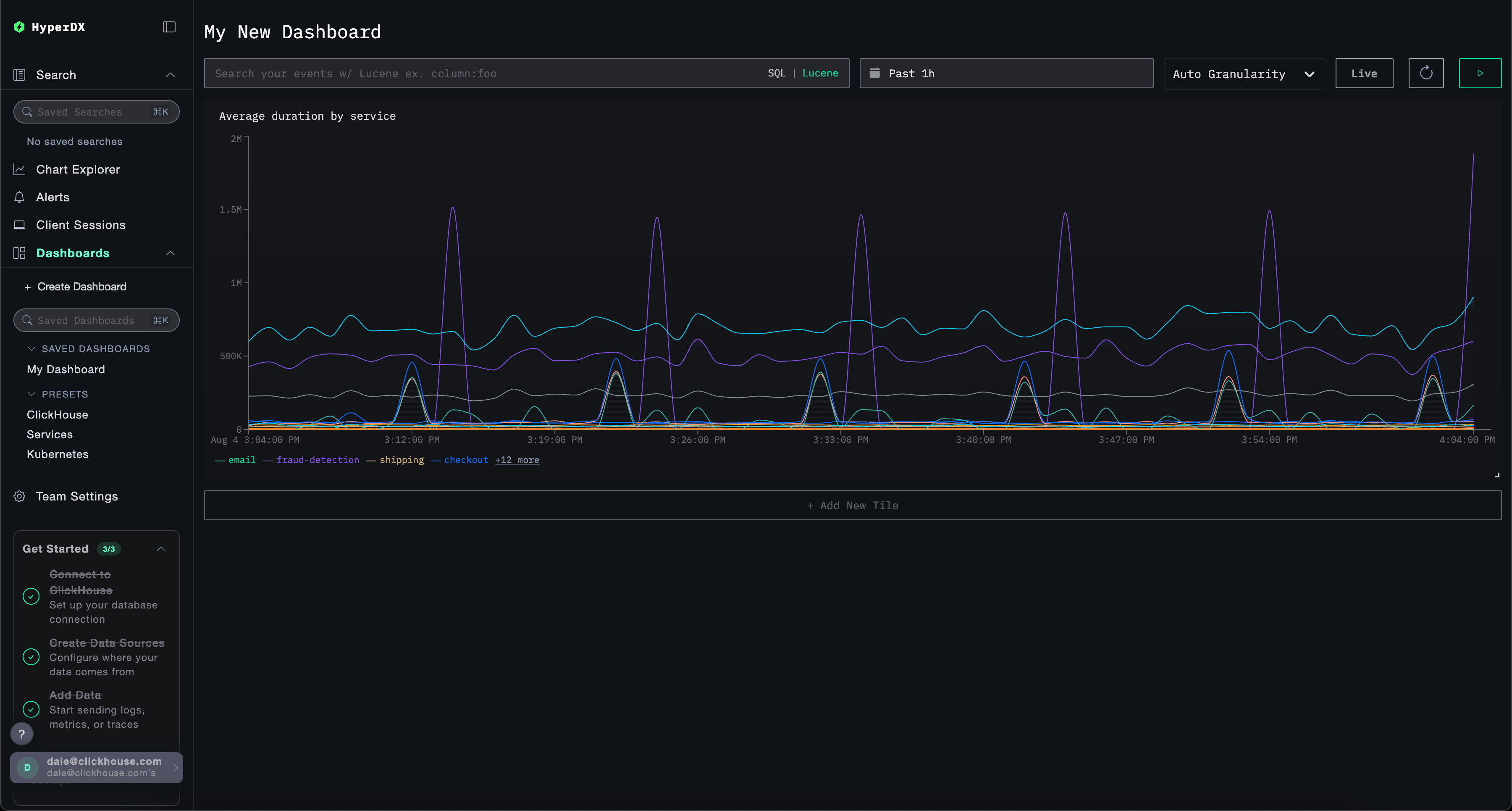
Измените размер визуализации так, чтобы она занимала всю ширину панели мониторинга.
Создание визуализации – события во времени по сервисам
Выберите Add New Tile, чтобы открыть панель создания визуализации.
Выберите тип визуализации Line/Bar в верхнем меню, а затем набор данных Logs (или Demo Logs, если используете play-clickstack.clickhouse.com). Заполните следующие значения, чтобы создать график, показывающий количество событий во времени по имени сервиса:
- Chart Name:
Event count by service - Metric:
Count of Events - Where:
<empty> - Group By:
ServiceName - Alias:
Count of events
Нажмите кнопку play перед тем, как нажать Save.
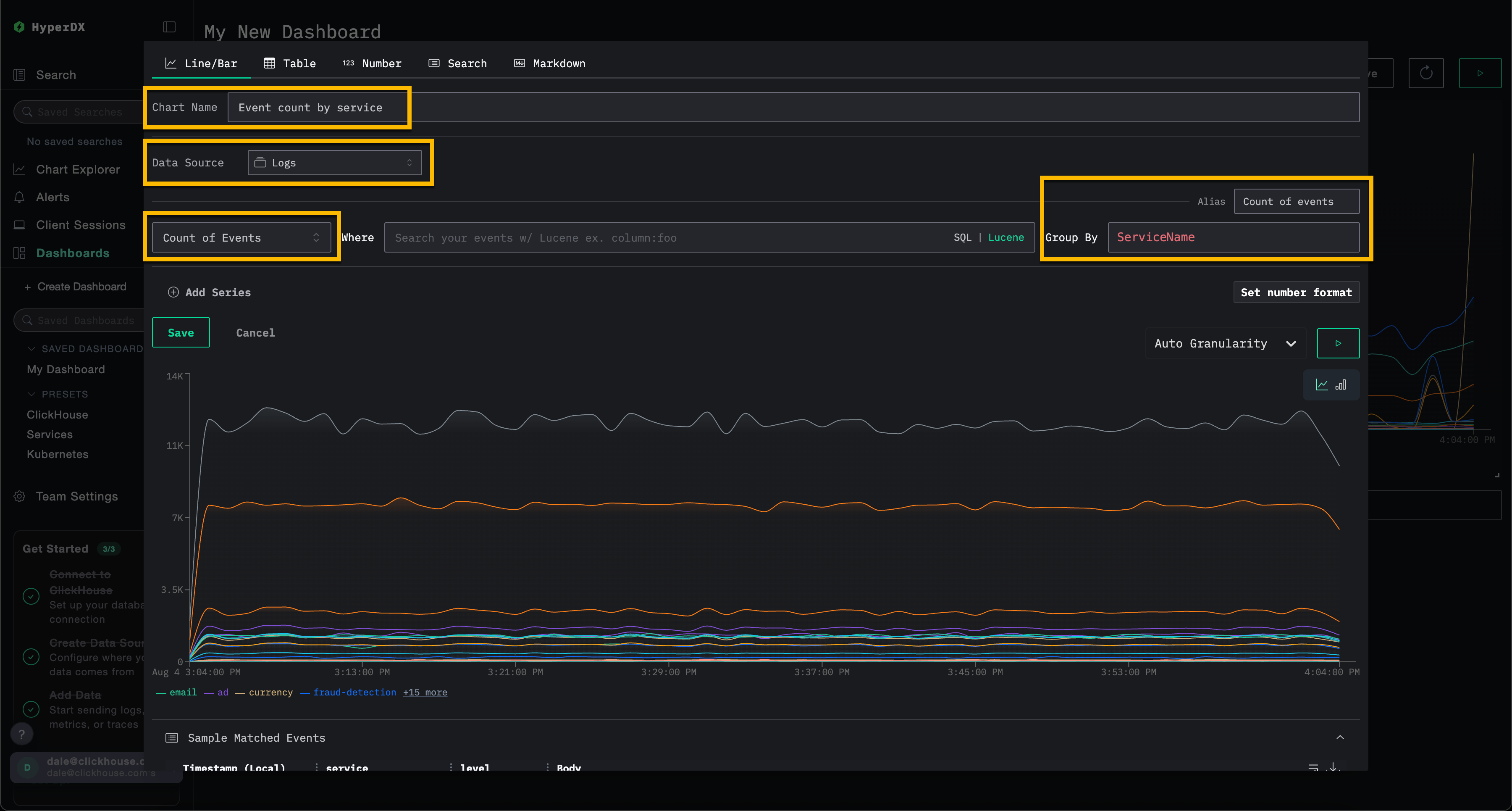
Измените размер визуализации так, чтобы она занимала всю ширину панели мониторинга.
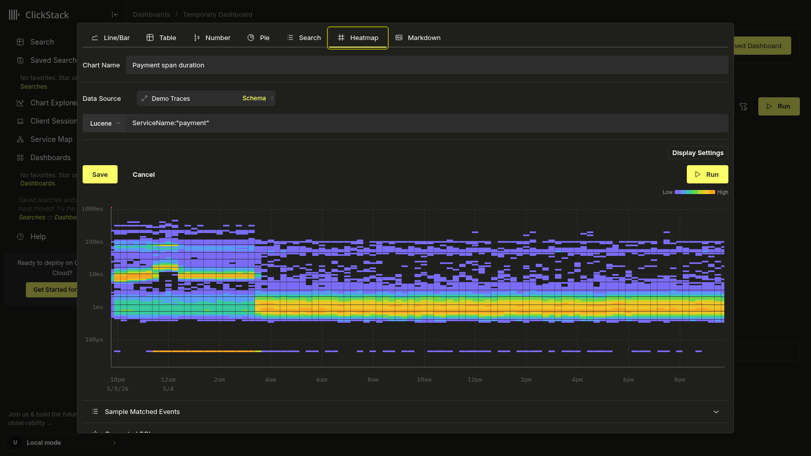
Добавление тепловой карты для длительности спанов
Тайлы тепловой карты отображают количество событий, попадающих в каждый бакет (время, значение), в виде цветной сетки. Используйте тепловую карту, когда необходимо увидеть форму распределения во времени, а не только среднее значение или отдельный перцентиль. Тепловая карта задержек выявляет бимодальные паттерны длительности, кластеры медленных хвостов или внезапные расширения распределения, которые линейный график сгладил бы усреднением.
Чтобы добавить плитку тепловой карты:
- Выберите
Add New Tile. - Выберите тип визуализации
Heatmapв верхнем меню. В раскрывающемся списке источников данных отображаются только источники, у которых тип источника —Traces. Источники логов, метрик и сеансов не отображаются, поскольку для тепловых карт нужен столбец с длительностью спана, который есть только у источников трейсов. - Выберите любой из ваших источников трейсов по имени. Само имя произвольное — важен только тип.
После выбора источника тепловая карта заполняется автоматически:
- Значение:
Duration Expressionисточника, приведенное к текущей единице отображения (например,(Duration)/1e6, чтобы преобразовать длительность span каждого события из наносекунд в миллисекунды) - Количество:
count()
- Укажите имя чарта и используйте
Where, чтобы ограничить тепловую карту конкретным сервисом или набором операций, производительность которых вы хотите отслеживать. - Настройте временной диапазон так, чтобы он соответствовал нужному периоду. Более широкие диапазоны позволяют выявить смещения распределения и бимодальные паттерны латентности, которые более короткие окна могут скрывать.
В приведённом ниже примере показан один сервис за 24-часовой период: быстрые и медленные пути длительности спана чётко разделены на две горизонтальные полосы.
Для дополнительной настройки тепловой карты нажмите Display Settings, чтобы открыть панель с параметрами Scale (Log или Linear), Value и выражением Count. Полный список настроек задокументирован в разделе Customize the heatmap на странице Event Deltas. Та же панель используется повторно.
Нажмите Run, чтобы просмотреть график, затем нажмите Save.
Сохранённый тайл отображается в виде тепловой карты на панели мониторинга. Наведите курсор на любую ячейку, чтобы увидеть границы бакета и количество событий.
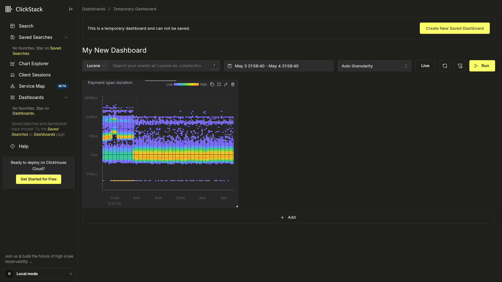
Тепловая карта выполняется в виде двух последовательных запросов: небольшого запроса границ, определяющего диапазон значений, и запроса тепловой карты, подсчитывающего события по бакетам. Оба запроса отображаются в редакторе в разделе Generated SQL, если вы хотите их изучить или скопировать.
Детализация до Event Deltas
Нажмите на любую ячейку отрисованного тайла тепловой карты, чтобы открыть действие View in Event Deltas.
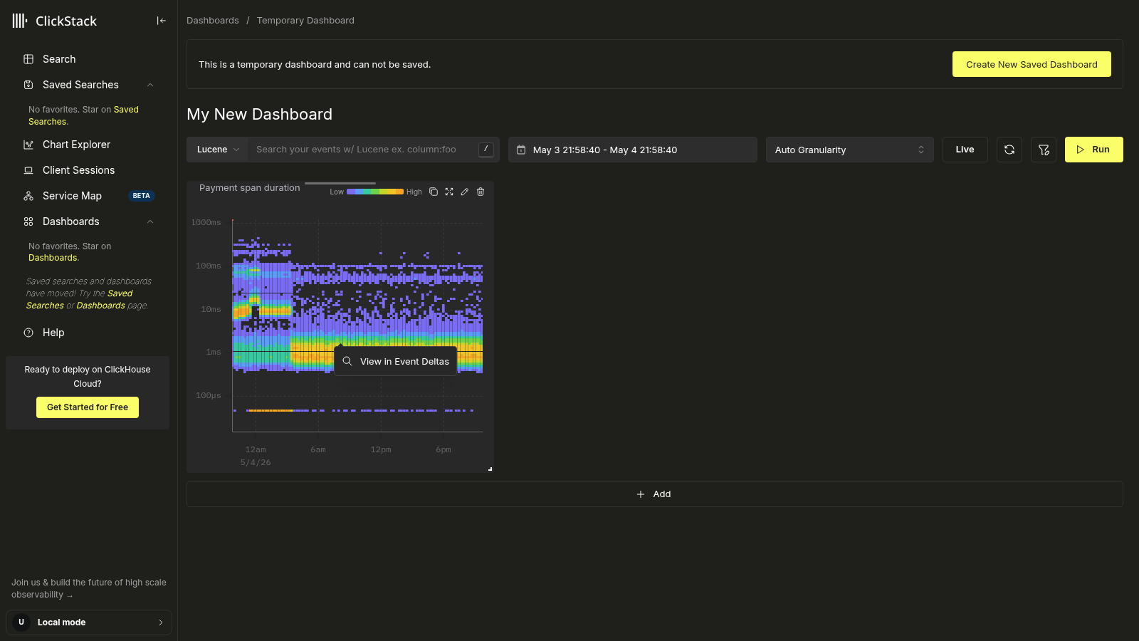
При выборе этого параметра открывается представление Event Deltas с перенесёнными источником данных тайла, условием Where и временным диапазоном. Там можно интерактивно изучить то же распределение, разбить данные по атрибуту, чтобы понять, чем медленные spans отличаются от быстрых, и просмотреть отдельные spans за любой ячейкой — без необходимости вручную воссоздавать запрос.
Фильтрация панели мониторинга
Фильтры Lucene или SQL, а также временной диапазон могут применяться на уровне панели мониторинга и будут автоматически распространяться на все визуализации.
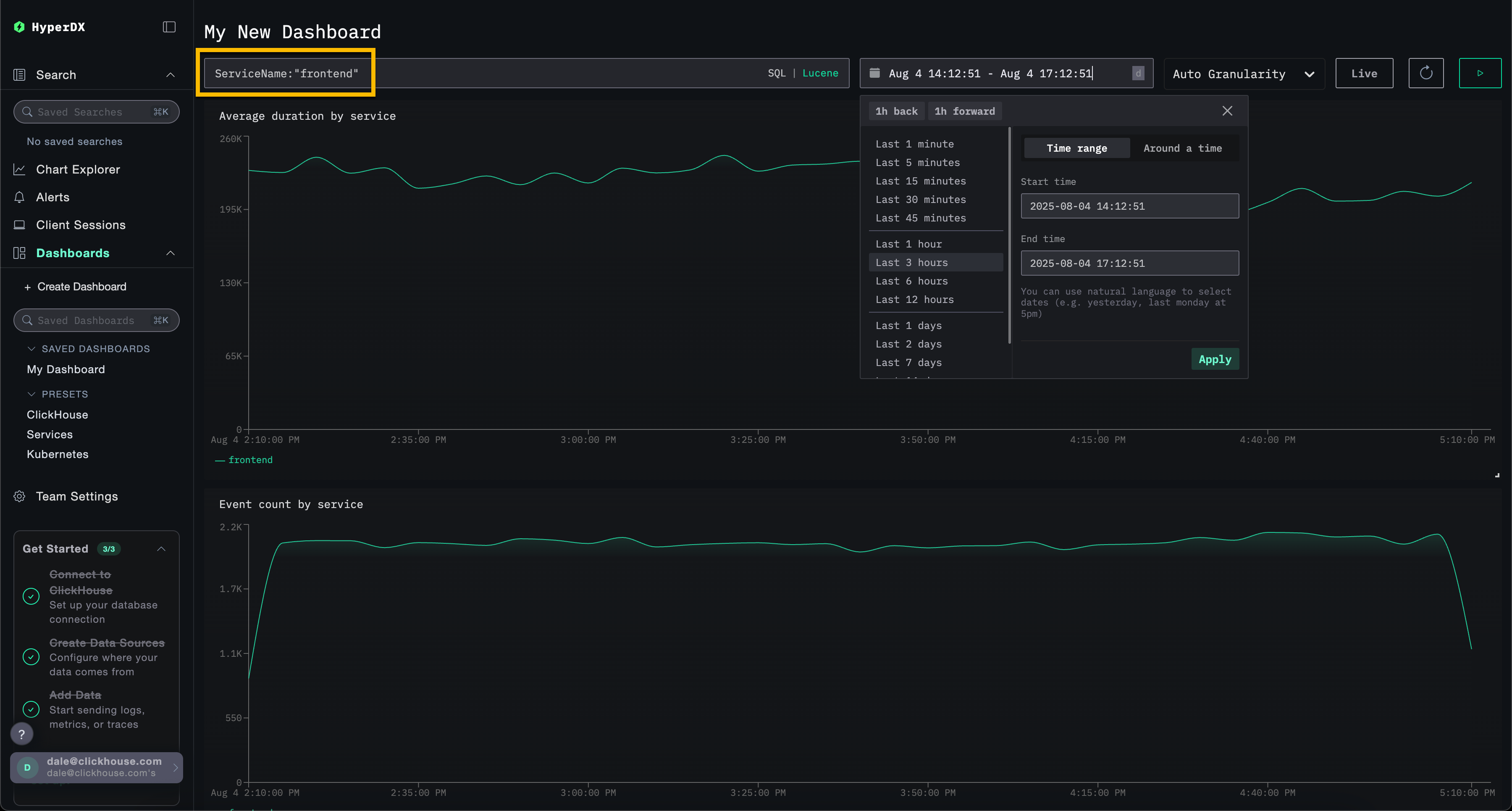
Для демонстрации примените Lucene-фильтр ServiceName:"frontend" к панели мониторинга и измените окно времени на период за последние 3 часа. Обратите внимание, что визуализации теперь отражают данные только сервиса frontend.
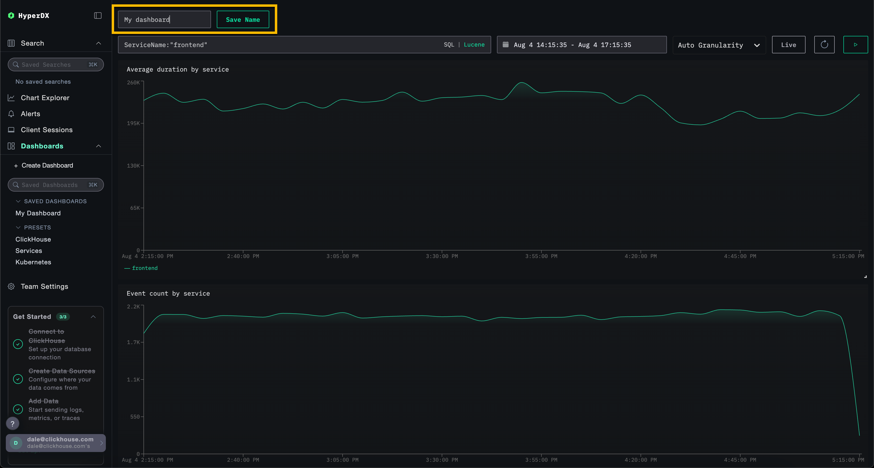
Панель мониторинга будет сохранена автоматически. Чтобы задать имя панели мониторинга, выберите заголовок и измените его, после чего нажмите Save Name.
Панели мониторинга — редактирование визуализаций
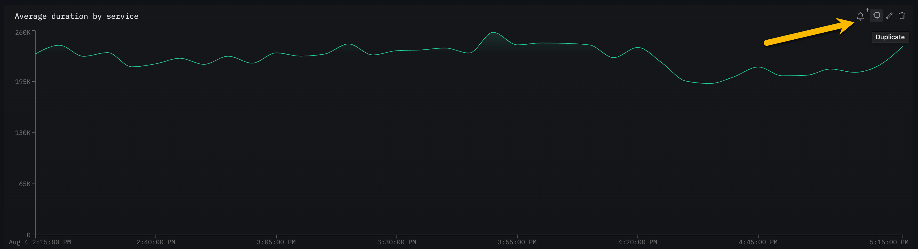
Чтобы удалить, отредактировать или продублировать визуализацию, наведите на неё курсор мыши и используйте соответствующие кнопки.
Панели мониторинга — список и поиск
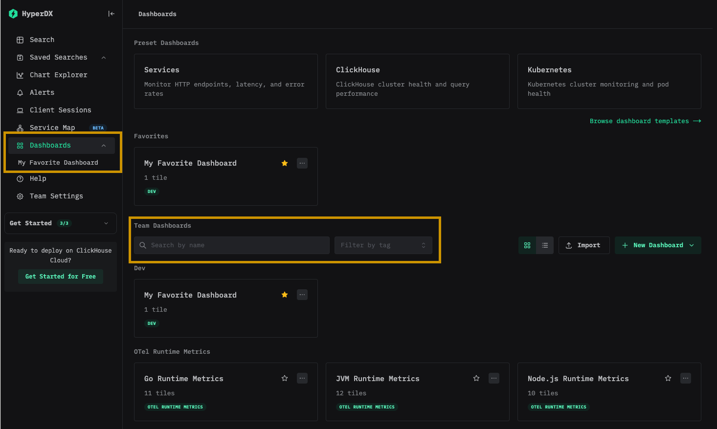
Панели мониторинга доступны на странице панелей мониторинга. Они сгруппированы по тегам; встроенные поиск и фильтрация позволяют быстро находить нужные панели мониторинга.
Панели мониторинга можно добавлять в избранное для быстрого доступа на боковой панели и в верхней части страницы со списком. Избранное индивидуально для каждого пользователя.
Панели мониторинга — назначение тегов
Вы можете добавлять теги к дашбордам и сохранённым поисковым запросам, чтобы упростить их организацию. Теги — это гибкий инструмент для классификации и фильтрации в соответствии с вашими потребностями.
Как работают теги
- Организация: Теги отображаются в левой панели, где дашборды и сохранённые поисковые запросы группируются по назначенным тегам
- Несколько тегов: Вы можете добавить один или несколько тегов к одному объекту для более точной категоризации
- Автоматическое создание: Если вы назначите тег, которого ещё не существует, он будет создан автоматически
- Простое управление: Вы можете добавлять или удалять теги в любое время, чтобы изменять структуру организации рабочего пространства
Это упрощает поиск связанных объектов и поддержание организованного рабочего пространства по мере роста вашей коллекции.
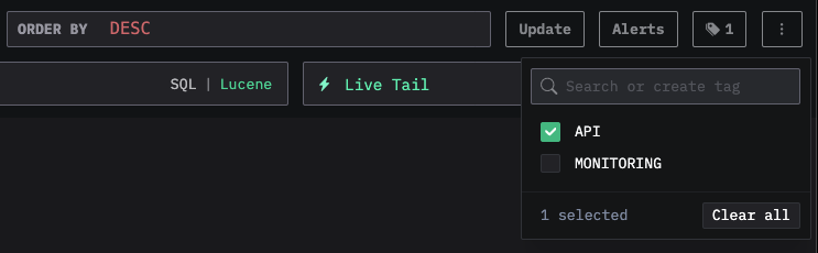
Вы также можете выбрать несколько тегов, чтобы фильтровать и просматривать объекты в разных категориях:
Пользовательские фильтры
Помимо текстовых фильтров, доступных на всех панелях мониторинга, сохраненные панели мониторинга поддерживают пользовательские выпадающие фильтры, которые заполняются данными из ClickHouse. Это удобные, многократно используемые элементы управления фильтрацией, позволяющие пользователям панели мониторинга фильтровать данные без ручного ввода выражений.
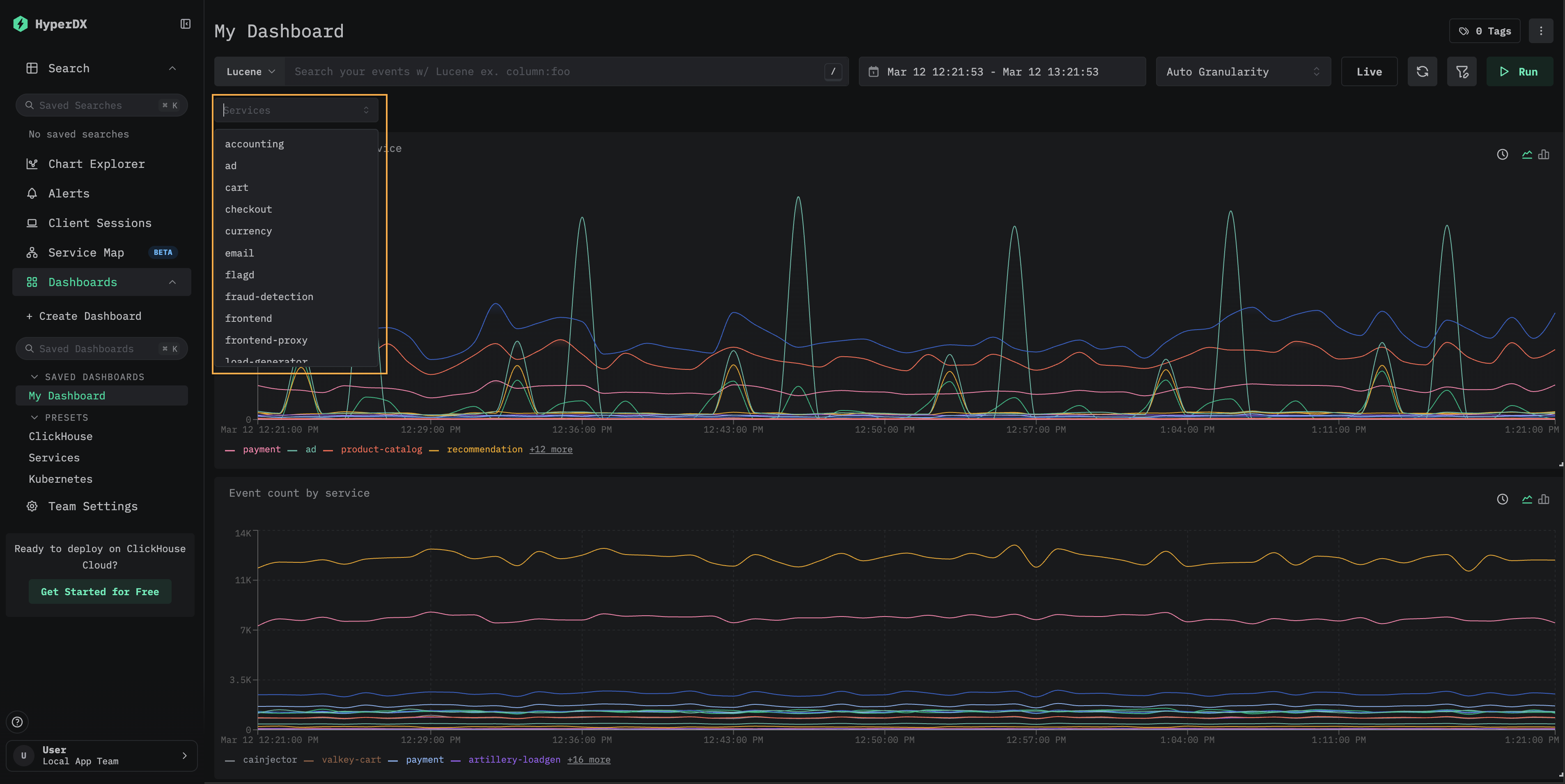
Следующие шаги показывают, как добавить пользовательский фильтр на панель мониторинга, созданную в разделе "Создание панелей мониторинга".
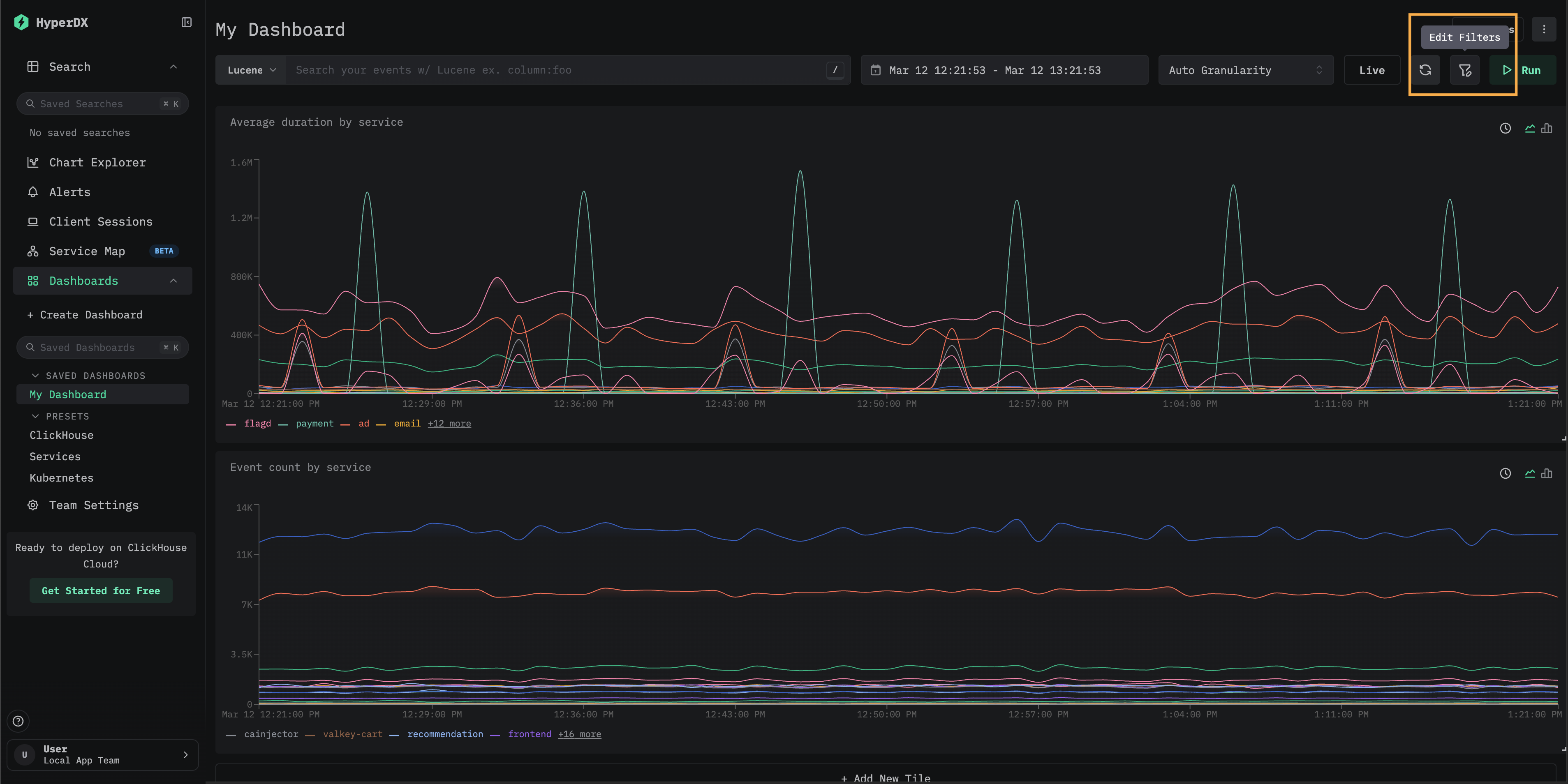
Откройте диалоговое окно Edit Filters
Откройте сохраненную панель мониторинга и выберите Edit Filters на панели инструментов.
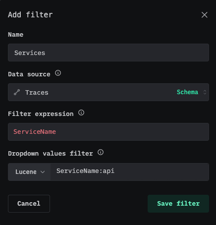
Добавьте новый фильтр
Нажмите Add new filter. Настройте фильтр: укажите Name, выберите Data source и введите Filter expression — SQL-столбец или выражение, уникальные значения которого будут заполнять выпадающий список. Затем нажмите Save filter.
Например, чтобы добавить фильтр сервисов для данных трейсов, используйте ServiceName в качестве выражения фильтра и источник данных Traces. Поле "Dropdown values filter" необязательно и позволяет ограничить, какие значения будут отображаться в выпадающем списке.
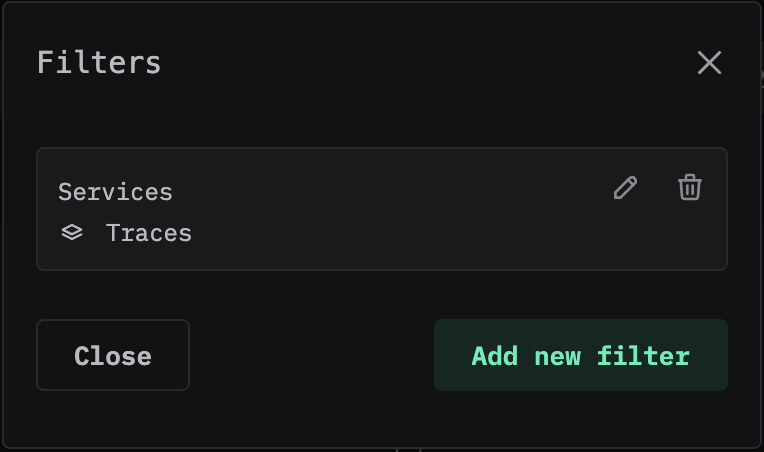
Модальное окно Filters показывает все настроенные фильтры для панели мониторинга. Здесь можно изменить или удалить существующие фильтры, а также добавить новые.
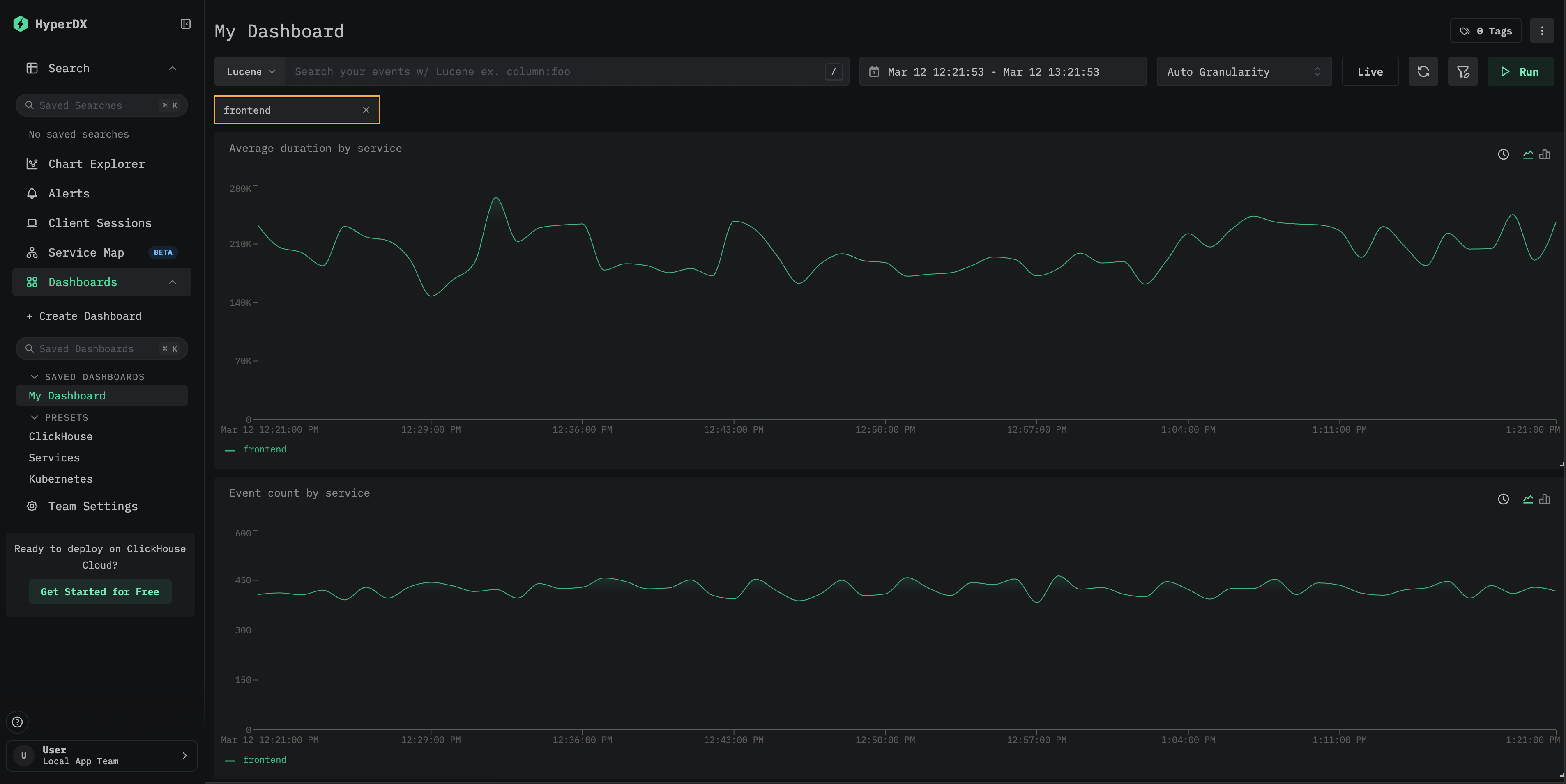
Используйте фильтр
Закройте модальное окно Filters. Новый выпадающий фильтр появится под строкой поиска. Нажмите на него, чтобы увидеть доступные значения, затем выберите одно из них, чтобы применить фильтрацию ко всем визуализациям на панели мониторинга.
(Необязательно) Сохраните значения фильтра по умолчанию
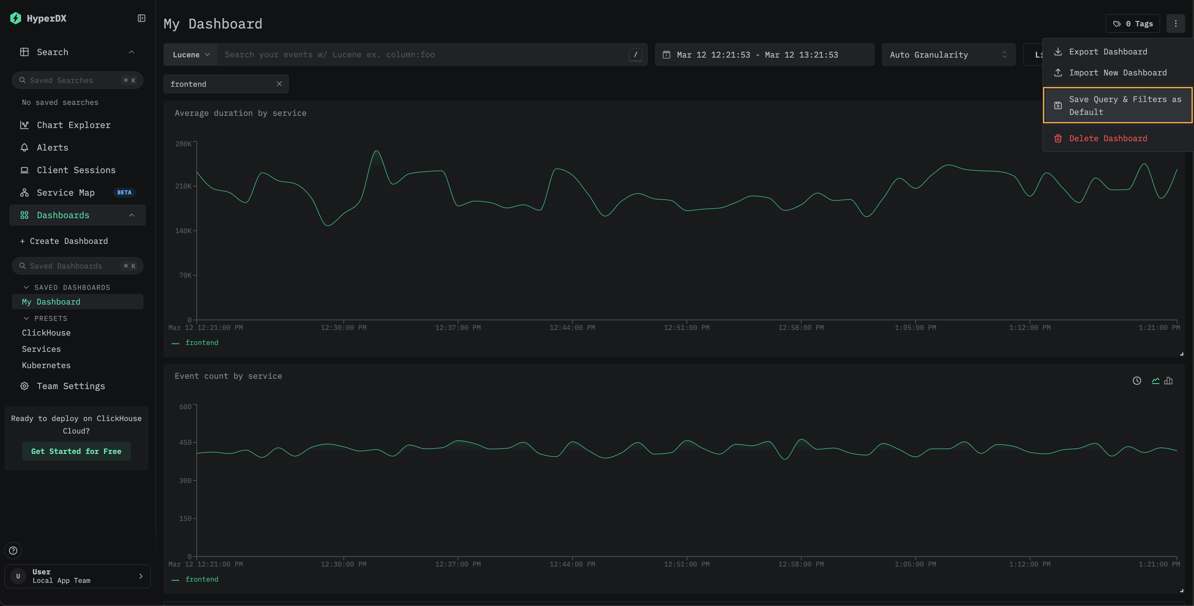
Чтобы сохранить выбранное значение фильтра как значение по умолчанию для панели мониторинга, выберите Save Query & Filters as Default в меню панели мониторинга. После этого панель мониторинга всегда будет открываться с примененными выбранными фильтрами. Чтобы сбросить это поведение, выберите Remove Default Query & Filters в том же меню.
Пользовательские выпадающие фильтры доступны в сохраненных панелях мониторинга. Пример такого подхода см. в панели мониторинга Kubernetes, где есть встроенные выпадающие фильтры для пода, Развертывания, имени узла, Пространства имен и кластера.
Переход к Search через детализацию
Плитки панели мониторинга поддерживают детализацию с переходом на страницу Search. Нажмите на точку данных на визуализации, чтобы открыть контекстное меню со следующими параметрами:
- View All Events — переход на страницу Search, где показаны все события из выбранного временного окна.
- Filter by group — переход на страницу Search с фильтрацией по конкретной серии.
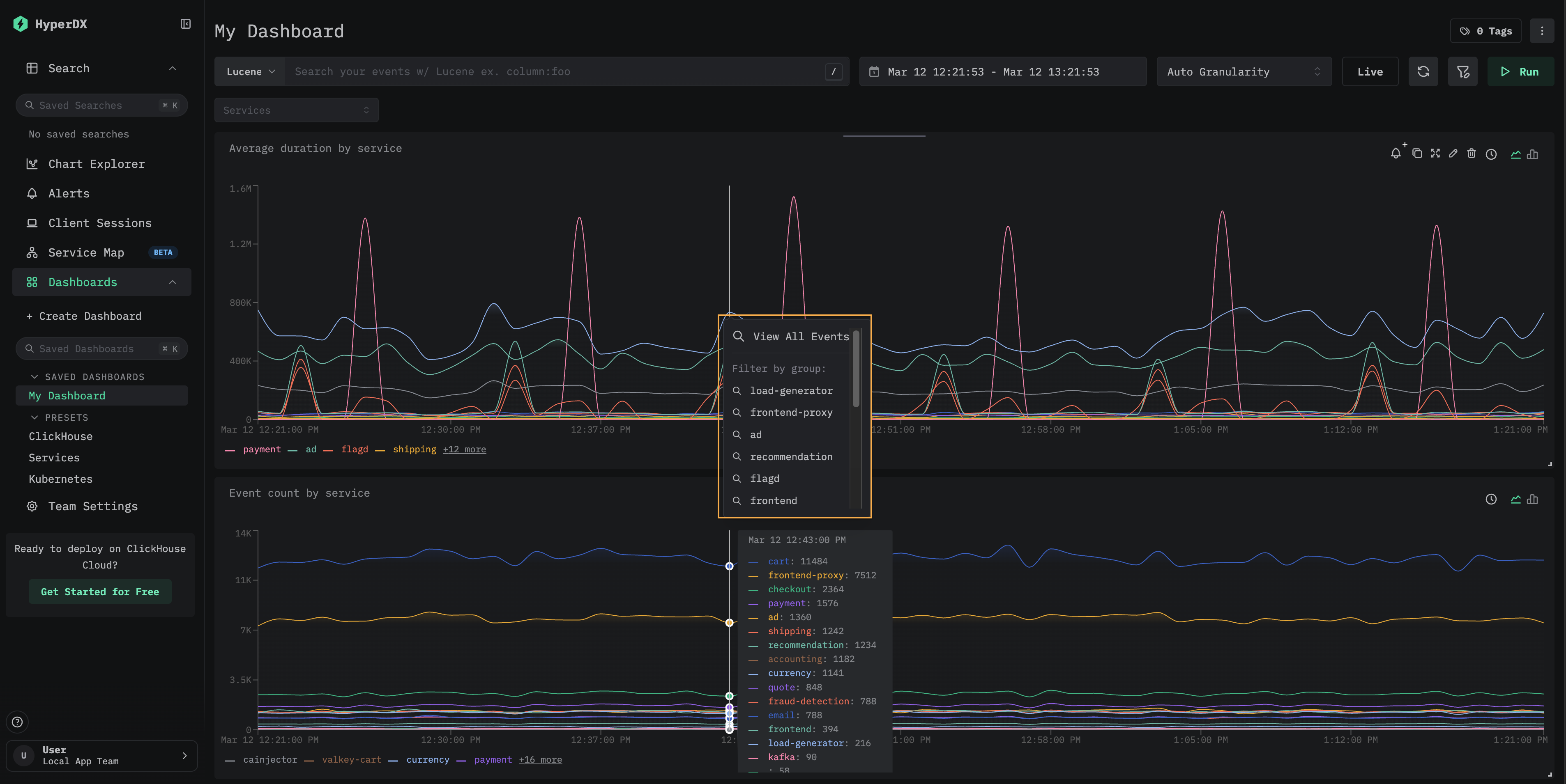
Это полезно при анализе отдельных всплесков или аномалий, замеченных на панели мониторинга: вы можете быстро перейти от агрегированного представления к лежащим в его основе отдельным событиям.
Пресеты
HyperDX разворачивается с преднастроенными дашбордами.
Дашборд ClickHouse
Этот дашборд содержит визуализации для мониторинга ClickHouse. Чтобы перейти к этому дашборду, выберите его в левом меню.
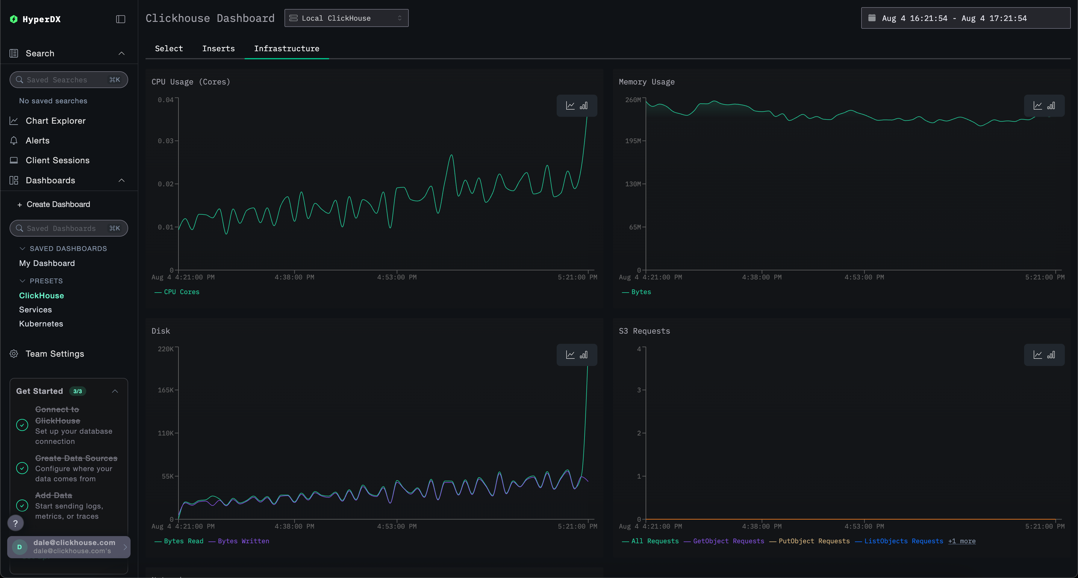
В этом дашборде используются вкладки для раздельного мониторинга Selects, Inserts и ClickHouse Infrastructure.
Этот дашборд выполняет запросы к системным таблицам ClickHouse для отображения ключевых метрик. Требуются следующие привилегии:
GRANT SHOW COLUMNS, SELECT(CurrentMetric_MemoryTracking, CurrentMetric_S3Requests, ProfileEvent_OSCPUVirtualTimeMicroseconds, ProfileEvent_OSReadChars, ProfileEvent_OSWriteChars, ProfileEvent_S3GetObject, ProfileEvent_S3ListObjects, ProfileEvent_S3PutObject, ProfileEvent_S3UploadPart, event_time) ON system.metric_log
GRANT SHOW COLUMNS, SELECT(active, database, partition, rows, table) ON system.parts
GRANT SHOW COLUMNS, SELECT(event_date, event_time, memory_usage, normalized_query_hash, query, query_duration_ms, query_kind, read_rows, tables, type, written_bytes, written_rows) ON system.query_log
GRANT SHOW COLUMNS, SELECT(event_date, event_time, hostname, metric, value) ON system.transposed_metric_log
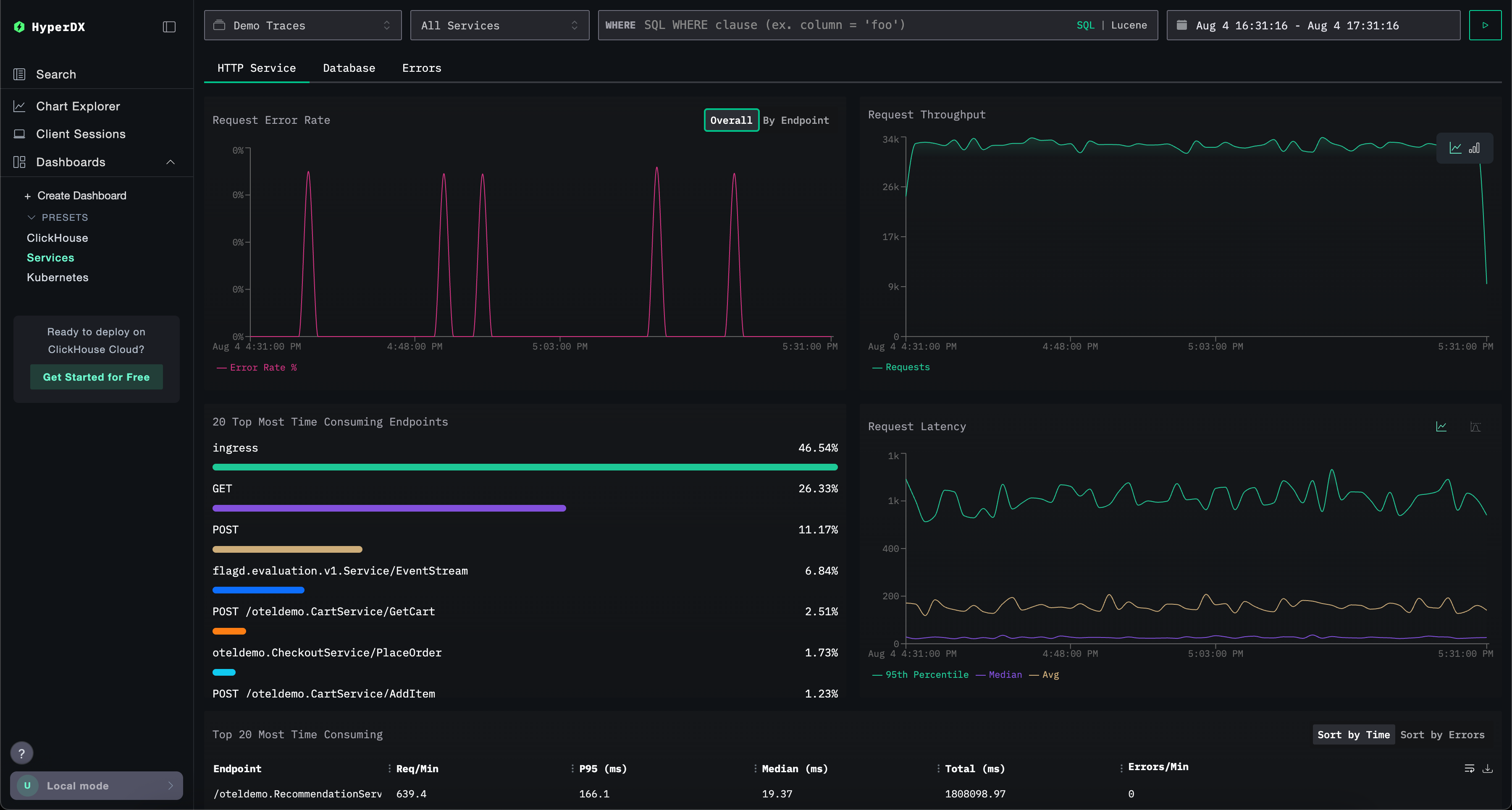
Панель мониторинга Services
Панель мониторинга Services отображает активные в данный момент сервисы на основе данных трейсов. Для этого необходимо собрать трейсы и настроить корректный источник данных Traces.
Имена сервисов автоматически определяются из данных трейсов, при этом используется набор преднастроенных визуализаций, сгруппированных по трём вкладкам: HTTP Services, Database и Errors.
Визуализации можно фильтровать с использованием синтаксиса Lucene или SQL, а временной интервал можно изменять для более детального анализа.
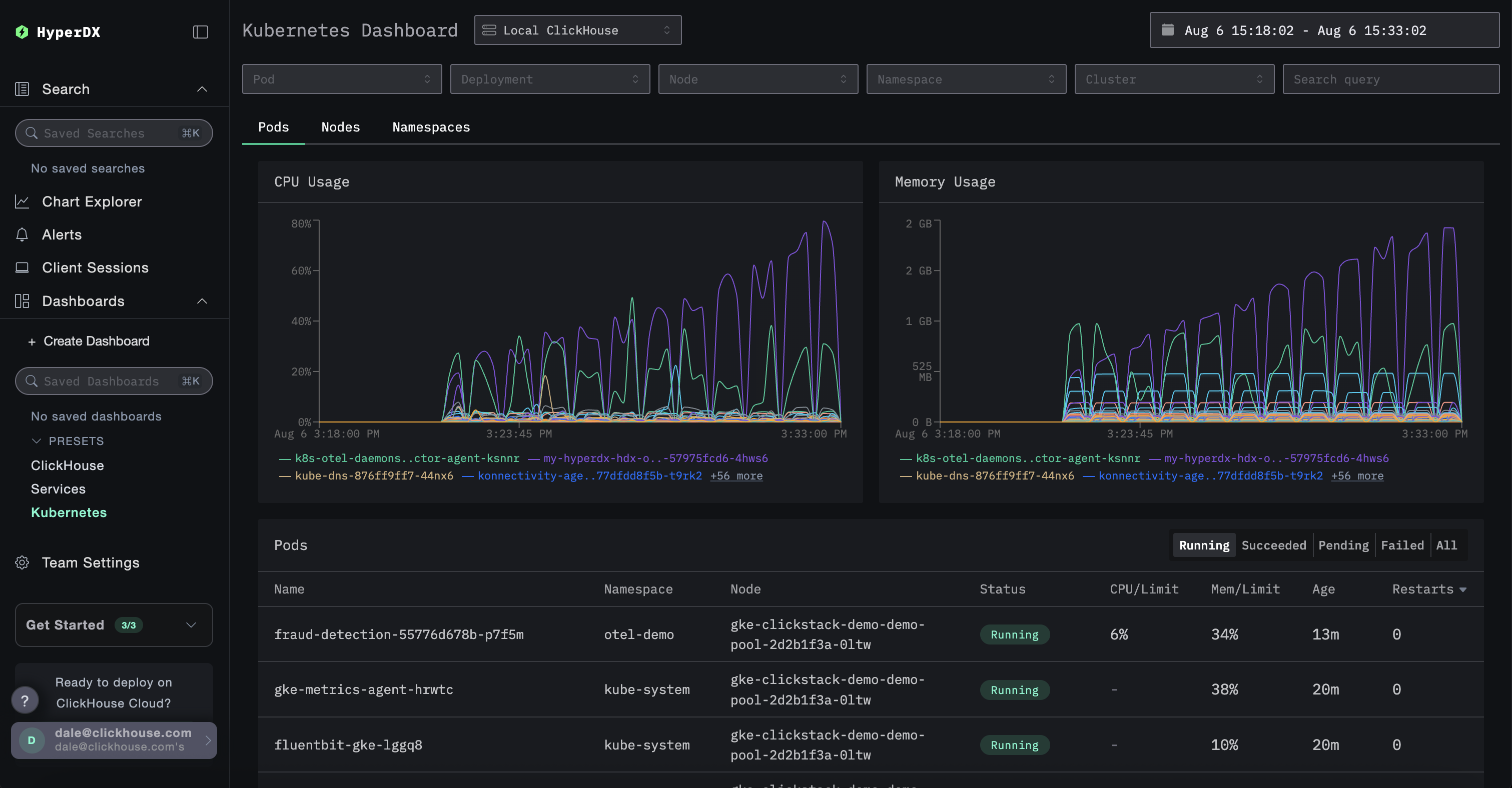
Панель Kubernetes
Эта панель позволяет вам исследовать события Kubernetes, собранные с помощью OpenTelemetry. Она предоставляет расширенные возможности фильтрации: можно отфильтровывать события по поду Kubernetes, развертыванию, имени узла, пространству имен и кластеру, а также выполнять полнотекстовый поиск.
Данные Kubernetes сгруппированы на трех вкладках для удобной навигации: Поды, Узлы и Пространства имен.