Исследование данных с помощью ноутбуков Marimo и chDB
В этом руководстве вы узнаете, как исследовать набор данных в ClickHouse Cloud в ноутбуке Marimo с помощью chDB — быстрого внутрипроцессного SQL OLAP-движка на базе ClickHouse.
Предварительные требования:
- Python 3.8 или выше
- виртуальное окружение
- работающий сервис ClickHouse Cloud и ваши данные для подключения
Если у вас ещё нет аккаунта ClickHouse Cloud, вы можете зарегистрироваться и оформить пробную подписку, получив $300 в виде бесплатных кредитов для начала работы.
Чему вы научитесь:
- Подключаться к ClickHouse Cloud из ноутбуков Marimo с использованием chDB
- Выполнять запросы к удалённым наборам данных и преобразовывать результаты в объекты DataFrame библиотеки Pandas
- Визуализировать данные с помощью Plotly в Marimo
- Использовать реактивную модель выполнения Marimo для интерактивного исследования данных
Мы будем использовать набор данных UK Property Price, который доступен в ClickHouse Cloud как один из стартовых наборов данных. Он содержит данные о ценах, по которым дома продавались в Соединённом Королевстве с 1995 по 2024 год.
Настройка
Загрузка набора данных
Чтобы добавить этот набор данных в существующий сервис ClickHouse Cloud, войдите на console.clickhouse.cloud с использованием данных своей учётной записи.
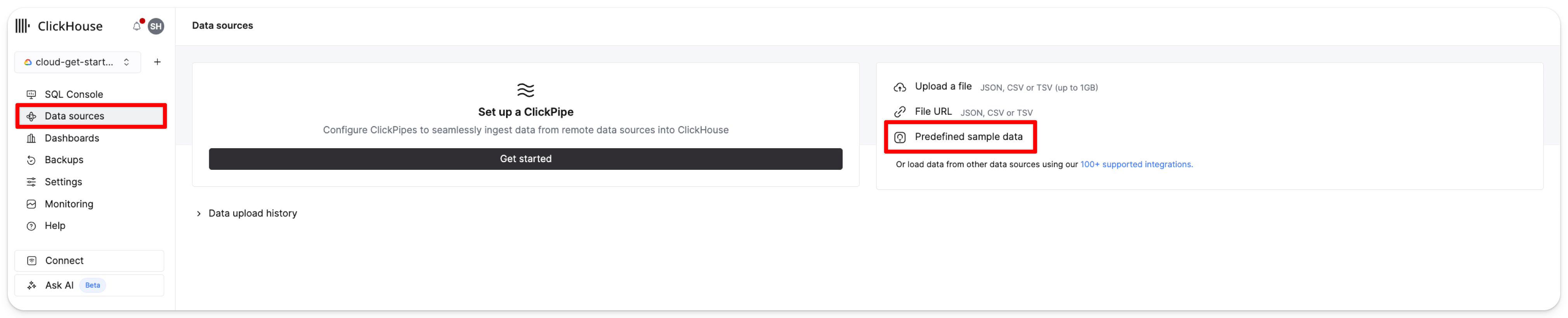
В меню слева нажмите Data sources. Затем нажмите Predefined sample data:
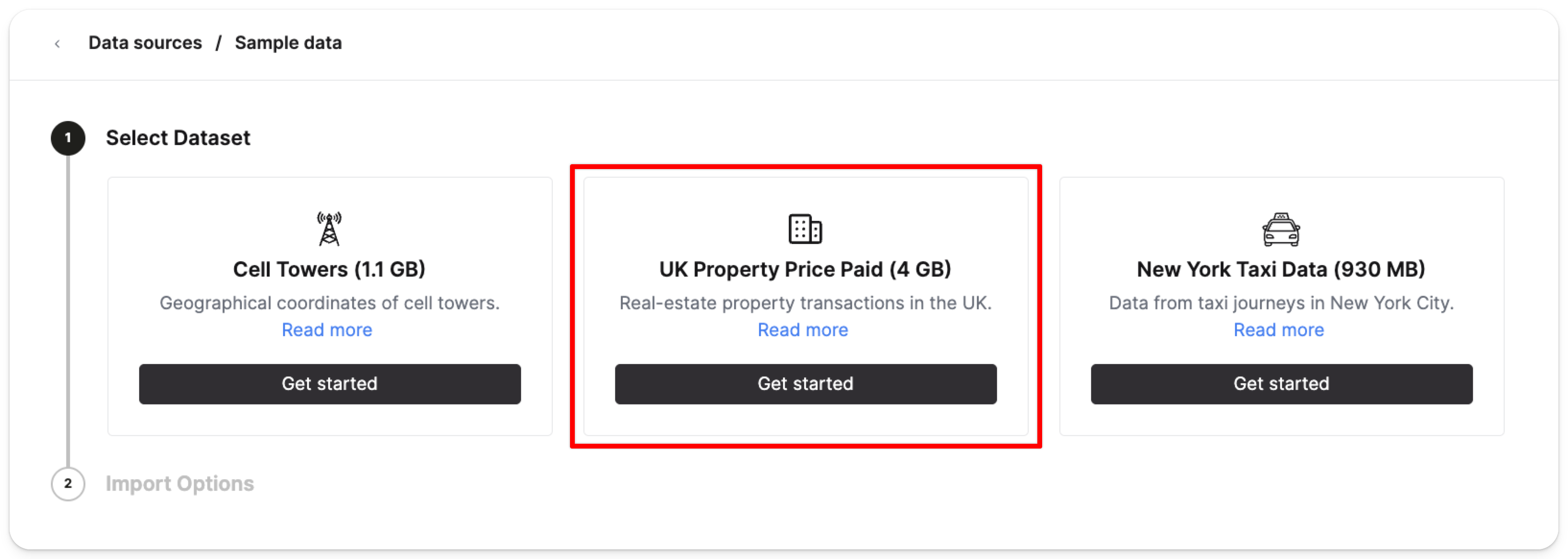
Выберите Get started в карточке UK property price paid data (4GB):
Затем нажмите Import dataset:
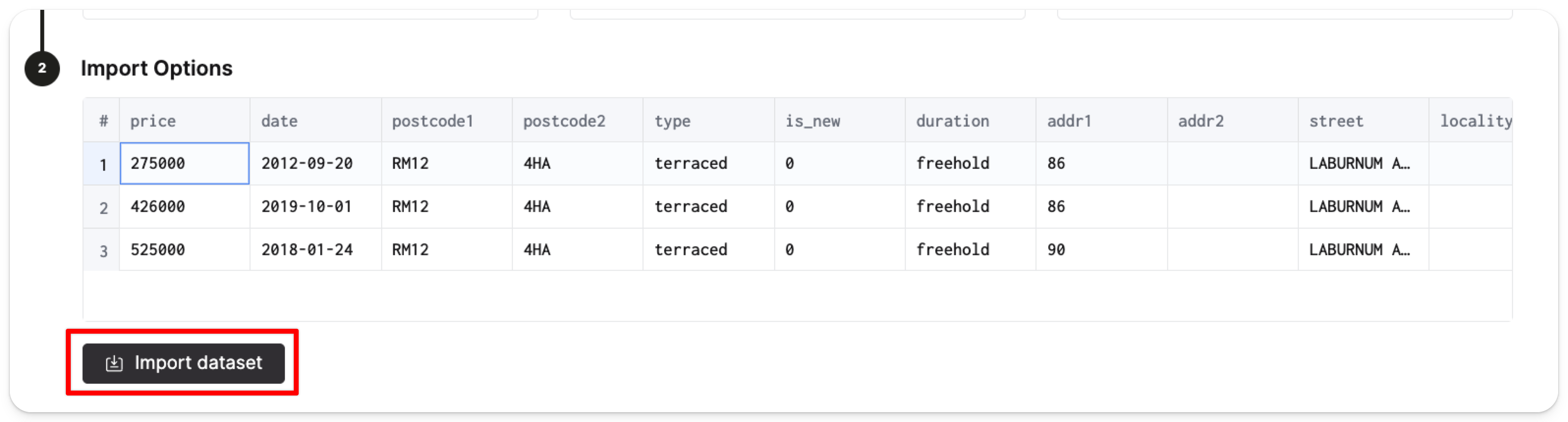
ClickHouse автоматически создаст таблицу pp_complete в базе данных default и заполнит таблицу 28,92 миллионами строк ценовых данных.
Чтобы снизить вероятность раскрытия ваших учётных данных, мы рекомендуем добавить имя пользователя и пароль ClickHouse Cloud в виде переменных окружения на локальной машине. В терминале выполните следующую команду, чтобы добавить имя пользователя и пароль как переменные окружения:
Настройка учётных данных
Переменные окружения, указанные выше, сохраняются только на время текущего сеанса терминала. Чтобы сделать их постоянными, добавьте их в конфигурационный файл вашей оболочки.
Установка Marimo
Теперь активируйте ваше виртуальное окружение. Находясь в виртуальном окружении, установите следующие пакеты, которые мы будем использовать в этом руководстве:
Создайте новый ноутбук Marimo с помощью следующей команды:
В новом окне браузера должен открыться интерфейс Marimo по адресу localhost:2718:
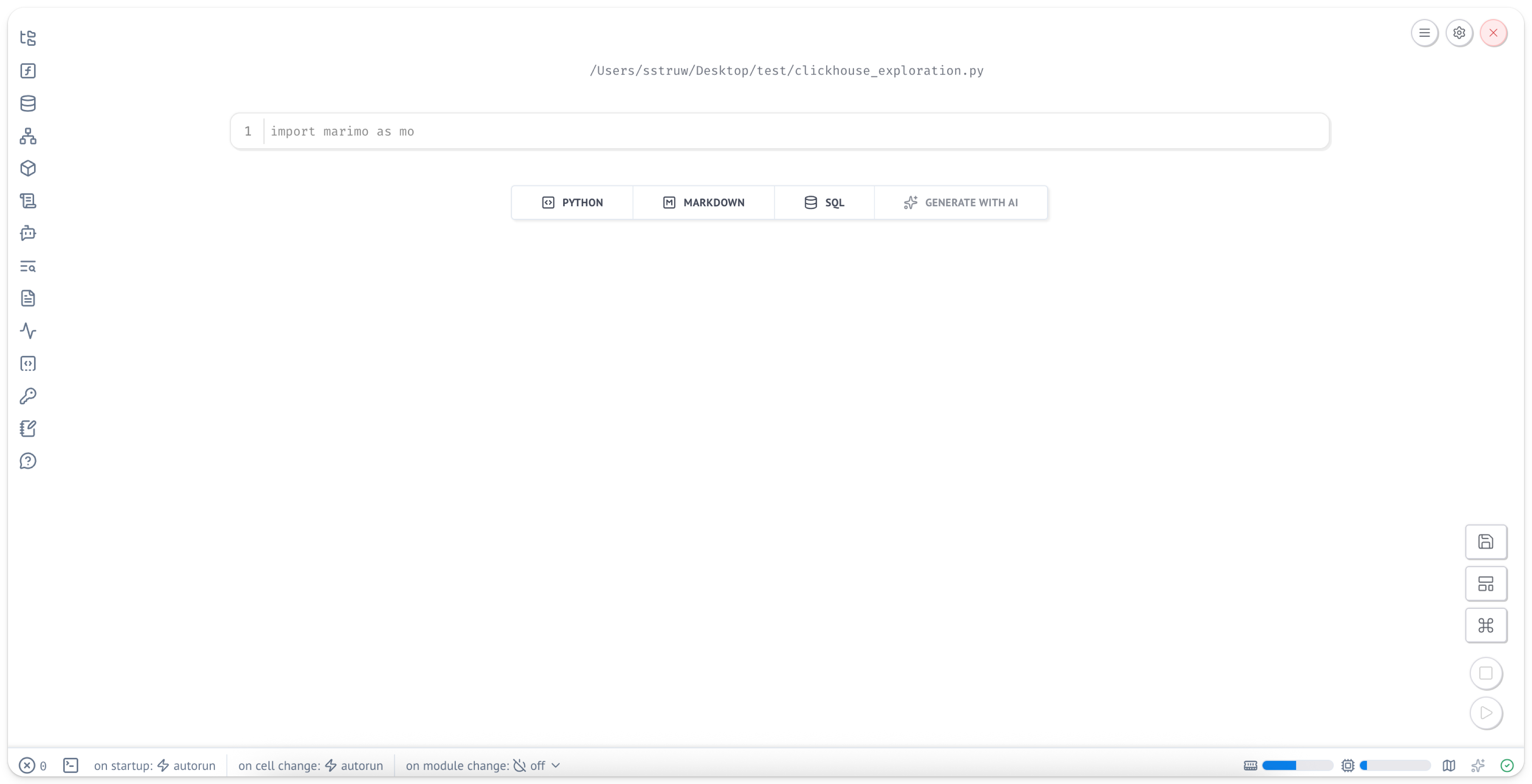
Ноутбуки Marimo представляют собой обычные файлы Python, поэтому их легко размещать в системах контроля версий и делиться ими с другими.
Установка зависимостей
В новой ячейке импортируйте необходимые пакеты:
Если вы наведёте курсор мыши на ячейку, вы увидите, что появляются два кружка с символом «+». Вы можете нажать на них, чтобы добавить новые ячейки.
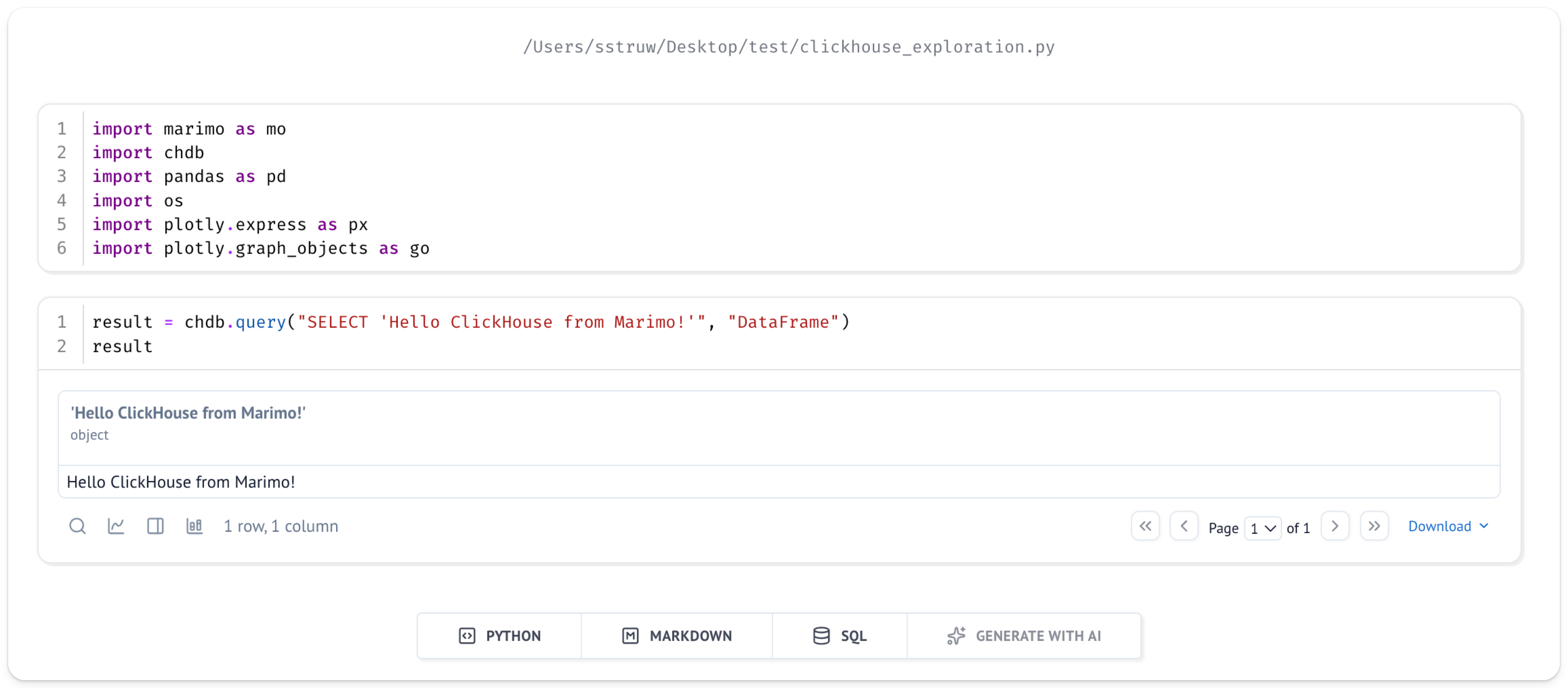
Добавьте новую ячейку и выполните простой запрос, чтобы убедиться, что всё настроено правильно:
Под ячейкой, которую вы только что запустили, должен появиться результат:
Исследование данных
После того как мы настроили набор данных UK price paid и запустили chDB в блокноте Marimo, можно приступать к исследованию данных.
Представим, что нас интересует, как изменялась цена со временем для определённого района в Великобритании, например столицы — Лондона.
Функция ClickHouse remoteSecure позволяет легко получать данные из ClickHouse Cloud.
Вы можете указать chDB вернуть эти данные напрямую в виде фрейма данных Pandas — это удобный и хорошо знакомый способ работы с данными.
Выполнение запросов к данным в ClickHouse Cloud
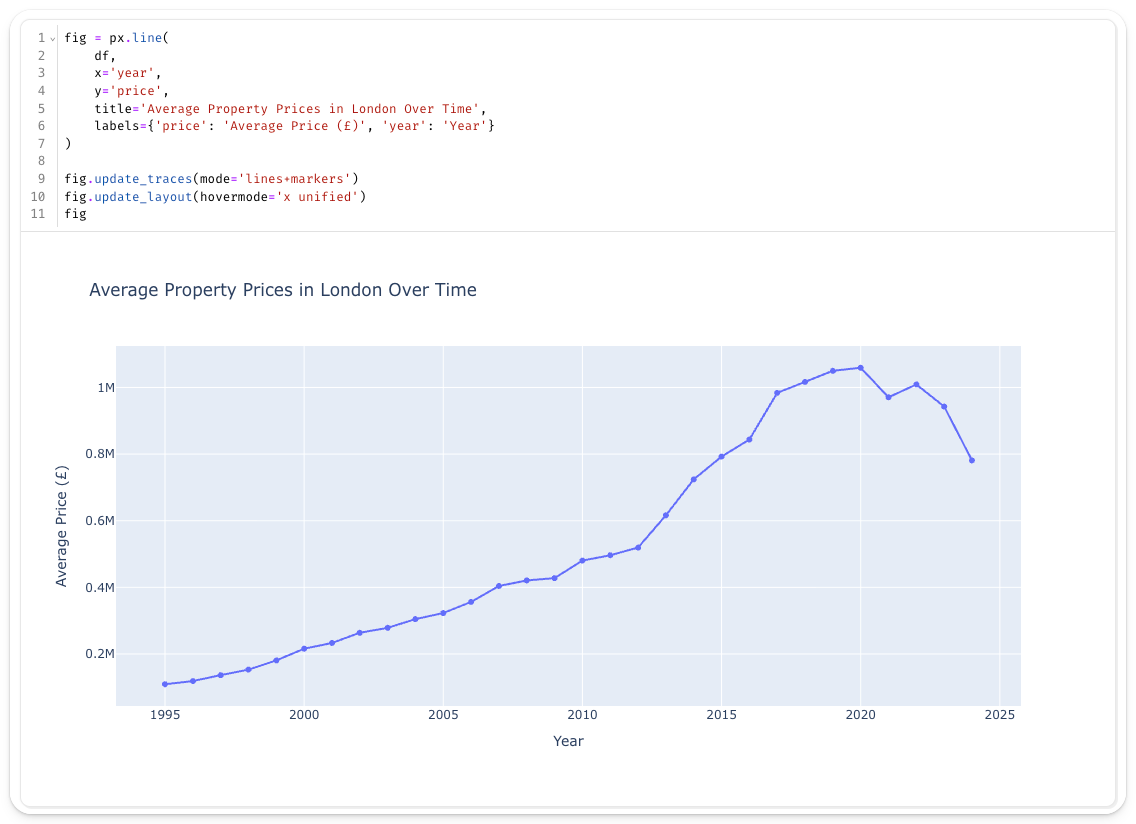
Создайте новую ячейку со следующим запросом, чтобы получить данные UK price paid из вашего сервиса ClickHouse Cloud и преобразовать их в pandas.DataFrame:
В приведённом выше фрагменте chdb.query(query, "DataFrame") выполняет указанный запрос и выводит результат в виде Pandas DataFrame.
В запросе мы используем функцию remoteSecure для подключения к ClickHouse Cloud.
Функция remoteSecure принимает в качестве параметров:
- строку подключения
- имя базы данных и таблицы
- ваше имя пользователя
- ваш пароль
В целях безопасности рекомендуется использовать переменные окружения для параметров имени пользователя и пароля, а не указывать их непосредственно в функции, хотя при необходимости это возможно.
Функция remoteSecure подключается к удалённому сервису ClickHouse Cloud, выполняет запрос и возвращает результат.
В зависимости от объёма ваших данных это может занять несколько секунд.
В данном случае мы возвращаем среднюю цену за год и фильтруем по town='LONDON'.
Затем результат сохраняется как DataFrame в переменной df.
Визуализация данных
Теперь, когда данные доступны нам в привычной форме, давайте посмотрим, как со временем изменялись цены на недвижимость в Лондоне.
Marimo особенно хорошо работает с интерактивными библиотеками визуализации, такими как Plotly. В новой ячейке создайте интерактивный график:
Вполне ожидаемо, что со временем цены на недвижимость в Лондоне значительно выросли.
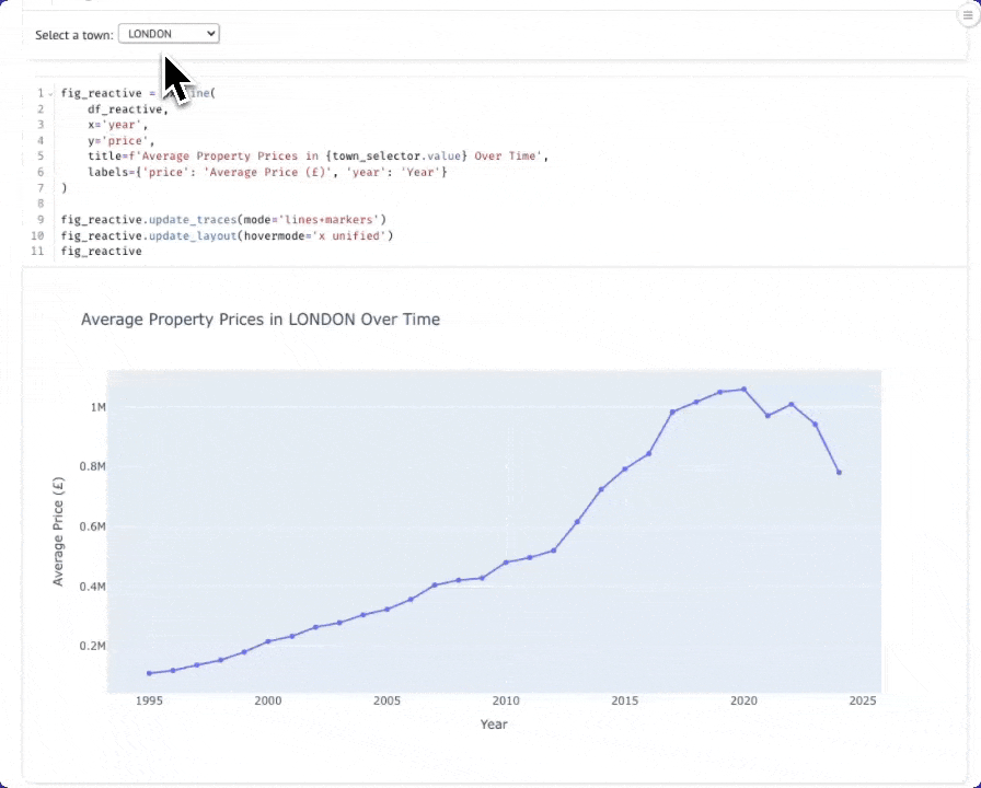
Одна из сильных сторон Marimo — её реактивная модель исполнения. Давайте создадим интерактивный виджет для динамического выбора городов.
Интерактивный выбор города
В новой ячейке создайте выпадающий список для выбора городов:
В другой ячейке создайте запрос, который реагирует на выбор города. Когда вы измените значение в выпадающем списке, эта ячейка будет выполняться повторно автоматически:
Теперь создайте диаграмму, которая будет автоматически обновляться при смене города. Вы можете переместить диаграмму выше динамического датафрейма, чтобы она располагалась под ячейкой с выпадающим списком.
Теперь при выборе города из выпадающего списка график будет динамически обновляться:
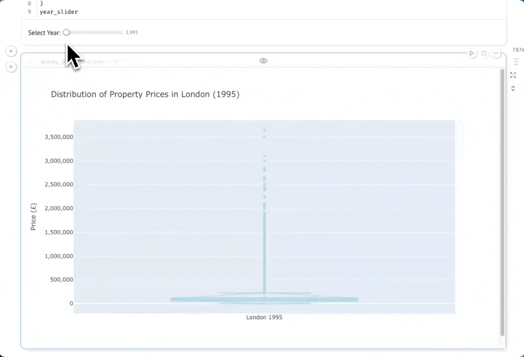
Изучение распределения цен с помощью интерактивных коробчатых диаграмм
Давайте глубже изучим данные, рассмотрев распределение цен на недвижимость в Лондоне по разным годам. Коробчатая диаграмма (box-and-whisker plot) покажет медиану, квартили и выбросы, давая гораздо более полное представление, чем просто средняя цена. Сначала создадим ползунок выбора года, который позволит нам интерактивно исследовать данные за разные годы:
В новой ячейке добавьте следующее:
Теперь давайте запросим цены отдельных объектов недвижимости за выбранный год. Обратите внимание, что мы здесь не выполняем агрегацию — нам нужны все отдельные сделки, чтобы построить наше распределение:
Если вы выберете кнопку параметров в правом верхнем углу ячейки, вы сможете скрыть код. По мере того как вы перемещаете ползунок, график будет автоматически обновляться благодаря реактивному выполнению Marimo:
Итоги
В этом руководстве было показано, как использовать chDB для исследования данных в ClickHouse Cloud с помощью ноутбуков Marimo.
На примере набора данных UK Property Price мы продемонстрировали, как выполнять запросы к удалённым данным ClickHouse Cloud с помощью функции remoteSecure() и преобразовывать результаты непосредственно в DataFrame библиотеки Pandas для анализа и визуализации.
Благодаря chDB и реактивной модели выполнения Marimo дата-сайентисты могут использовать мощные возможности SQL в ClickHouse вместе с привычными инструментами Python, такими как Pandas и Plotly, с дополнительным преимуществом интерактивных виджетов и автоматического отслеживания зависимостей, что делает исследовательский анализ более эффективным и воспроизводимым.
