Цель: создайте свою первую панель мониторинга с Rocket.BI
В этом руководстве вы установите Rocket.BI и создадите простую панель мониторинга. Вот как выглядит эта панель мониторинга:
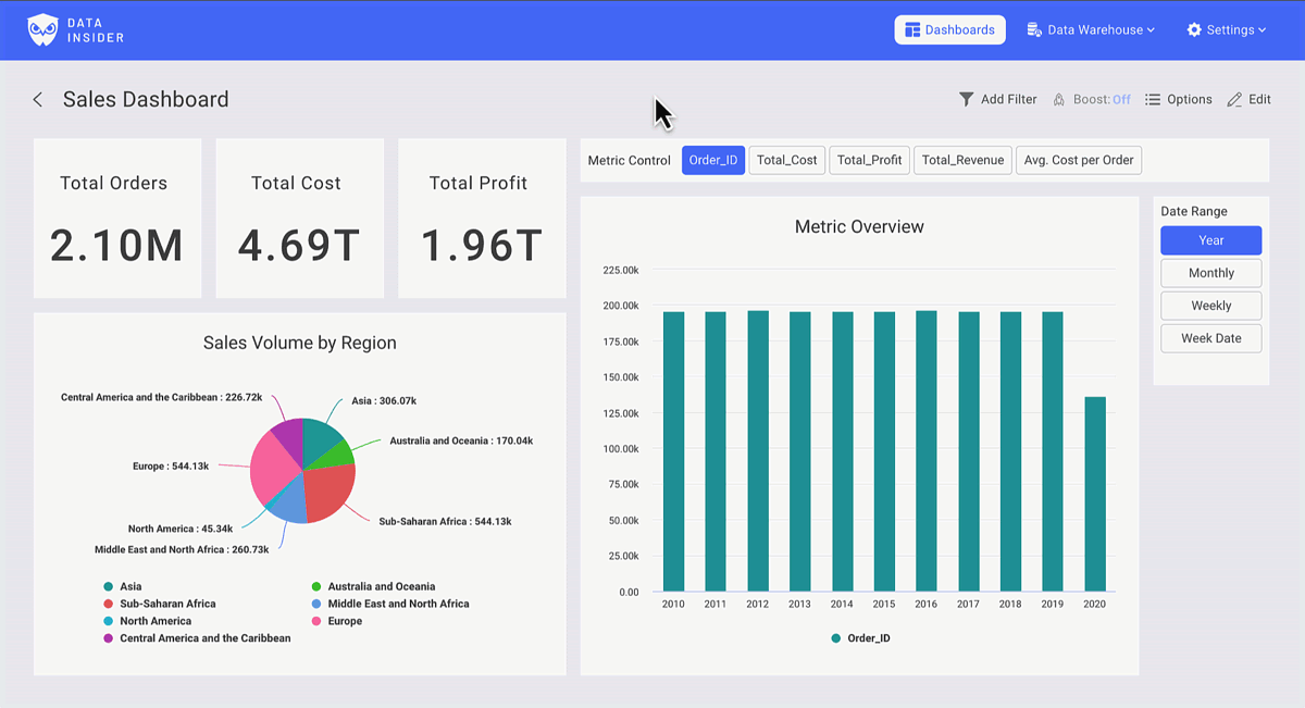
Вы можете посмотреть эту панель мониторинга по ссылке.
Установка
Запустите RocketBI с помощью наших готовых Docker-образов.
Скачайте docker-compose.yml и файл конфигурации:
Отредактируйте файл .clickhouse.env и добавьте информацию о сервере ClickHouse.
Запустите RocketBI командой: docker-compose up -d .
Откройте браузер, перейдите по адресу localhost:5050 и войдите, используя следующие учетные данные: hello@gmail.com/123456
Инструкции по сборке из исходного кода и расширенной настройке см. здесь: Rocket.BI Readme
Давайте создадим панель мониторинга
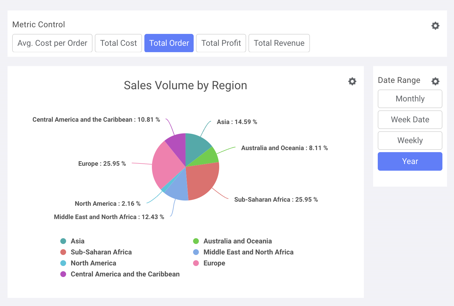
На вкладке Dashboard вы найдете свои отчеты и сможете начать визуализацию, нажав +New
Вы можете создавать неограниченное количество панелей мониторинга и добавлять неограниченное количество диаграмм на панель мониторинга.
Смотрите подробное руководство на YouTube: https://www.youtube.com/watch?v=TMkdMHHfvqY
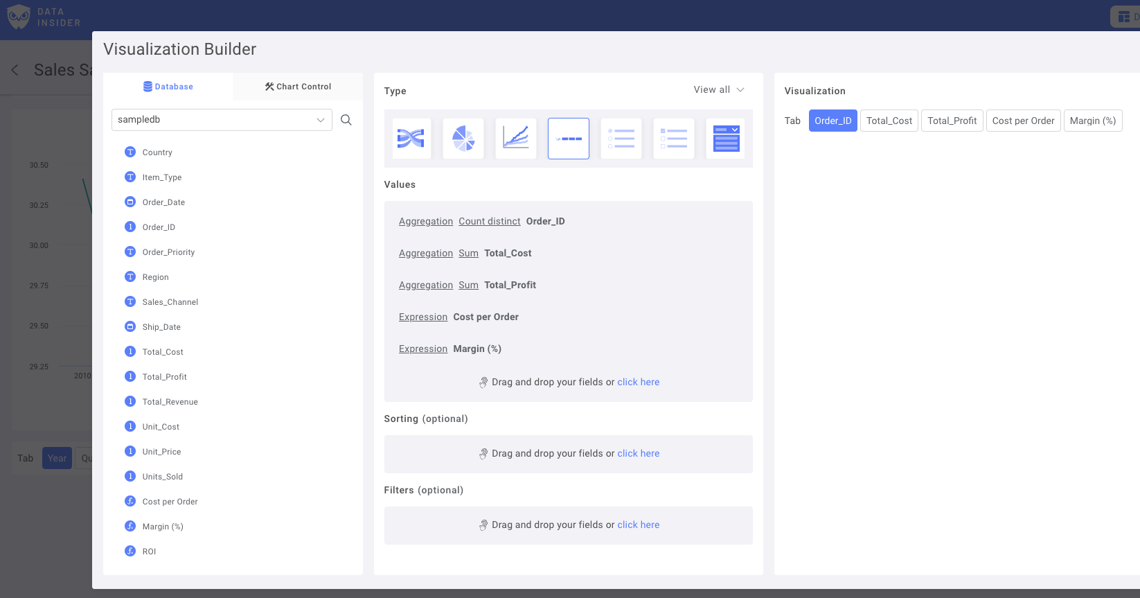
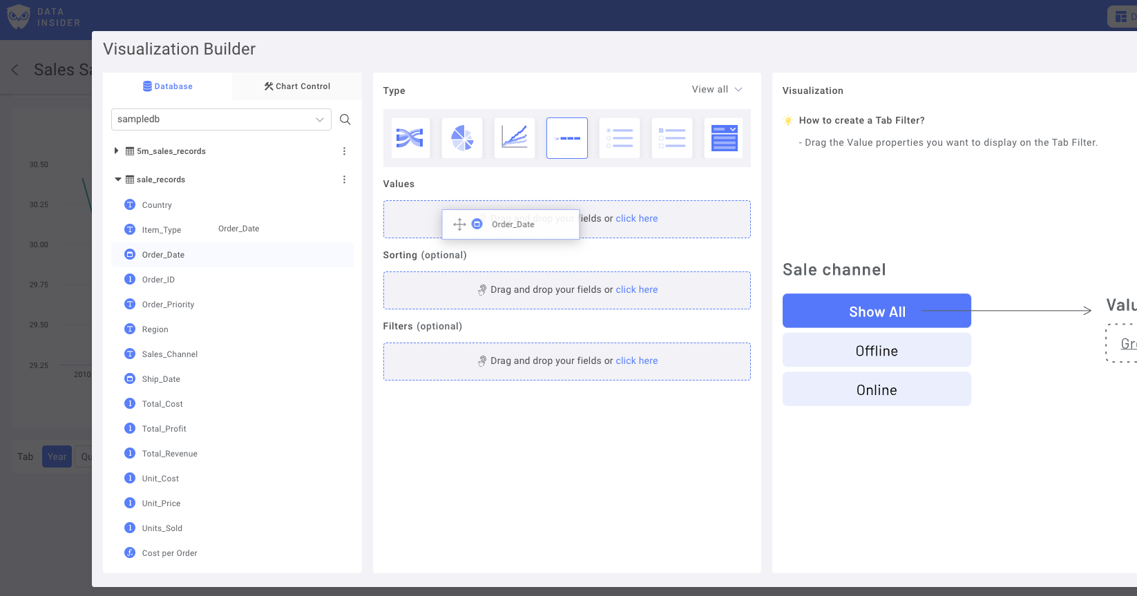
Создайте элементы управления для диаграммы
Создайте элемент управления метриками
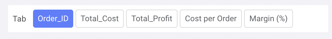
На вкладке Tab выберите поля метрик, которые хотите использовать. Убедитесь, что параметр агрегации задан правильно.
Переименуйте фильтры и сохраните элемент управления на панели мониторинга
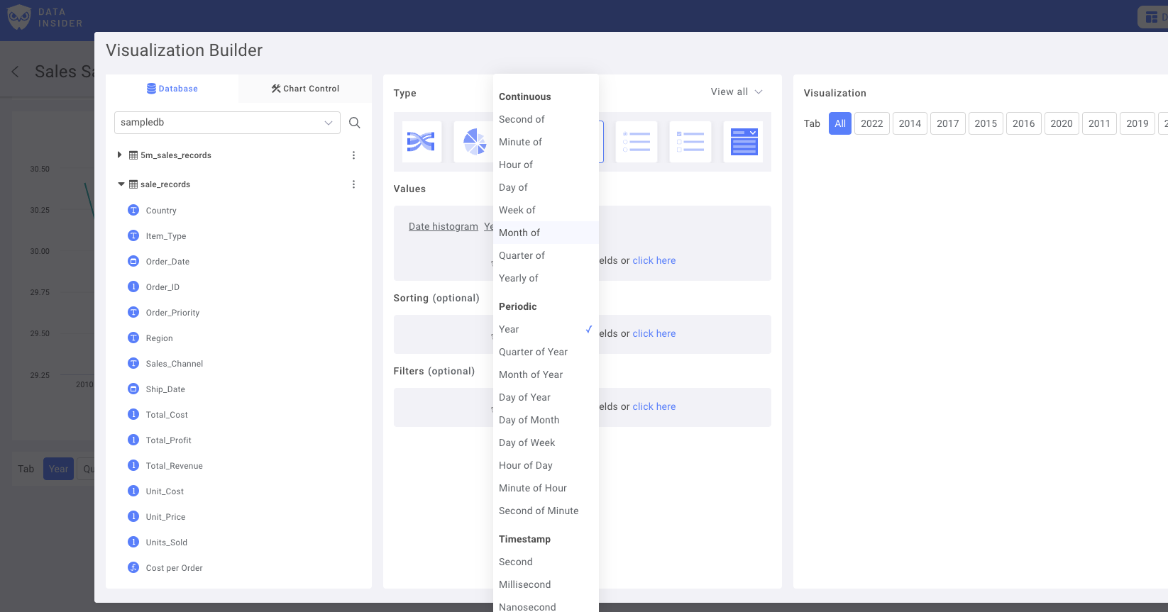
Создайте элемент управления типа «Дата»
Выберите поле даты в качестве основного столбца даты:
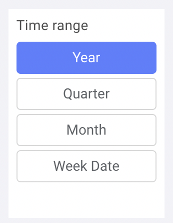
Добавьте дублирующиеся варианты с разными диапазонами. Например: Year, Monthly, Daily date или Day of Week.
Переименуйте фильтры и сохраните элемент управления на панели мониторинга
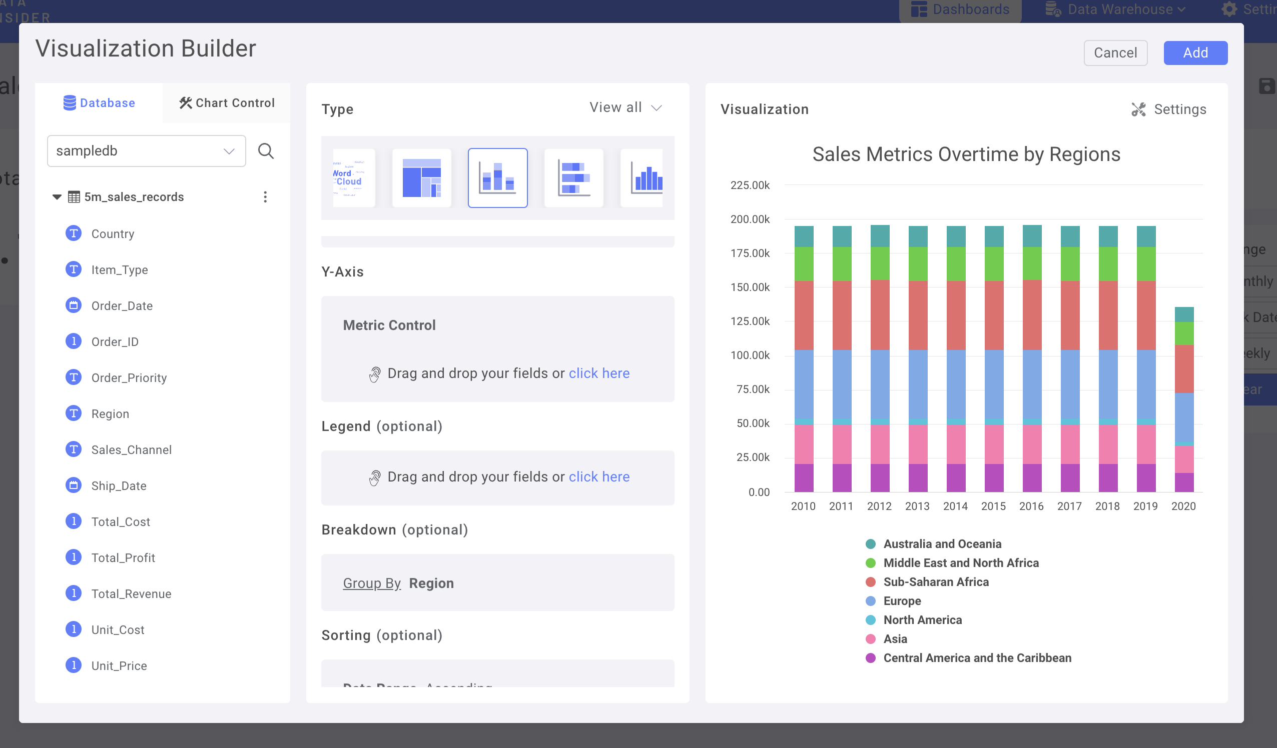
Теперь давайте создадим диаграммы
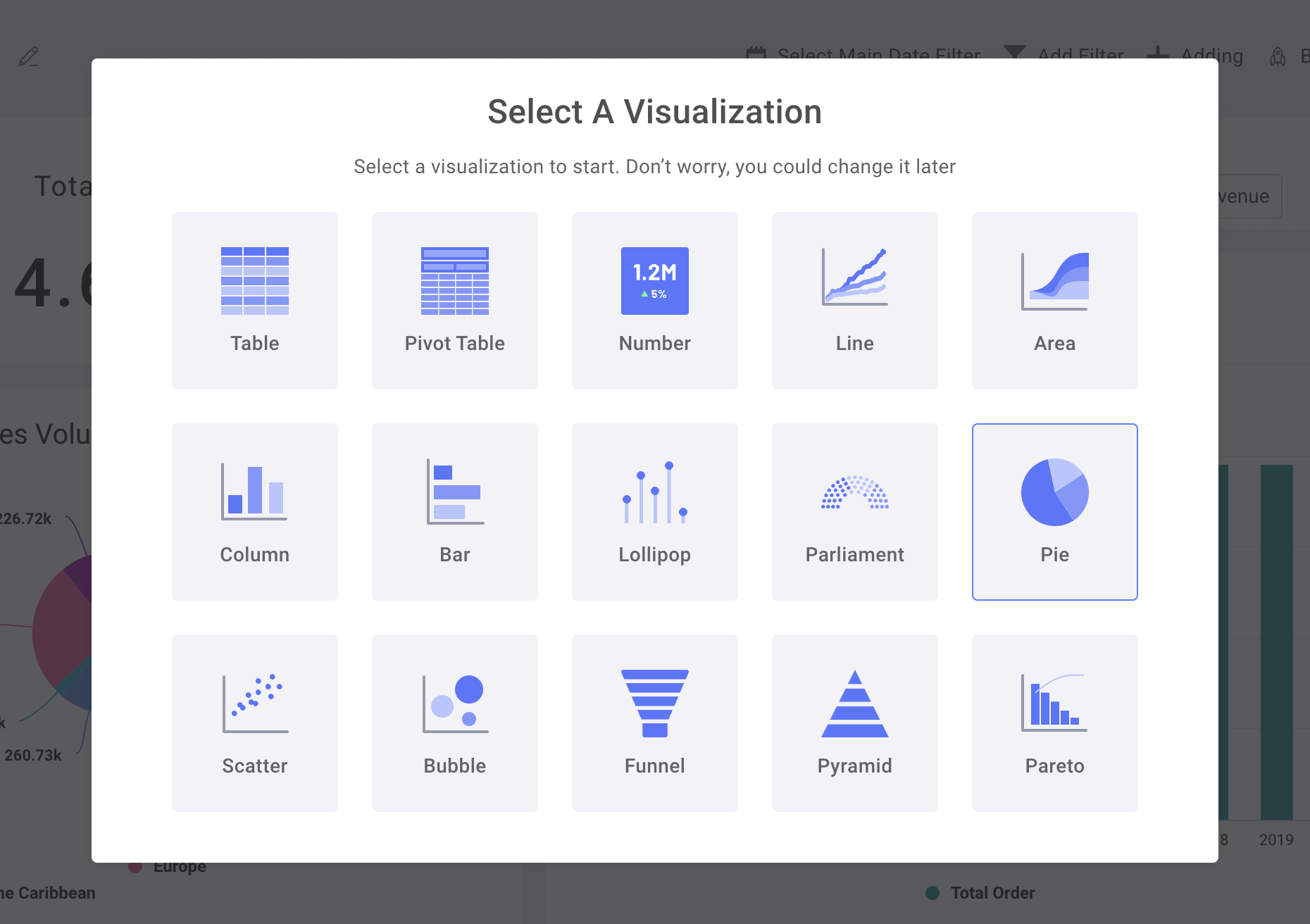
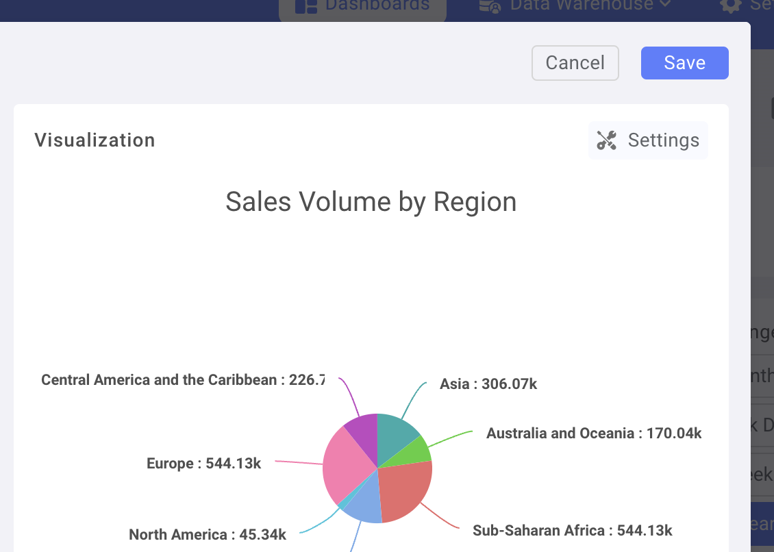
Круговая диаграмма: метрики продаж по регионам
Выберите Adding new chart, затем — Select Pie Chart
Сначала перетащите столбец "Region" из Dataset в поле Legend
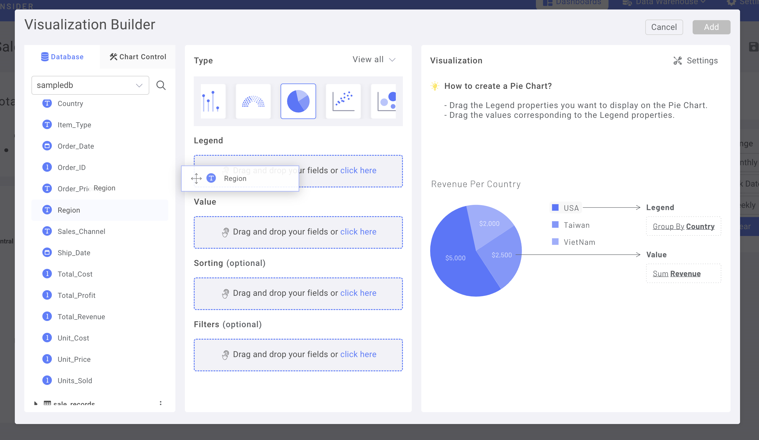
Затем переключитесь на вкладку Chart Control
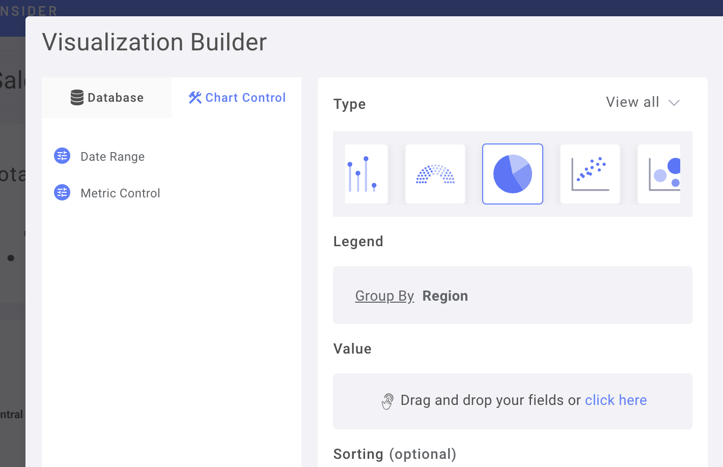
Перетащите элемент Metrics Control в поле Value
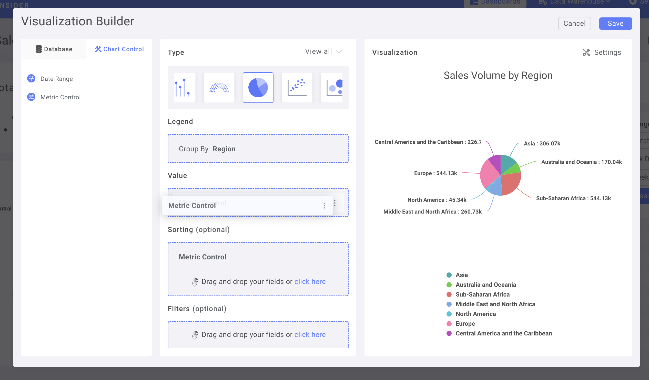
(вы также можете использовать Metrics Control для сортировки)
Перейдите в Chart Setting для дальнейшей настройки
Например, измените Data label на Percentage
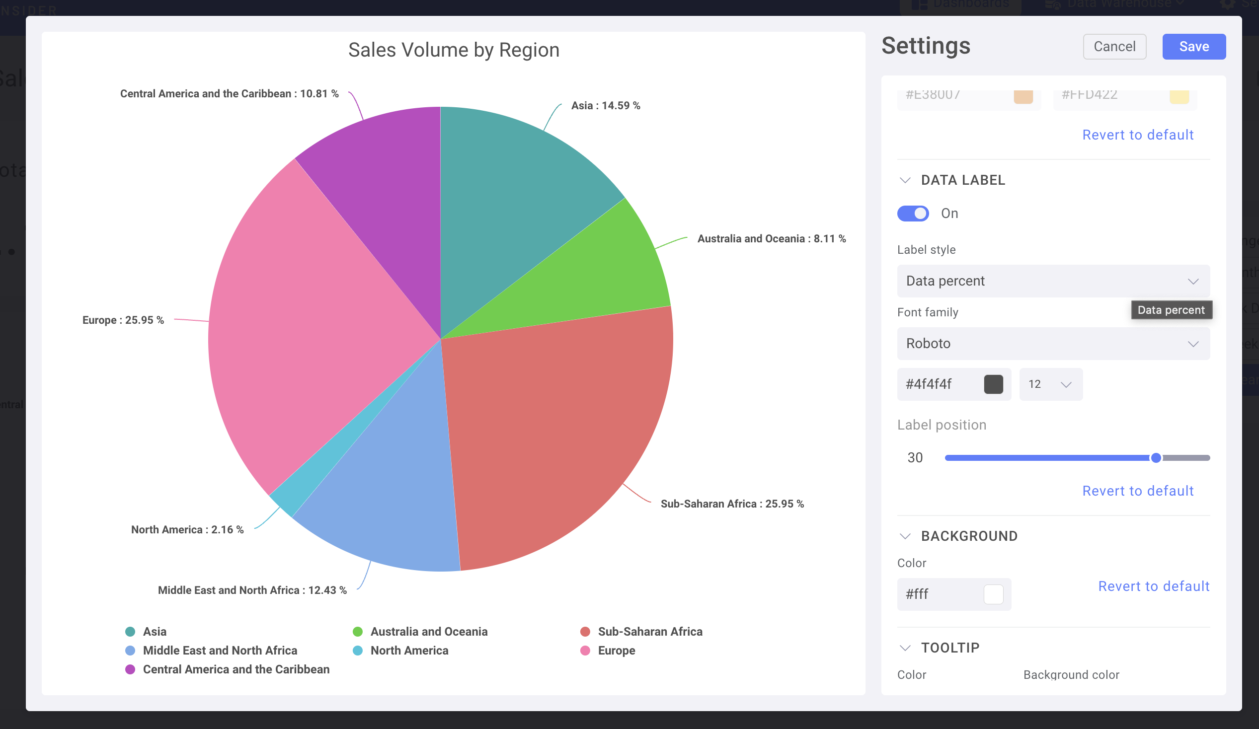
Сохраните диаграмму и добавьте её на панель мониторинга
Используйте элемент управления датой на диаграмме временных рядов
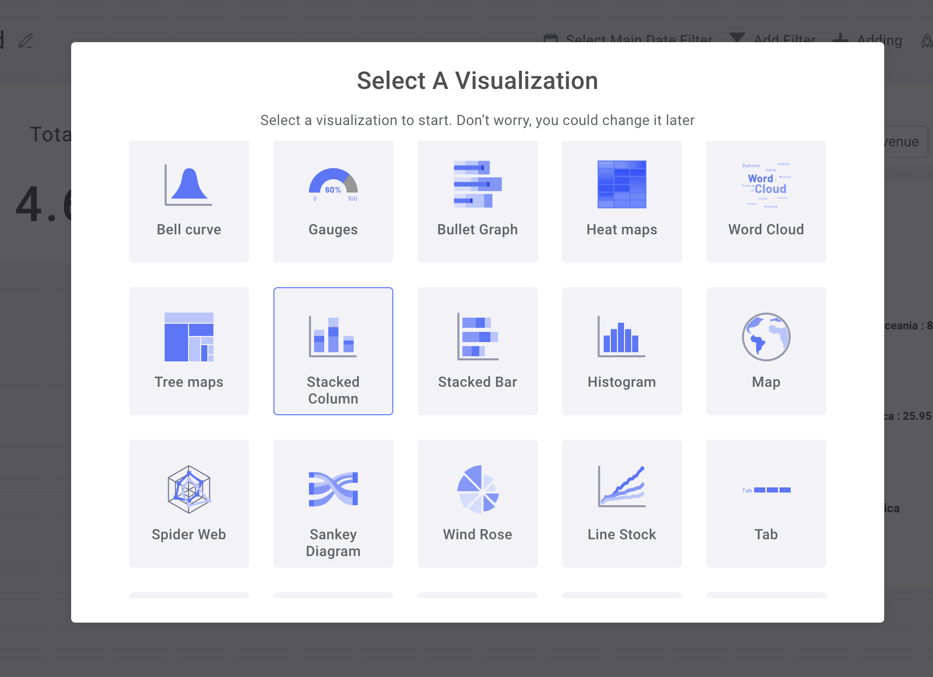
Используйте столбчатую диаграмму с накоплением
В Chart Control задайте Metrics Control для оси Y, а Date Range — для оси X
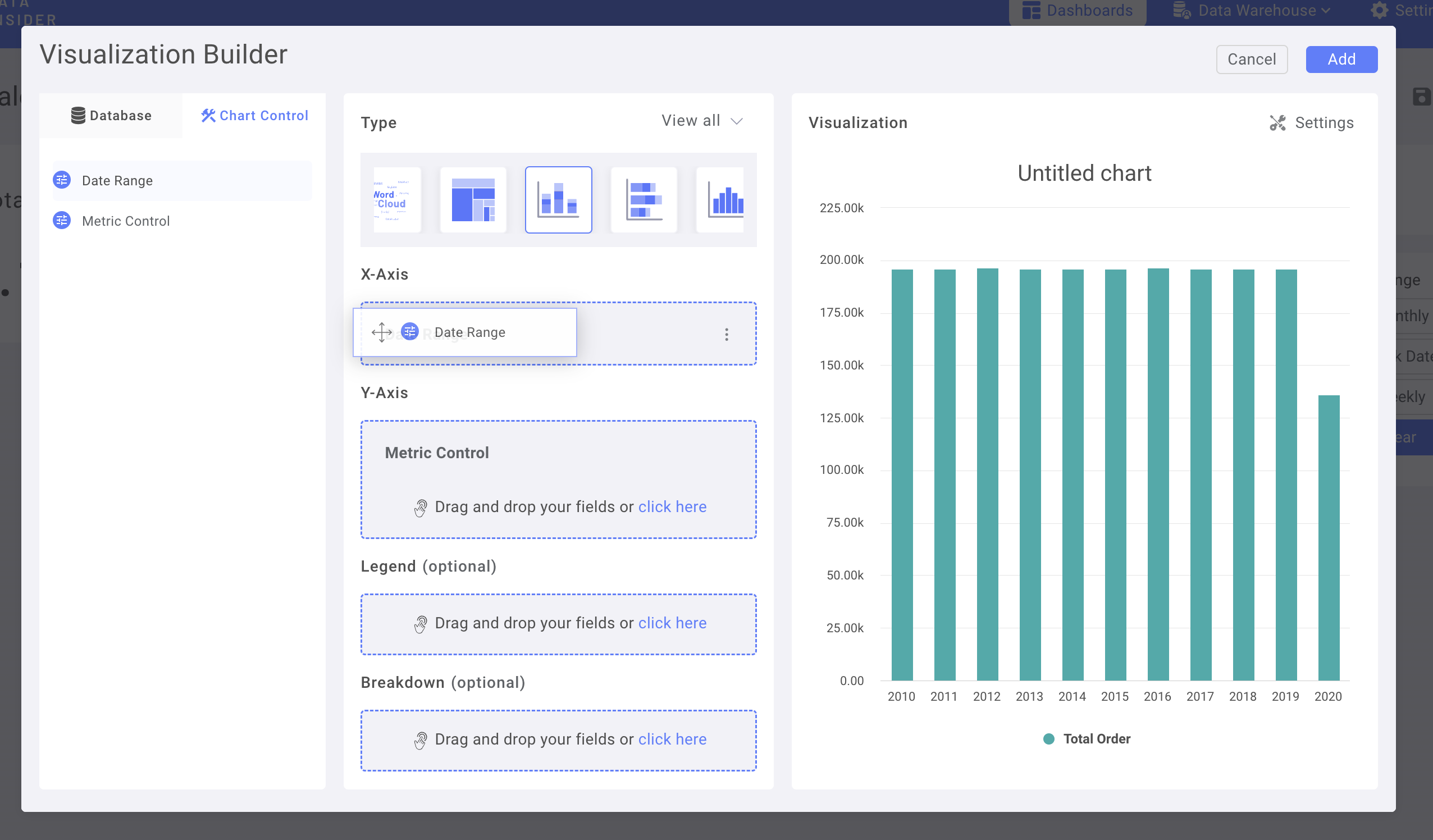
Добавьте столбец Region в Breakdown
Добавьте Number Chart в качестве KPI и завершите оформление панели мониторинга
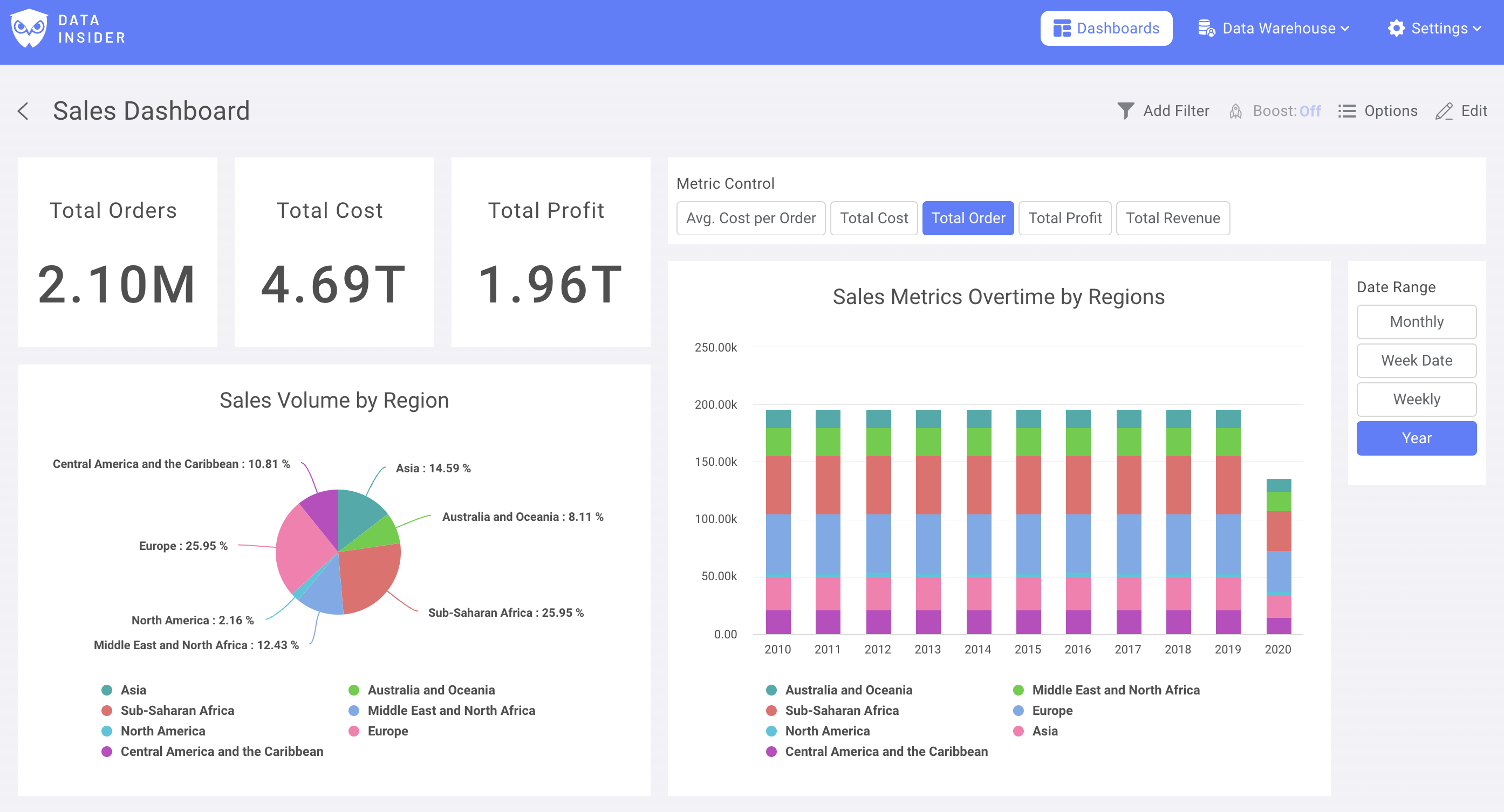
Теперь вы успешно создали свою первую панель мониторинга в Rocket.BI
